Description
This guide provides detailed instructions and examples for using the functions
provided in the eda_toolkit library and how to use them effectively in your projects.
For most of the ensuing examples, we will leverage the Census Income Data (1994) from
the UCI Machine Learning Repository [1]. This dataset provides a rich source of
information for demonstrating the functionalities of the eda_toolkit.
Data Preparation and Management
Path directories
Ensure that the directory exists. If not, create it.
- ensure_directory(path)
- Parameters:
path (str) – The path to the directory that needs to be ensured.
- Returns:
None
The ensure_directory function is a utility designed to facilitate the
management of directory paths within your project. When working with data
science projects, it is common to save and load data, images, and other
artifacts from specific directories. This function helps in making sure that
these directories exist before any read/write operations are performed. If
the specified directory does not exist, the function creates it. If it
already exists, it does nothing, thus preventing any errors related to
missing directories.
Example Usage
In the example below, we demonstrate how to use the ensure_directory function
to verify and create directories as needed. This example sets up paths for data and
image directories, ensuring they exist before performing any operations that depend on them.
First, we define the base path as the parent directory of the current directory.
The os.pardir constant, equivalent to ".."", is used to navigate up one
directory level. Then, we define paths for the data directory and data output
directory, both located one level up from the current directory.
Next, we set paths for the PNG and SVG image directories, located within an
images folder in the parent directory. Using the ensure_directory
function, we then verify that these directories exist. If any of the specified
directories do not exist, the function creates them.
from eda_toolkit import ensure_directory

import os # import operating system for dir


base_path = os.path.join(os.pardir)

# Go up one level from 'notebooks' to parent directory,
# then into the 'data' folder
data_path = os.path.join(os.pardir, "data")
data_output = os.path.join(os.pardir, "data_output")

# create image paths
image_path_png = os.path.join(base_path, "images", "png_images")
image_path_svg = os.path.join(base_path, "images", "svg_images")

# Use the function to ensure'data' directory exists
ensure_directory(data_path)
ensure_directory(data_output)
ensure_directory(image_path_png)
ensure_directory(image_path_svg)
Output
Created directory: ../data
Created directory: ../data_output
Created directory: ../images/png_images
Created directory: ../images/svg_images
Adding Unique Identifiers
Add a column of unique IDs with a specified number of digits to the dataframe.
- add_ids(df, id_colname='ID', num_digits=9, seed=None, set_as_index=True)
- Parameters:
df (pd.DataFrame) – The dataframe to add IDs to.
id_colname (str) – The name of the new column for the IDs.
num_digits (int) – The number of digits for the unique IDs.
seed (int, optional) – The seed for the random number generator. Defaults to
None.set_as_index (bool, optional) – Whether to set the new ID column as the index. Defaults to
False.
- Returns:
The updated dataframe with the new ID column.
- Return type:
pd.DataFrame
The add_ids function is used to append a column of unique identifiers with a
specified number of digits to a given dataframe. This is particularly useful for
creating unique patient or record IDs in datasets. The function allows you to
specify a custom column name for the IDs, the number of digits for each ID, and
optionally set a seed for the random number generator to ensure reproducibility.
Additionally, you can choose whether to set the new ID column as the index of the dataframe.
Example Usage
In the example below, we demonstrate how to use the add_ids function to add a
column of unique IDs to a dataframe. We start by importing the necessary libraries
and creating a sample dataframe. We then use the add_ids function to generate
and append a column of unique IDs with a specified number of digits to the dataframe.
First, we import the pandas library and the add_ids function from the eda_toolkit.
Then, we create a sample dataframe with some data. We call the add_ids function,
specifying the dataframe, the column name for the IDs, the number of digits for
each ID, a seed for reproducibility, and whether to set the new ID column as the
index. The function generates unique IDs for each row and adds them as the first
column in the dataframe.
from eda_toolkit import add_ids

# Add a column of unique IDs with 9 digits and call it "census_id"
df = add_ids(
    df=df,
    id_colname="census_id",
    num_digits=9,
    seed=111,
    set_as_index=True,
)
Output
First 5 Rows of Census Income Data (Adapted from Kohavi, 1996, UCI Machine Learning Repository) [1]
DataFrame index is unique.
| age | workclass | fnlwgt | education | education-num | marital-status | occupation | relationship | |
|---|---|---|---|---|---|---|---|---|
| census_id | ||||||||
| 74130842 | 39 | State-gov | 77516 | Bachelors | 13 | Never-married | Adm-clerical | Not-in-family |
| 97751875 | 50 | Self-emp-not-inc | 83311 | Bachelors | 13 | Married-civ-spouse | Exec-managerial | Husband |
| 12202842 | 38 | Private | 215646 | HS-grad | 9 | Divorced | Handlers-cleaners | Not-in-family |
| 96078789 | 53 | Private | 234721 | 11th | 7 | Married-civ-spouse | Handlers-cleaners | Husband |
| 35130194 | 28 | Private | 338409 | Bachelors | 13 | Married-civ-spouse | Prof-specialty | Wife |
Trailing Period Removal
Strip the trailing period from floats in a specified column of a DataFrame, if present.
- strip_trailing_period(df, column_name)
- Parameters:
df (pd.DataFrame) – The DataFrame containing the column to be processed.
column_name (str) – The name of the column containing floats with potential trailing periods.
- Returns:
The updated DataFrame with the trailing periods removed from the specified column.
- Return type:
pd.DataFrame
The
strip_trailing_periodfunction is designed to remove trailing periods from float values in a specified column of a DataFrame. This can be particularly useful when dealing with data that has been inconsistently formatted, ensuring that all float values are correctly represented.
Example Usage
In the example below, we demonstrate how to use the strip_trailing_period function to clean a
column in a DataFrame. We start by importing the necessary libraries and creating a sample DataFrame.
We then use the strip_trailing_period function to remove any trailing periods from the specified column.
from eda_toolkit import strip_trailing_period

# Create a sample dataframe with trailing periods in some values
data = {
    "values": [1.0, 2.0, 3.0, 4.0, 5.0, 6.],
}
df = pd.DataFrame(data)

# Remove trailing periods from the 'values' column
df = strip_trailing_period(df=df, column_name="values")
Output
First 6 Rows of Data Before and After Removing Trailing Periods (Adapted from Example)
Before:
|
After:
|
Note: The last row shows 6 as an int with a trailing period with its conversion to float.
Standardized Dates
Parse and standardize date strings based on the provided rule.
- parse_date_with_rule(date_str)
This function takes a date string and standardizes it to the
ISO 8601format (YYYY-MM-DD). It assumes dates are provided in either day/month/year or month/day/year format. The function first checks if the first part of the date string (day or month) is greater than 12, which unambiguously indicates a day/month/year format. If the first part is 12 or less, the function attempts to parse the date as month/day/year, falling back to day/month/year if the former raises aValueErrordue to an impossible date (e.g., month being greater than 12).- Parameters:
date_str (str) – A date string to be standardized.
- Returns:
A standardized date string in the format
YYYY-MM-DD.- Return type:
- Raises:
ValueError – If
date_stris in an unrecognized format or if the function cannot parse the date.
Example Usage
In the example below, we demonstrate how to use the parse_date_with_rule
function to standardize date strings. We start by importing the necessary library
and creating a sample list of date strings. We then use the parse_date_with_rule
function to parse and standardize each date string to the ISO 8601 format.
from eda_toolkit import parse_date_with_rule

# Sample date strings
date_strings = ["15/04/2021", "04/15/2021", "01/12/2020", "12/01/2020"]

# Standardize the date strings
standardized_dates = [parse_date_with_rule(date) for date in date_strings]

print(standardized_dates)
Output
['2021-04-15', '2021-04-15', '2020-12-01', '2020-01-12']
Important
In the next example, we demonstrate how to apply the parse_date_with_rule
function to a DataFrame column containing date strings using the .apply() method.
This is particularly useful when you need to standardize date formats across an
entire column in a DataFrame.
# Creating the DataFrame
data = {
    "date_column": [
        "31/12/2021",
        "01/01/2022",
        "12/31/2021",
        "13/02/2022",
        "07/04/2022",
    ],
    "name": ["Alice", "Bob", "Charlie", "David", "Eve"],
    "amount": [100.0, 150.5, 200.75, 250.25, 300.0],
}

df = pd.DataFrame(data)

# Apply the function to the DataFrame column
df["standardized_date"] = df["date_column"].apply(parse_date_with_rule)

print(df)
Output
   date_column     name  amount standardized_date
0   31/12/2021    Alice  100.00        2021-12-31
1   01/01/2022      Bob  150.50        2022-01-01
2   12/31/2021  Charlie  200.75        2021-12-31
3   13/02/2022    David  250.25        2022-02-13
4   07/04/2022      Eve  300.00        2022-04-07
DataFrame Analysis
Analyze DataFrame columns, including dtype, null values, and unique value counts.
- dataframe_columns(df)
This function analyzes the columns of a DataFrame, providing details about the data type, the number and percentage of
nullvalues, the total number of unique values, and the most frequent unique value along with its count and percentage. It handles special cases such as converting date columns and replacing empty strings with PandasNAvalues.- Parameters:
df (pandas.DataFrame) – The DataFrame to analyze.
- Returns:
A DataFrame with the analysis results for each column.
- Return type:
pandas.DataFrame
Example Usage
In the example below, we demonstrate how to use the dataframe_columns
function to analyze a DataFrame’s columns.
from eda_toolkit import dataframe_columns

dataframe_columns(df=df)
Output
Result on Census Income Data (Adapted from Kohavi, 1996, UCI Machine Learning Repository) [1]
Shape:  (48842, 16)

Total seconds of processing time: 0.861555
| column | dtype | null_total | null_pct | unique_values_total | max_unique_value | max_unique_value_total | max_unique_value_pct | |
|---|---|---|---|---|---|---|---|---|
| 0 | age | int64 | 0 | 0 | 74 | 36 | 1348 | 2.76 |
| 1 | workclass | object | 963 | 1.97 | 9 | Private | 33906 | 69.42 |
| 2 | fnlwgt | int64 | 0 | 0 | 28523 | 203488 | 21 | 0.04 |
| 3 | education | object | 0 | 0 | 16 | HS-grad | 15784 | 32.32 |
| 4 | education-num | int64 | 0 | 0 | 16 | 9 | 15784 | 32.32 |
| 5 | marital-status | object | 0 | 0 | 7 | Married-civ-spouse | 22379 | 45.82 |
| 6 | occupation | object | 966 | 1.98 | 15 | Prof-specialty | 6172 | 12.64 |
| 7 | relationship | object | 0 | 0 | 6 | Husband | 19716 | 40.37 |
| 8 | race | object | 0 | 0 | 5 | White | 41762 | 85.5 |
| 9 | sex | object | 0 | 0 | 2 | Male | 32650 | 66.85 |
| 10 | capital-gain | int64 | 0 | 0 | 123 | 0 | 44807 | 91.74 |
| 11 | capital-loss | int64 | 0 | 0 | 99 | 0 | 46560 | 95.33 |
| 12 | hours-per-week | int64 | 0 | 0 | 96 | 40 | 22803 | 46.69 |
| 13 | native-country | object | 274 | 0.56 | 42 | United-States | 43832 | 89.74 |
| 14 | income | object | 0 | 0 | 4 | <=50K | 24720 | 50.61 |
| 15 | age_group | category | 0 | 0 | 9 | 18-29 | 13920 | 28.5 |
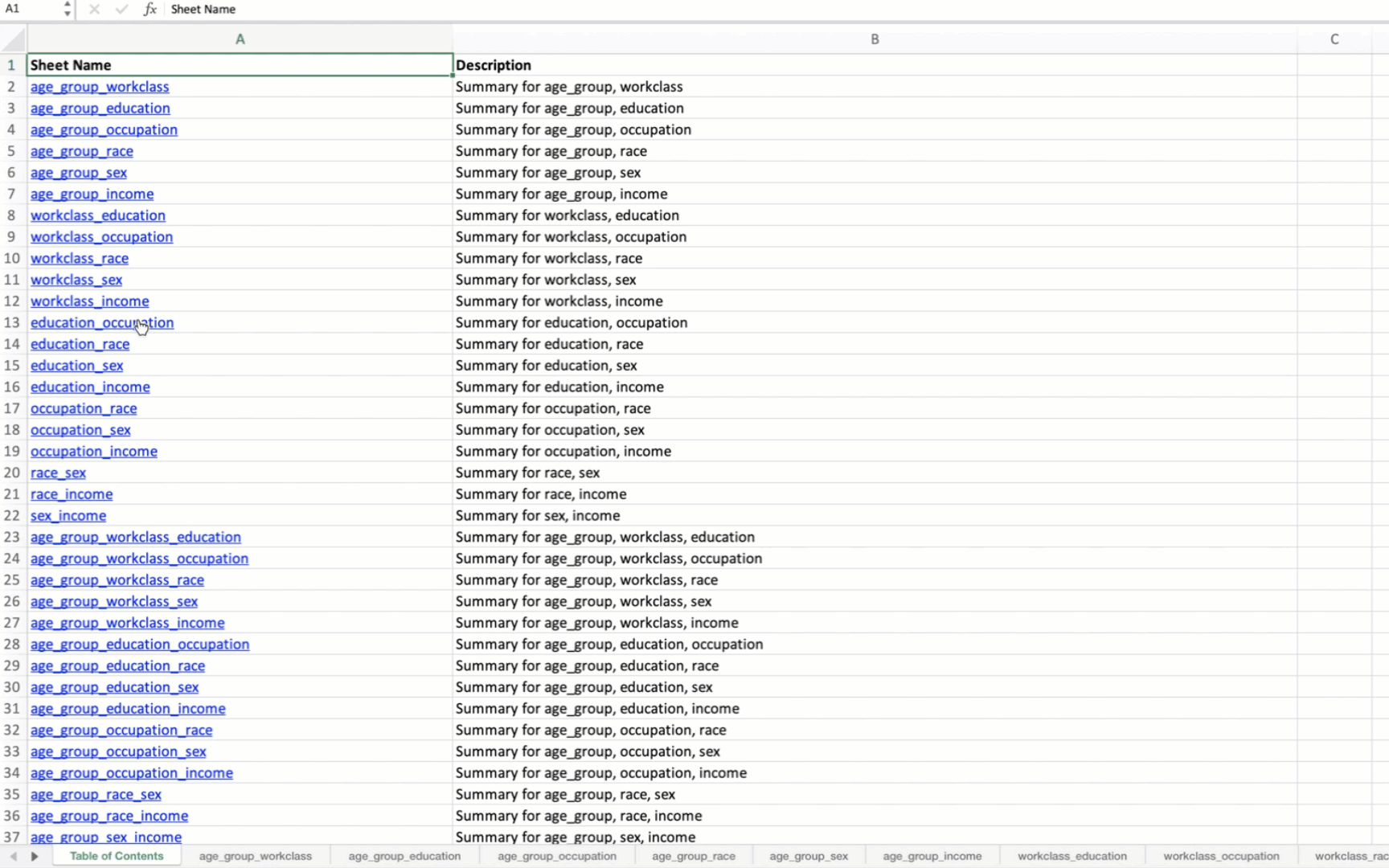
Generating Summary Tables for Variable Combinations
This function generates summary tables for all possible combinations of specified variables in a DataFrame and save them to an Excel file.
- summarize_all_combinations(df, variables, data_path, data_name, min_length=2)
- Parameters:
df (pandas.DataFrame) – The pandas DataFrame containing the data.
variables (list) – List of unique variables to generate combinations.
data_path (str) – Path where the output Excel file will be saved.
data_name (str) – Name of the output Excel file.
min_length (int) – Minimum length of combinations to generate. Defaults to
2.
- Returns:
A dictionary of summary tables and a list of all generated combinations.
- Return type:
The function returns two outputs:
1. summary_tables: A dictionary where each key is a tuple representing a combination
of variables, and each value is a DataFrame containing the summary table for that combination.
Each summary table includes the count and proportion of occurrences for each unique combination of values.
2. all_combinations: A list of all generated combinations of the specified variables.
This is useful for understanding which combinations were analyzed and included in the summary tables.
Example Usage
Below, we use the summarize_all_combinations function to generate summary tables for the specified
variables from a DataFrame containing the census data [1].
from eda_toolkit import summarize_all_combinations

# Define unique variables for the analysis
unique_vars = [
    "age_group",
    "workclass",
    "education",
    "occupation",
    "race",
    "sex",
    "income",
]

# Generate summary tables for all combinations of the specified variables
summary_tables, all_combinations = summarize_all_combinations(
    df=df,
    data_path=data_output,
    variables=unique_vars,
    data_name="census_summary_tables.xlsx",
)

# Print all combinations of variables
print(all_combinations)
Output
[('age_group', 'workclass'),
('age_group', 'education'),
('age_group', 'occupation'),
('age_group', 'race'),
('age_group', 'sex'),
('age_group', 'income'),
('workclass', 'education'),
('workclass', 'occupation'),
('workclass', 'race'),
('workclass', 'sex'),
('workclass', 'income'),
('education', 'occupation'),
('education', 'race'),
('education', 'sex'),
('education', 'income'),
('occupation', 'race'),
('occupation', 'sex'),
('occupation', 'income'),
('race', 'sex'),
('race', 'income'),
('sex', 'income'),
('age_group', 'workclass', 'education'),
('age_group', 'workclass', 'occupation'),
('age_group', 'workclass', 'race'),
('age_group', 'workclass', 'sex'),
('age_group', 'workclass', 'income'),
('age_group', 'education', 'occupation'),
('age_group', 'education', 'race'),
('age_group', 'education', 'sex'),
('age_group', 'education', 'income'),
('age_group', 'occupation', 'race'),
('age_group', 'occupation', 'sex'),
('age_group', 'occupation', 'income'),
('age_group', 'race', 'sex'),
('age_group', 'race', 'income'),
('age_group', 'sex', 'income'),
('workclass', 'education', 'occupation'),
('workclass', 'education', 'race'),
('workclass', 'education', 'sex'),
('workclass', 'education', 'income'),
('workclass', 'occupation', 'race'),
('workclass', 'occupation', 'sex'),
('workclass', 'occupation', 'income'),
('workclass', 'race', 'sex'),
('workclass', 'race', 'income'),
('workclass', 'sex', 'income'),
('education', 'occupation', 'race'),
('education', 'occupation', 'sex'),
('education', 'occupation', 'income'),
('education', 'race', 'sex'),
('education', 'race', 'income'),
('education', 'sex', 'income'),
('occupation', 'race', 'sex'),
('occupation', 'race', 'income'),
('occupation', 'sex', 'income'),
('race', 'sex', 'income'),
('age_group', 'workclass', 'education', 'occupation'),
('age_group', 'workclass', 'education', 'race'),
('age_group', 'workclass', 'education', 'sex'),
('age_group', 'workclass', 'education', 'income'),
('age_group', 'workclass', 'occupation', 'race'),
('age_group', 'workclass', 'occupation', 'sex'),
('age_group', 'workclass', 'occupation', 'income'),
('age_group', 'workclass', 'race', 'sex'),
('age_group', 'workclass', 'race', 'income'),
('age_group', 'workclass', 'sex', 'income'),
('age_group', 'education', 'occupation', 'race'),
('age_group', 'education', 'occupation', 'sex'),
('age_group', 'education', 'occupation', 'income'),
('age_group', 'education', 'race', 'sex'),
('age_group', 'education', 'race', 'income'),
('age_group', 'education', 'sex', 'income'),
('age_group', 'occupation', 'race', 'sex'),
('age_group', 'occupation', 'race', 'income'),
('age_group', 'occupation', 'sex', 'income'),
('age_group', 'race', 'sex', 'income'),
('workclass', 'education', 'occupation', 'race'),
('workclass', 'education', 'occupation', 'sex'),
('workclass', 'education', 'occupation', 'income'),
('workclass', 'education', 'race', 'sex'),
('workclass', 'education', 'race', 'income'),
('workclass', 'education', 'sex', 'income'),
('workclass', 'occupation', 'race', 'sex'),
('workclass', 'occupation', 'race', 'income'),
('workclass', 'occupation', 'sex', 'income'),
('workclass', 'race', 'sex', 'income'),
('education', 'occupation', 'race', 'sex'),
('education', 'occupation', 'race', 'income'),
('education', 'occupation', 'sex', 'income'),
('education', 'race', 'sex', 'income'),
('occupation', 'race', 'sex', 'income'),
('age_group', 'workclass', 'education', 'occupation', 'race'),
('age_group', 'workclass', 'education', 'occupation', 'sex'),
('age_group', 'workclass', 'education', 'occupation', 'income'),
('age_group', 'workclass', 'education', 'race', 'sex'),
('age_group', 'workclass', 'education', 'race', 'income'),
('age_group', 'workclass', 'education', 'sex', 'income'),
('age_group', 'workclass', 'occupation', 'race', 'sex'),
('age_group', 'workclass', 'occupation', 'race', 'income'),
('age_group', 'workclass', 'occupation', 'sex', 'income'),
('age_group', 'workclass', 'race', 'sex', 'income'),
('age_group', 'education', 'occupation', 'race', 'sex'),
('age_group', 'education', 'occupation', 'race', 'income'),
('age_group', 'education', 'occupation', 'sex', 'income'),
('age_group', 'education', 'race', 'sex', 'income'),
('age_group', 'occupation', 'race', 'sex', 'income'),
('workclass', 'education', 'occupation', 'race', 'sex'),
('workclass', 'education', 'occupation', 'race', 'income'),
('workclass', 'education', 'occupation', 'sex', 'income'),
('workclass', 'education', 'race', 'sex', 'income'),
('workclass', 'occupation', 'race', 'sex', 'income'),
('education', 'occupation', 'race', 'sex', 'income'),
('age_group', 'workclass', 'education', 'occupation', 'race', 'sex'),
('age_group', 'workclass', 'education', 'occupation', 'race', 'income'),
('age_group', 'workclass', 'education', 'occupation', 'sex', 'income'),
('age_group', 'workclass', 'education', 'race', 'sex', 'income'),
('age_group', 'workclass', 'occupation', 'race', 'sex', 'income'),
('age_group', 'education', 'occupation', 'race', 'sex', 'income'),
('workclass', 'education', 'occupation', 'race', 'sex', 'income'),
('age_group',
'workclass',
'education',
'occupation',
'race',
'sex',
'income')]
When applied to the US Census data, the output Excel file will contain summary tables for all possible combinations of the specified variables. The first sheet will be a Table of Contents with hyperlinks to each summary table.
Saving DataFrames to Excel with Customized Formatting
Save multiple DataFrames to separate sheets in an Excel file with customized formatting.
This section explains how to save multiple DataFrames to separate sheets in an Excel file with customized formatting using the save_dataframes_to_excel function.
- save_dataframes_to_excel(file_path, df_dict, decimal_places=0)
- Parameters:
- Notes:
The function will autofit columns and left-align text.
Numeric columns will be formatted with the specified number of decimal places.
Headers will be bold and left-aligned without borders.
The function performs the following tasks:
Writes each DataFrame to its respective sheet in the Excel file.
Rounds numeric columns to the specified number of decimal places.
Applies customized formatting to headers and cells.
Autofits columns based on the content length.
Example Usage
Below, we use the save_dataframes_to_excel function to save two DataFrames:
the original DataFrame and a filtered DataFrame with ages between 18 and 40.
from eda_toolkit import save_dataframes_to_excel

# Example usage
file_name = "df_census.xlsx"  # Name of the output Excel file
file_path = os.path.join(data_path, file_name)

# filter DataFrame to Ages 18-40
filtered_df = df[(df["age"] > 18) & (df["age"] < 40)]

df_dict = {
    "original_df": df,
    "ages_18_to_40": filtered_df,
}

save_dataframes_to_excel(
    file_path=file_path,
    df_dict=df_dict,
    decimal_places=0,
)
Output
The output Excel file will contain the original DataFrame and a filtered DataFrame as a separate tab with ages between 18 and 40, each on separate sheets with customized formatting.
Creating Contingency Tables
Create a contingency table from one or more columns in a DataFrame, with sorting options.
This section explains how to create contingency tables from one or more columns in a DataFrame using the contingency_table function.
- contingency_table(df, cols=None, sort_by=0)
- Parameters:
df (pandas.DataFrame) – The DataFrame to analyze.
cols (str or list, optional) – Name of the column (as a string) for a single column or list of column names for multiple columns. Must provide at least one column.
sort_by (int) – Enter
0to sort results by column groups; enter1to sort results by totals in descending order.
- Raises:
ValueError – If no columns are specified or if sort_by is not
0or1.- Returns:
A DataFrame with the specified columns,
'Total', and'Percentage'.- Return type:
pandas.DataFrame
Example Usage
Below, we use the contingency_table function to create a contingency table
from the specified columns in a DataFrame containing census data [1]
from eda_toolkit import contingency_table

# Example usage
contingency_table(
    df=df,
    cols=[
        "age_group",
        "workclass",
        "race",
        "sex",
    ],
    sort_by=1,
)
Output
The output will be a contingency table with the specified columns, showing the
total counts and percentages of occurrences for each combination of values. The
table will be sorted by the 'Total' column in descending order because sort_by
is set to 1.
    age_group     workclass                race     sex  Total  Percentage
0       30-39       Private               White    Male   5856       11.99
1       18-29       Private               White    Male   5623       11.51
2       40-49       Private               White    Male   4267        8.74
3       18-29       Private               White  Female   3680        7.53
4       50-59       Private               White    Male   2565        5.25
..        ...           ...                 ...     ...    ...         ...
467     50-59   Federal-gov               Other    Male      1        0.00
468     50-59     Local-gov  Asian-Pac-Islander  Female      1        0.00
469     70-79  Self-emp-inc               Black    Male      1        0.00
470     80-89     Local-gov  Asian-Pac-Islander    Male      1        0.00
471                                                      48842      100.00

[472 rows x 6 columns]
Highlighting Specific Columns in a DataFrame
This section explains how to highlight specific columns in a DataFrame using the highlight_columns function.
Highlight specific columns in a DataFrame with a specified background color.
- highlight_columns(df, columns, color='yellow')
- Parameters:
- Returns:
A Styler object with the specified columns highlighted.
- Return type:
pandas.io.formats.style.Styler
Example Usage
Below, we use the highlight_columns function to highlight the age and education
columns in the first 5 rows of the census [1] DataFrame with a pink background color.
from eda_toolkit import highlight_columns

# Applying the highlight function
highlighted_df = highlight_columns(
    df=df,
    columns=["age", "education"],
    color="#F8C5C8",
)

highlighted_df
Output
The output will be a DataFrame with the specified columns highlighted in the given background color.
The age and education columns will be highlighted in pink.
The resulting styled DataFrame can be displayed in a Jupyter Notebook or saved to an
HTML file using the .render() method of the Styler object.
| age | workclass | fnlwgt | education | education-num | marital-status | occupation | relationship | |
|---|---|---|---|---|---|---|---|---|
| census_id | ||||||||
| 82943611 | 39 | State-gov | 77516 | Bachelors | 13 | Never-married | Adm-clerical | Not-in-family |
| 42643227 | 50 | Self-emp-not-inc | 83311 | Bachelors | 13 | Married-civ-spouse | Exec-managerial | Husband |
| 93837254 | 38 | Private | 215646 | HS-grad | 9 | Divorced | Handlers-cleaners | Not-in-family |
| 87104229 | 53 | Private | 234721 | 11th | 7 | Married-civ-spouse | Handlers-cleaners | Husband |
| 90069867 | 28 | Private | 338409 | Bachelors | 13 | Married-civ-spouse | Prof-specialty | Wife |
Binning Numerical Columns
Binning numerical columns is a technique used to convert continuous numerical data into discrete categories or “bins.” This is especially useful for simplifying analysis, creating categorical features from numerical data, or visualizing the distribution of data within specific ranges. The process of binning involves dividing a continuous range of values into a series of intervals, or “bins,” and then assigning each value to one of these intervals.
Note
The code snippets below create age bins and assign a corresponding age group
label to each age in the DataFrame. The pd.cut function from pandas is used to
categorize the ages and assign them to a new column, age_group. Adjust the bins
and labels as needed for your specific data.
Below, we use the age column of the census data [1] from the UCI Machine Learning Repository as an example:
Bins Definition: The bins are defined by specifying the boundaries of each interval. For example, in the code snippet below, the
bin_ageslist specifies the boundaries for age groups:bin_ages = [ 0, 18, 30, 40, 50, 60, 70, 80, 90, 100, float("inf"), ]
Each pair of consecutive elements in
bin_agesdefines a bin. For example:The first bin is
[0, 18),The second bin is
[18, 30),and so on.
Labels for Bins: The label_ages list provides labels corresponding to each bin:
label_ages = [
    "< 18",
    "18-29",
    "30-39",
    "40-49",
    "50-59",
    "60-69",
    "70-79",
    "80-89",
    "90-99",
    "100 +",
]
These labels are used to categorize the numerical values into meaningful groups.
Applying the Binning: The pd.cut function from Pandas is used to apply the binning process. For each value in the
agecolumn of the DataFrame, it assigns a corresponding label based on which bin the value falls into. Here,right=Falseindicates that each bin includes the left endpoint but excludes the right endpoint. For example, ifbin_ages = [0, 10, 20, 30], then a value of10will fall into the bin[10, 20)and be labeled accordingly.df["age_group"] = pd.cut( df["age"], bins=bin_ages, labels=label_ages, right=False, )
Mathematically, for a given value x in the
agecolumn:\[\begin{split}\text{age_group} = \begin{cases} < 18 & \text{if } 0 \leq x < 18 \\ 18-29 & \text{if } 18 \leq x < 30 \\ \vdots \\ 100 + & \text{if } x \geq 100 \end{cases}\end{split}\]The parameter right=False in pd.cut means that the bins are left-inclusive and right-exclusive, except for the last bin, which is always right-inclusive when the upper bound is infinity (float(“inf”)).
KDE and Histogram Distribution Plots
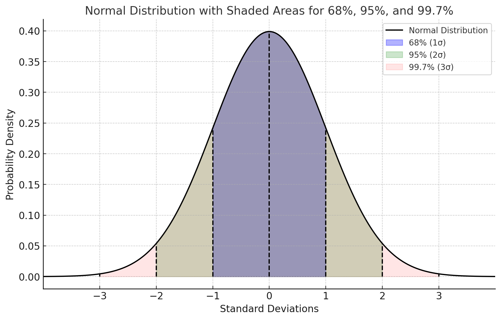
Gaussian Assumption for Normality
The Gaussian (normal) distribution is a key assumption in many statistical methods. It is mathematically represented by the probability density function (PDF):
where:
\(\mu\) is the mean
\(\sigma^2\) is the variance
In a normally distributed dataset:
68% of data falls within \(\mu \pm \sigma\)
95% within \(\mu \pm 2\sigma\)
99.7% within \(\mu \pm 3\sigma\)
Histograms and KDE
Histograms:
Visualize data distribution by binning values and counting frequencies.
If data is Gaussian, the histogram approximates a bell curve.
Kernel Density Estimation (KDE):
A non-parametric way to estimate the PDF by smoothing individual data points with a kernel function.
The KDE for a dataset \(X = \{x_1, x_2, \ldots, x_n\}\) is given by:
where:
\(K\) is the kernel function (often Gaussian)
\(h\) is the bandwidth (smoothing parameter)
Combined Use of Histograms and KDE
Histograms offer a discrete, binned view of the data.
KDE provides a smooth, continuous estimate of the underlying distribution.
Together, they effectively illustrate how well the data aligns with the Gaussian assumption, highlighting any deviations from normality.
KDE Distribution Function
Generate KDE or histogram distribution plots for specified columns in a DataFrame.
The kde_distributions function is a versatile tool designed for generating
Kernel Density Estimate (KDE) plots, histograms, or a combination of both for
specified columns within a DataFrame. This function is particularly useful for
visualizing the distribution of numerical data across various categories or groups.
It leverages the powerful seaborn library [2] for plotting, which is built on top of
matplotlib [3] and provides a high-level interface for drawing attractive and informative
statistical graphics.
Key Features and Parameters
Flexible Plotting: The function supports creating histograms, KDE plots, or a combination of both for specified columns, allowing users to visualize data distributions effectively.
Leverages Seaborn Library: The function is built on the seaborn library, which provides high-level, attractive visualizations, making it easy to create complex plots with minimal code.
Customization: Users have control over plot aesthetics, such as colors, fill options, grid sizes, axis labels, tick marks, and more, allowing them to tailor the visualizations to their needs.
Scientific Notation Control: The function allows disabling scientific notation on the axes, providing better readability for certain types of data.
Log Scaling: The function includes an option to apply logarithmic scaling to specific variables, which is useful when dealing with data that spans several orders of magnitude.
Output Options: The function supports saving plots as PNG or SVG files, with customizable filenames and output directories, making it easy to integrate the plots into reports or presentations.
- kde_distributions(df, vars_of_interest=None, grid_figsize=(10, 8), single_figsize=(6, 4), kde=True, hist_color='#0000FF', kde_color='#FF0000', hist_edgecolor='#000000', hue=None, fill=True, fill_alpha=1, n_rows=1, n_cols=1, w_pad=1.0, h_pad=1.0, image_path_png=None, image_path_svg=None, image_filename=None, bbox_inches=None, single_var_image_path_png=None, single_var_image_path_svg=None, single_var_image_filename=None, y_axis_label='Density', plot_type='both', log_scale_vars=None, bins='auto', binwidth=None, label_fontsize=10, tick_fontsize=10, text_wrap=50, disable_sci_notation=False, stat='density', xlim=None, ylim=None)
- Parameters:
df (pandas.DataFrame) – The DataFrame containing the data to plot.
vars_of_interest (list of str, optional) – List of column names for which to generate distribution plots.
grid_figsize (tuple, optional) – Size of the overall grid figure, default is
(10, 8).single_figsize (tuple, optional) – Size of individual figures for each variable, default is
(6, 4).kde (bool, optional) – Whether to include KDE plots on the histograms, default is
True.hist_color (str, optional) – Color of the histogram bars, default is
'#0000FF'.kde_color (str, optional) – Color of the KDE plot, default is
'#FF0000'.hist_edgecolor (str, optional) – Color of the histogram bar edges, default is
'#000000'.hue (str, optional) – Column name to group data by, adding different colors for each group.
fill (bool, optional) – Whether to fill the histogram bars with color, default is
True.fill_alpha (float, optional) – Alpha transparency for the fill color of the histogram bars, where
0is fully transparent and1is fully opaque. Default is1.n_rows (int, optional) – Number of rows in the subplot grid, default is
1.n_cols (int, optional) – Number of columns in the subplot grid, default is
1.w_pad (float, optional) – Width padding between subplots, default is
1.0.h_pad (float, optional) – Height padding between subplots, default is
1.0.image_path_png (str, optional) – Directory path to save the PNG image of the overall distribution plots.
image_path_svg (str, optional) – Directory path to save the SVG image of the overall distribution plots.
image_filename (str, optional) – Filename to use when saving the overall distribution plots.
bbox_inches (str, optional) – Bounding box to use when saving the figure. For example,
'tight'.single_var_image_path_png (str, optional) – Directory path to save the PNG images of the separate distribution plots.
single_var_image_path_svg (str, optional) – Directory path to save the SVG images of the separate distribution plots.
single_var_image_filename (str, optional) – Filename to use when saving the separate distribution plots. The variable name will be appended to this filename.
y_axis_label (str, optional) – The label to display on the
y-axis, default is'Density'.plot_type (str, optional) – The type of plot to generate, options are
'hist','kde', or'both'. Default is'both'.log_scale_vars (list of str, optional) – List of variable names to apply log scaling.
bins (int or sequence, optional) – Specification of histogram bins, default is
'auto'.binwidth (number or pair of numbers, optional) – Width of each bin, overrides bins but can be used with binrange.
label_fontsize (int, optional) – Font size for axis labels, including xlabel, ylabel, and tick marks, default is
10.tick_fontsize (int, optional) – Font size for axis tick labels, default is
10.text_wrap (int, optional) – Maximum width of the title text before wrapping, default is
50.disable_sci_notation (bool, optional) – Toggle to disable scientific notation on axes, default is
False.stat (str, optional) – Aggregate statistic to compute in each bin (e.g.,
'count','frequency','probability','percent','density'), default is'density'.xlim (tuple or list, optional) – Limits for the
x-axisas a tuple or list of (min, max).ylim (tuple or list, optional) – Limits for the
y-axisas a tuple or list of (min, max).
- Raises:
If
plot_typeis not one of'hist','kde', or'both'.If
statis not one of'count','density','frequency','probability','proportion','percent'.If
log_scale_varscontains variables that are not present in the DataFrame.If
fillis set toFalseandhist_edgecoloris not the default.
If
statis set to ‘count’ whilekdeisTrue, as it may produce misleading plots.If both
binsandbinwidthare specified, which may affect performance.
- Returns:
None
KDE and Histograms Example
In the below example, the kde_distributions function is used to generate
histograms for several variables of interest: "age", "education-num", and
"hours-per-week". These variables represent different demographic and
financial attributes from the dataset. The kde=True parameter ensures that a
Kernel Density Estimate (KDE) plot is overlaid on the histograms, providing a
smoothed representation of the data’s probability density.
The visualizations are arranged in a single row of four columns, as specified
by n_rows=1 and n_cols=3, respectively. The overall size of the grid
figure is set to 14 inches wide and 4 inches tall (grid_figsize=(14, 4)),
while each individual plot is configured to be 4 inches by 4 inches
(single_figsize=(4, 4)). The fill=True parameter fills the histogram
bars with color, and the spacing between the subplots is managed using
w_pad=1 and h_pad=1, which add 1 inch of padding both horizontally and
vertically.
To handle longer titles, the text_wrap=50 parameter ensures that the title
text wraps to a new line after 50 characters. The bbox_inches="tight" setting
is used when saving the figure, ensuring that it is cropped to remove any excess
whitespace around the edges. The variables specified in vars_of_interest are
passed directly to the function for visualization.
Each plot is saved individually with filenames that are prefixed by
"kde_density_single_distribution", followed by the variable name. The `y-axis`
for all plots is labeled as “Density” (y_axis_label="Density"), reflecting that
the height of the bars or KDE line represents the data’s density. The histograms
are divided into 10 bins (bins=10), offering a clear view of the distribution
of each variable.
The plot_type="hist" parameter indicates that only histograms will be generated
for each variable. Additionally, the font sizes for the axis labels and tick labels
are set to 16 points (label_fontsize=16) and 14 points (tick_fontsize=14),
respectively, ensuring that all text within the plots is legible and well-formatted.
from eda_toolkit import kde_distributions

vars_of_interest = [
    "age",
    "education-num",
    "hours-per-week",
]

kde_distributions(
    df=df,
    kde=True,
    n_rows=1,
    n_cols=3,
    grid_figsize=(14, 4),  # Size of the overall grid figure
    single_figsize=(4, 4),  # Size of individual figures
    fill=True,
    fill_alpha=0.60,
    w_pad=1,
    h_pad=1,
    text_wrap=50,
    bbox_inches="tight",
    vars_of_interest=vars_of_interest,
    y_axis_label="Density",
    bins=10,
    plot_type="hist",
    label_fontsize=16,  # Font size for axis labels
    tick_fontsize=14,  # Font size for tick labels
)

Histogram Example (Density)
In this example, the kde_distributions function is used to generate histograms for
the variables "age", "education-num", and "hours-per-week" but with
kde=False, meaning no KDE plots are included—only histograms are displayed.
The plots are arranged in a single row of four columns (n_rows=1, n_cols=3),
with a grid size of 14x4 inches (grid_figsize=(14, 4)). The histograms are
divided into 10 bins (bins=10), and the y-axis is labeled “Density” (y_axis_label="Density").
Font sizes for the axis labels and tick labels are set to 16 and 14 points,
respectively, ensuring clarity in the visualizations. This setup focuses on the
histogram representation without the KDE overlay.
from eda_toolkit import kde_distributions

vars_of_interest = [
    "age",
    "education-num",
    "hours-per-week",
]

kde_distributions(
    df=df,
    kde=False,
    n_rows=1,
    n_cols=3,
    grid_figsize=(14, 4),  # Size of the overall grid figure
    single_figsize=(4, 4),  # Size of individual figures
    w_pad=1,
    h_pad=1,
    text_wrap=50,
    bbox_inches="tight",
    vars_of_interest=vars_of_interest,
    y_axis_label="Density",
    bins=10,
    plot_type="hist",
    stat="Density",
    label_fontsize=16,  # Font size for axis labels
    tick_fontsize=14,  # Font size for tick labels
)

Histogram Example (Count)
In this example, the kde_distributions function is modified to generate histograms
with a few key changes. The hist_color is set to “orange”, changing the color of the
histogram bars. The `y-axis` label is updated to “Count” (y_axis_label="Count"),
reflecting that the histograms display the count of observations within each bin.
Additionally, the stat parameter is set to “Count” to show the actual counts instead of
densities. The rest of the parameters remain the same as in the previous example,
with the plots arranged in a single row of four columns (n_rows=1, n_cols=4),
a grid size of 14x4 inches, and a bin count of 10. This setup focuses on
visualizing the raw counts in the dataset using orange-colored histograms.
from eda_toolkit import kde_distributions

vars_of_interest = [
    "age",
    "education-num",
    "hours-per-week",
]

kde_distributions(
    df=df,
    kde=False,
    n_rows=1,
    n_cols=3,
    grid_figsize=(14, 4),  # Size of the overall grid figure
    single_figsize=(4, 4),  # Size of individual figures
    w_pad=1,
    h_pad=1,
    text_wrap=50,
    hist_color="orange",
    bbox_inches="tight",
    vars_of_interest=vars_of_interest,
    y_axis_label="Count",
    bins=10,
    plot_type="hist",
    stat="Count",
    label_fontsize=16,  # Font size for axis labels
    tick_fontsize=14,  # Font size for tick labels
)

Stacked Crosstab Plots
Generates stacked bar plots and crosstabs for specified columns in a DataFrame.
The stacked_crosstab_plot function is a versatile tool for generating stacked bar plots and contingency tables (crosstabs) from a pandas DataFrame. This function is particularly useful for visualizing categorical data across multiple columns, allowing users to easily compare distributions and relationships between variables. It offers extensive customization options, including control over plot appearance, color schemes, and the ability to save plots in multiple formats.
The function also supports generating both regular and normalized stacked bar plots, with the option to return the generated crosstabs as a dictionary for further analysis.
- stacked_crosstab_plot(df, col, func_col, legend_labels_list, title, kind='bar', width=0.9, rot=0, custom_order=None, image_path_png=None, image_path_svg=None, save_formats=None, color=None, output='both', return_dict=False, x=None, y=None, p=None, file_prefix=None, logscale=False, plot_type='both', show_legend=True, label_fontsize=12, tick_fontsize=10, text_wrap=50, remove_stacks=False)
Generates stacked or regular bar plots and crosstabs for specified columns.
This function allows users to create stacked bar plots (or regular bar plots if stacks are removed) and corresponding crosstabs for specific columns in a DataFrame. It provides options to customize the appearance, including font sizes for axis labels, tick labels, and title text wrapping, and to choose between regular or normalized plots.
- Parameters:
df (pandas.DataFrame) – The DataFrame containing the data to plot.
col (str) – The name of the column in the DataFrame to be analyzed.
func_col (list) – List of ground truth columns to be analyzed.
legend_labels_list (list) – List of legend labels for each ground truth column.
title (list) – List of titles for the plots.
kind (str, optional) – The kind of plot to generate (
'bar'or'barh'for horizontal bars), default is'bar'.width (float, optional) – The width of the bars in the bar plot, default is
0.9.rot (int, optional) – The rotation angle of the
x-axislabels, default is0.custom_order (list, optional) – Specifies a custom order for the categories in the
col.image_path_png (str, optional) – Directory path where generated PNG plot images will be saved.
image_path_svg (str, optional) – Directory path where generated SVG plot images will be saved.
save_formats (list, optional) – List of file formats to save the plot images in.
color (list, optional) – List of colors to use for the plots. If not provided, a default color scheme is used.
output (str, optional) – Specify the output type:
"plots_only","crosstabs_only", or"both". Default is"both".return_dict (bool, optional) – Specify whether to return the crosstabs dictionary, default is
False.x (int, optional) – The width of the figure.
y (int, optional) – The height of the figure.
p (int, optional) – The padding between the subplots.
file_prefix (str, optional) – Prefix for the filename when output includes plots.
logscale (bool, optional) – Apply log scale to the
y-axis, default isFalse.plot_type (str, optional) – Specify the type of plot to generate:
"both","regular","normalized". Default is"both".show_legend (bool, optional) – Specify whether to show the legend, default is
True.label_fontsize (int, optional) – Font size for axis labels, default is
12.tick_fontsize (int, optional) – Font size for tick labels on the axes, default is
10.text_wrap (int, optional) – The maximum width of the title text before wrapping, default is
50.remove_stacks (bool, optional) – If
True, removes stacks and creates a regular bar plot using only thecolparameter. Only works whenplot_typeis set to'regular'. Default isFalse.xlim (tuple or list, optional) – Limits for the
x-axisas a tuple or list of (min, max).ylim (tuple or list, optional) – Limits for the
y-axisas a tuple or list of (min, max).
- Raises:
If
outputis not one of"both","plots_only", or"crosstabs_only".If
plot_typeis not one of"both","regular","normalized".If
remove_stacksis set to True andplot_typeis not"regular".If the lengths of
title,func_col, andlegend_labels_listare not equal.
KeyError – If any columns specified in
colorfunc_colare missing in the DataFrame.
- Returns:
Dictionary of crosstabs DataFrames if
return_dictisTrue. Otherwise, returnsNone.- Return type:
dictorNone
Stacked Bar Plots With Crosstabs Example
The provided code snippet demonstrates how to use the stacked_crosstab_plot
function to generate stacked bar plots and corresponding crosstabs for different
columns in a DataFrame. Here’s a detailed breakdown of the code using the census
dataset as an example [1].
First, the func_col list is defined, specifying the columns ["sex", "income"]
to be analyzed. These columns will be used in the loop to generate separate plots.
The legend_labels_list is then defined, with each entry corresponding to a
column in func_col. In this case, the labels for the sex column are
["Male", "Female"], and for the income column, they are ["<=50K", ">50K"].
These labels will be used to annotate the legends of the plots.
Next, the title list is defined, providing titles for each plot corresponding
to the columns in func_col. The titles are set to ["Sex", "Income"],
which will be displayed on top of each respective plot.
Note
The legend_labels_list parameter should be a list of lists, where each
inner list corresponds to the ground truth labels for the respective item in
the func_col list. Each element in the func_col list represents a
column in your DataFrame that you wish to analyze, and the corresponding
inner list in legend_labels_list should contain the labels that will be
used in the legend of your plots.
For example:
# Define the func_col to use in the loop in order of usage
func_col = ["sex", "income"]

# Define the legend_labels to use in the loop
legend_labels_list = [
    ["Male", "Female"],  # Corresponds to "sex"
    ["<=50K", ">50K"],   # Corresponds to "income"
]

# Define titles for the plots
title = [
    "Sex",
    "Income",
]
Important
Ensure that the number of elements in func_col, legend_labels_list,
and title are the same. Each item in func_col must have a corresponding
list of labels in legend_labels_list and a title in title. This
consistency is essential for the function to correctly generate the plots
with the appropriate labels and titles.
In this example:
func_colcontains two elements:"sex"and"income". Each corresponds to a specific column in your DataFrame.legend_labels_listis a nested list containing two inner lists:The first inner list,
["Male", "Female"], corresponds to the"sex"column infunc_col.The second inner list,
["<=50K", ">50K"], corresponds to the"income"column infunc_col.
titlecontains two elements:"Sex"and"Income", which will be used as the titles for the respective plots.
Note
If you assign the function to a variable, the dictionary returned when
return_dict=True will be suppressed in the output. However, the dictionary
is still available within the assigned variable for further use.
from eda_toolkit import stacked_crosstab_plot

# Call the stacked_crosstab_plot function
stacked_crosstabs = stacked_crosstab_plot(
    df=df,
    col="age_group",
    func_col=func_col,
    legend_labels_list=legend_labels_list,
    title=title,
    kind="bar",
    width=0.8,
    rot=45, # axis rotation angle
    custom_order=None,
    color=["#00BFC4", "#F8766D"], # default color schema
    output="both",
    return_dict=True,
    x=14,
    y=8,
    p=10,
    logscale=False,
    plot_type="both",
    show_legend=True,
    label_fontsize=14,
    tick_fontsize=12,
)
The above example generates stacked bar plots for "sex" and "income"
grouped by "education". The plots are executed with legends, labels, and
tick sizes customized for clarity. The function returns a dictionary of
crosstabs for further analysis or export.
Important
Importance of Correctly Aligning Labels
It is crucial to properly align the elements in the legend_labels_list,
title, and func_col parameters when using the stacked_crosstab_plot
function. Each of these lists must be ordered consistently because the function
relies on their alignment to correctly assign labels and titles to the
corresponding plots and legends.
For instance, in the example above:
The first element in
func_colis"sex", and it is aligned with the first set of labels["Male", "Female"]inlegend_labels_listand the first title"Sex"in thetitlelist.Similarly, the second element in
func_col,"income", aligns with the labels["<=50K", ">50K"]and the title"Income".
Misalignment between these lists would result in incorrect labels or titles being applied to the plots, potentially leading to confusion or misinterpretation of the data. Therefore, it’s important to ensure that each list is ordered appropriately and consistently to accurately reflect the data being visualized.
Proper Setup of Lists
When setting up the legend_labels_list, title, and func_col, ensure
that each element in the lists corresponds to the correct variable in the DataFrame.
This involves:
Ordering: Maintaining the same order across all three lists to ensure that labels and titles correspond correctly to the data being plotted.
Consistency: Double-checking that each label in
legend_labels_listmatches the categories present in the correspondingfunc_col, and that thetitleaccurately describes the plot.
By adhering to these guidelines, you can ensure that the stacked_crosstab_plot
function produces accurate and meaningful visualizations that are easy to interpret and analyze.
Output


Note
When you set return_dict=True, you are able to see the crosstabs printed out
as shown below.
| Crosstab for sex | |||||
|---|---|---|---|---|---|
| sex | Female | Male | Total | Female_% | Male_% |
| age_group | |||||
| < 18 | 295 | 300 | 595 | 49.58 | 50.42 |
| 18-29 | 5707 | 8213 | 13920 | 41 | 59 |
| 30-39 | 3853 | 9076 | 12929 | 29.8 | 70.2 |
| 40-49 | 3188 | 7536 | 10724 | 29.73 | 70.27 |
| 50-59 | 1873 | 4746 | 6619 | 28.3 | 71.7 |
| 60-69 | 939 | 2115 | 3054 | 30.75 | 69.25 |
| 70-79 | 280 | 535 | 815 | 34.36 | 65.64 |
| 80-89 | 40 | 91 | 131 | 30.53 | 69.47 |
| 90-99 | 17 | 38 | 55 | 30.91 | 69.09 |
| Total | 16192 | 32650 | 48842 | 33.15 | 66.85 |
| Crosstab for income | |||||
| income | <=50K | >50K | Total | <=50K_% | >50K_% |
| age_group | |||||
| < 18 | 595 | 0 | 595 | 100 | 0 |
| 18-29 | 13174 | 746 | 13920 | 94.64 | 5.36 |
| 30-39 | 9468 | 3461 | 12929 | 73.23 | 26.77 |
| 40-49 | 6738 | 3986 | 10724 | 62.83 | 37.17 |
| 50-59 | 4110 | 2509 | 6619 | 62.09 | 37.91 |
| 60-69 | 2245 | 809 | 3054 | 73.51 | 26.49 |
| 70-79 | 668 | 147 | 815 | 81.96 | 18.04 |
| 80-89 | 115 | 16 | 131 | 87.79 | 12.21 |
| 90-99 | 42 | 13 | 55 | 76.36 | 23.64 |
| Total | 37155 | 11687 | 48842 | 76.07 | 23.93 |
When you set return_dict=True, you can access these crosstabs as
DataFrames by assigning them to their own vriables. For example:
crosstab_age_sex = crosstabs_dict["sex"]
crosstab_age_income = crosstabs_dict["income"]
Pivoted Stacked Bar Plots Example
Using the census dataset [1], to create horizontal stacked bar plots, set the kind parameter to
"barh" in the stacked_crosstab_plot function. This option pivots the
standard vertical stacked bar plot into a horizontal orientation, making it easier
to compare categories when there are many labels on the y-axis.

Non-Normalized Stacked Bar Plots Example
In the census data [1], to create stacked bar plots without the normalized versions,
set the plot_type parameter to "regular" in the stacked_crosstab_plot
function. This option removes the display of normalized plots beneath the regular
versions. Alternatively, setting the plot_type to "normalized" will display
only the normalized plots. The example below demonstrates regular stacked bar plots
for income by age.

Regular Non-Stacked Bar Plots Example
In the census data [1], to generate regular (non-stacked) bar plots without
displaying their normalized versions, set the plot_type parameter to "regular"
in the stacked_crosstab_plot function and enable remove_stacks by setting
it to True. This configuration removes any stacked elements and prevents the
display of normalized plots beneath the regular versions. Alternatively, setting
plot_type to "normalized" will display only the normalized plots.
When unstacking bar plots in this fashion, the distribution is aligned in descending order, making it easier to visualize the most prevalent categories.
In the example below, the color of the bars has been set to a dark grey (#333333),
and the legend has been removed by setting show_legend=False. This illustrates
regular bar plots for income by age, without stacking.

Box and Violin Plots
Create and save individual boxplots or violin plots, an entire grid of plots, or both for given metrics and comparisons.
The box_violin_plot function is designed to generate both individual and grid
plots of boxplots or violin plots for a set of specified metrics against comparison
categories within a DataFrame. This function offers flexibility in how the plots are
presented and saved, allowing users to create detailed visualizations that highlight
the distribution of metrics across different categories.
With options to customize the plot type (boxplot or violinplot),
axis label rotation, figure size, and whether to display or save the plots, this
function can be adapted for a wide range of data visualization needs. Users can
choose to display individual plots, a grid of plots, or both, depending on the
requirements of their analysis.
Additionally, the function includes features for rotating the plots, adjusting the font sizes of labels, and selectively showing or hiding legends. It also supports the automatic saving of plots in either PNG or SVG format, depending on the specified paths, making it a powerful tool for producing publication-quality figures.
The function is particularly useful in scenarios where the user needs to compare the distribution of multiple metrics across different categories, enabling a clear visual analysis of how these metrics vary within the dataset.
- box_violin_plot(df, metrics_list, metrics_boxplot_comp, n_rows, n_cols, image_path_png=None, image_path_svg=None, save_plots=None, show_legend=True, plot_type='boxplot', xlabel_rot=0, show_plot='both', rotate_plot=False, individual_figsize=(6, 4), grid_figsize=None, label_fontsize=12, tick_fontsize=10, text_wrap=50, xlim=None, ylim=None)
- Parameters:
df (pandas.DataFrame) – The DataFrame containing the data to plot.
metrics_list (list of str) – List of metric names (columns in df) to plot.
metrics_boxplot_comp (list of str) – List of comparison categories (columns in df).
n_rows (int) – Number of rows in the subplot grid.
n_cols (int) – Number of columns in the subplot grid.
image_path_png (str, optional) – Optional directory path to save
.pngimages.image_path_svg (str, optional) – Optional directory path to save
.svgimages.save_plots (str, optional) – String,
"all","individual", or"grid"to control saving plots.show_legend (bool, optional) – Boolean, True if showing the legend in the plots.
plot_type (str, optional) – Specify the type of plot, either
"boxplot"or"violinplot". Default is"boxplot".xlabel_rot (int, optional) – Rotation angle for
x-axislabels. Default is0.show_plot (str, optional) – Specify the plot display mode:
"individual","grid", or"both". Default is"both".rotate_plot (bool, optional) – Boolean, True if rotating (pivoting) the plots.
individual_figsize (tuple or list, optional) – Width and height of the figure for individual plots. Default is (
6, 4).grid_figsize (tuple or list, optional) – Width and height of the figure for grid plots.
label_fontsize (int, optional) – Font size for axis labels. Default is
12.tick_fontsize (int, optional) – Font size for axis tick labels. Default is
10.text_wrap (int, optional) – The maximum width of the title text before wrapping. Default is
50.xlim (tuple or list, optional) – Limits for the
x-axisas a tuple or list of (min, max).ylim (tuple or list, optional) – Limits for the
y-axisas a tuple or list of (min, max).
- Raises:
If
show_plotis not one of"individual","grid", or"both".If
save_plotsis not one of None,"all","individual", or"grid".If
save_plotsis set without specifyingimage_path_pngorimage_path_svg.If
rotate_plotis not a boolean value.If
individual_figsizeis not a tuple or list of two numbers.If
grid_figsizeis specified but is not a tuple or list of two numbers.
- Returns:
None
This function provides the ability to create and save boxplots or violin plots for specified metrics and comparison categories. It supports the generation of individual plots, a grid of plots, or both. Users can customize the appearance, save the plots to specified directories, and control the display of legends and labels.
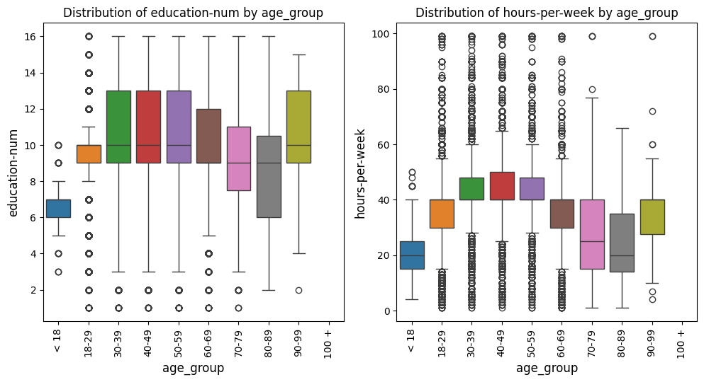
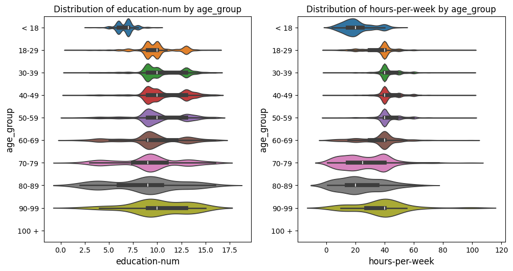
Box Plots Grid Example
In this example with the US census data [1], the box_violin_plot function is employed to create a grid of
boxplots, comparing different metrics against the "age_group" column in the
DataFrame. The metrics_boxplot_comp parameter is set to ["age_group"], meaning
that the comparison will be based on different age groups. The metrics_list is
provided as age_boxplot_list, which contains the specific metrics to be visualized.
The function is configured to arrange the plots in a grid format with 3 rows and 4
columns, using the n_rows=3 and n_cols=4 parameters. The image_path_png and
image_path_svg parameters are specified to save the plots in both PNG and
SVG formats, and the save_plots option is set to "all", ensuring that both
individual and grid plots are saved.
The plots are displayed in a grid format, as indicated by the show_plot="grid"
parameter. The plot_type is set to "boxplot", so the function will generate
boxplots for each metric in the list. Additionally, the `x-axis` labels are rotated
by 90 degrees (xlabel_rot=90) to ensure that the labels are legible. The legend is
hidden by setting show_legend=False, keeping the plots clean and focused on the data.
This configuration provides a comprehensive visual comparison of the specified
metrics across different age groups, with all plots saved for future reference or publication.
age_boxplot_list = df[
    [
        "education-num",
        "hours-per-week",
    ]
].columns.to_list()
from eda_toolkit import box_violin_plot

metrics_boxplot_comp = ["age_group"]

box_violin_plot(
    df=df,
    metrics_list=age_boxplot_list,
    metrics_boxplot_comp=metrics_boxplot_comp,
    n_rows=3,
    n_cols=4,
    image_path_png=image_path_png,
    image_path_svg=image_path_svg,
    save_plots="all",
    show_plot="both",
    show_legend=False,
    plot_type="boxplot",
    xlabel_rot=90,
)
Violin Plots Grid Example
In this example with the US census data [1], we keep everything the same as the prior example, but change the
plot_type to violinplot. This adjustment will generate violin plots instead
of boxplots while maintaining all other settings.
from eda_toolkit import box_violin_plot

metrics_boxplot_comp = ["age_group"]

box_violin_plot(
    df=df,
    metrics_list=age_boxplot_list,
    metrics_boxplot_comp=metrics_boxplot_comp,
    n_rows=3,
    n_cols=4,
    image_path_png=image_path_png,
    image_path_svg=image_path_svg,
    save_plots="all",
    show_plot="both",
    show_legend=False,
    plot_type="violinplot",
    xlabel_rot=90,
)
Pivoted Violin Plots Grid Example
In this example with the US census data [1], we set xlabel_rot=0 and rotate_plot=True
to pivot the plot, changing the orientation of the axes while keeping the `x-axis` labels upright.
This adjustment flips the axes, providing a different perspective on the data distribution.
from eda_toolkit import box_violin_plot

metrics_boxplot_comp = ["age_group"]

box_violin_plot(
    df=df,
    metrics_list=age_boxplot_list,
    metrics_boxplot_comp=metrics_boxplot_comp,
    n_rows=3,
    n_cols=4,
    image_path_png=image_path_png,
    image_path_svg=image_path_svg,
    save_plots="all",
    show_plot="both",
    rotate_plot=True,
    show_legend=False,
    plot_type="violinplot",
    xlabel_rot=0,
)
Scatter Plots and Best Fit Lines
Pearson Correlation Coefficient
The Pearson correlation coefficient, often denoted as \(r\), is a measure of the linear relationship between two variables. It quantifies the degree to which a change in one variable is associated with a change in another variable. The Pearson correlation ranges from \(-1\) to \(1\), where:
\(r = 1\) indicates a perfect positive linear relationship.
\(r = -1\) indicates a perfect negative linear relationship.
\(r = 0\) indicates no linear relationship.
The Pearson correlation coefficient between two variables \(X\) and \(Y\) is defined as:
where:
\(\text{Cov}(X, Y)\) is the covariance of \(X\) and \(Y\).
\(\sigma_X\) is the standard deviation of \(X\).
\(\sigma_Y\) is the standard deviation of \(Y\).
Covariance measures how much two variables change together. It is defined as:
where:
\(n\) is the number of data points.
\(X_i\) and \(Y_i\) are the individual data points.
\(\mu_X\) and \(\mu_Y\) are the means of \(X\) and \(Y\).
The standard deviation measures the dispersion or spread of a set of values. For a variable \(X\), the standard deviation \(\sigma_X\) is:
Substituting the covariance and standard deviation into the Pearson correlation formula:
This formula normalizes the covariance by the product of the standard deviations of the two variables, resulting in a dimensionless coefficient that indicates the strength and direction of the linear relationship between \(X\) and \(Y\).
\(r > 0\): Positive correlation. As \(X\) increases, \(Y\) tends to increase.
\(r < 0\): Negative correlation. As \(X\) increases, \(Y\) tends to decrease.
\(r = 0\): No linear correlation. There is no consistent linear relationship between \(X\) and \(Y\).
The closer the value of \(r\) is to \(\pm 1\), the stronger the linear relationship between the two variables.
Scatter Fit Plot
Create and Save Scatter Plots or a Grid of Scatter Plots
This function, scatter_fit_plot, is designed to generate scatter plots for
one or more pairs of variables (x_vars and y_vars) from a given DataFrame.
The function can produce either individual scatter plots or organize multiple
scatter plots into a grid layout, making it easy to visualize relationships between
different pairs of variables in one cohesive view.
Optional Best Fit Line
An optional feature of this function is the ability to add a best fit line to the scatter plots. This line, often called a regression line, is calculated using a linear regression model and represents the trend in the data. By adding this line, you can visually assess the linear relationship between the variables, and the function can also display the equation of this line in the plot’s legend.s
Customizable Plot Aesthetics
The function offers a wide range of customization options to tailor the appearance of the scatter plots:
Point Color: You can specify a default color for the scatter points or use a
hueparameter to color the points based on a categorical variable. This allows for easy comparison across different groups within the data.Point Size: The size of the scatter points can be controlled and scaled based on another variable, which can help highlight differences or patterns related to that variable.
Markers: The shape or style of the scatter points can also be customized. Whether you prefer circles, squares, or other marker types, the function allows you to choose the best representation for your data.
Axis and Label Configuration
The function also provides flexibility in setting axis labels, tick marks, and grid sizes. You can rotate axis labels for better readability, adjust font sizes, and even specify limits for the x and y axes to focus on particular data ranges.
Plot Display and Saving Options
The function allows you to display plots individually, as a grid, or both. Additionally, you can save the generated plots as PNG or SVG files, making it easy to include them in reports or presentations.
Correlation Coefficient Display
For users interested in understanding the strength of the relationship between variables, the function can also display the Pearson correlation coefficient directly in the plot title. This numeric value provides a quick reference to the linear correlation between the variables, offering further insight into their relationship.
- scatter_fit_plot(df, x_vars, y_vars, n_rows, n_cols, image_path_png=None, image_path_svg=None, save_plots=None, show_legend=True, xlabel_rot=0, show_plot='both', rotate_plot=False, individual_figsize=(6, 4), grid_figsize=None, label_fontsize=12, tick_fontsize=10, text_wrap=50, add_best_fit_line=False, scatter_color='C0', best_fit_linecolor='red', best_fit_linestyle='-', hue=None, hue_palette=None, size=None, sizes=None, marker='o', show_correlation=True, xlim=None, ylim=None)
Create and save scatter plots or a grid of scatter plots for given x_vars and y_vars, with an optional best fit line and customizable point color, size, and markers.
- Parameters:
df (pandas.DataFrame) – The DataFrame containing the data.
x_vars (list of str) – List of variable names to plot on the x-axis.
y_vars (list of str) – List of variable names to plot on the y-axis.
n_rows (int) – Number of rows in the subplot grid.
n_cols (int) – Number of columns in the subplot grid.
image_path_png (str, optional) – Directory path to save PNG images of the scatter plots.
image_path_svg (str, optional) – Directory path to save SVG images of the scatter plots.
save_plots (str, optional) – Controls which plots to save:
"all","individual", or"grid".show_legend (bool, optional) – Whether to display the legend on the plots. Default is
True.xlabel_rot (int, optional) – Rotation angle for x-axis labels. Default is
0.show_plot (str, optional) – Controls plot display:
"individual","grid", or"both". Default is"both".rotate_plot (bool, optional) – Whether to rotate (pivot) the plots. Default is
False.individual_figsize (tuple or list, optional) – Width and height of the figure for individual plots. Default is
(6, 4).grid_figsize (tuple or list, optional) – Width and height of the figure for grid plots.
label_fontsize (int, optional) – Font size for axis labels. Default is
12.tick_fontsize (int, optional) – Font size for axis tick labels. Default is
10.text_wrap (int, optional) – The maximum width of the title text before wrapping, default is
50.add_best_fit_line (bool, optional) – Whether to add a best fit line to the scatter plots. Default is
False.scatter_color (str, optional) – Color code for the scattered points. Default is
"C0".best_fit_linecolor (str, optional) – Color code for the best fit line. Default is
"red".best_fit_linestyle (str, optional) – Linestyle for the best fit line. Default is
"-".hue (str, optional) – Column name for the grouping variable that will produce points with different colors.
hue_palette (dict, list, or str, optional) – Specifies colors for each hue level. Can be a dictionary mapping hue levels to colors, a list of colors, or the name of a seaborn color palette.
size (str, optional) – Column name for the grouping variable that will produce points with different sizes.
sizes (dict, optional) – Dictionary mapping sizes (smallest and largest) to min and max values.
marker (str, optional) – Marker style used for the scatter points. Default is
"o".show_correlation (bool, optional) – Whether to display the Pearson correlation coefficient in the plot title. Default is
True.xlim (tuple or list, optional) – Limits for the x-axis as a tuple or list of (min, max).
ylim (tuple or list, optional) – Limits for the y-axis as a tuple or list of (min, max).
- Raises:
If
show_plotis not one of"individual","grid", or"both".If
save_plotsis not one ofNone,"all","individual", or"grid".If
save_plotsis set but no image paths are provided.If
rotate_plotis not a boolean value.If
individual_figsizeorgrid_figsizeare not tuples/lists with two numeric values.
- Returns:
NoneThis function does not return any value but generates and optionally saves scatter plots for the specified x_vars and y_vars.
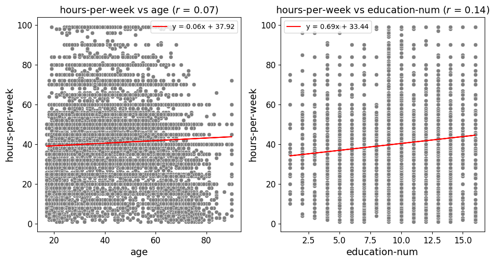
Regression-Centric Scatter Plots Example
In this US census data [1] example, the scatter_fit_plot function is
configured to display the Pearson correlation coefficient and a best fit line
on each scatter plot. The correlation coefficient is shown in the plot title,
controlled by the show_correlation=True parameter, which provides a measure
of the strength and direction of the linear relationship between the variables.
Additionally, the add_best_fit_line=True parameter adds a best fit line to
each plot, with the equation for the line displayed in the legend. This equation,
along with the best fit line, helps to visually assess the relationship between
the variables, making it easier to identify trends and patterns in the data. The
combination of the correlation coefficient and the best fit line offers both
a quantitative and visual representation of the relationships, enhancing the
interpretability of the scatter plots.
from eda_toolkit import scatter_fit_plot

scatter_fit_plot(
    df=df,
    x_vars=["age", "education-num"],
    y_vars=["hours-per-week"],
    n_rows=3,
    n_cols=4,
    image_path_png=image_path_png,
    image_path_svg=image_path_svg,
    save_plots="grid",
    show_legend=True,
    xlabel_rot=0,
    show_plot="grid",
    rotate_plot=False,
    grid_figsize=None,
    label_fontsize=14,
    tick_fontsize=12,
    add_best_fit_line=True,
    scatter_color="#808080",
    show_correlation=True,
)
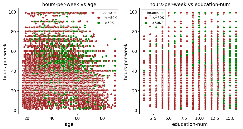
Scatter Plots Grouped by Category Example
In this example, the scatter_fit_plot function is used to generate a grid of
scatter plots that examine the relationships between age and hours-per-week
as well as education-num and hours-per-week. Compared to the previous
example, a few key inputs have been changed to adjust the appearance and functionality
of the plots:
Hue and Hue Palette: The
hueparameter is set to"income", meaning that the data points in the scatter plots are colored according to the values in theincomecolumn. A custom color mapping is provided via thehue_paletteparameter, where the income categories"<=50K"and">50K"are assigned the colors"brown"and"green", respectively. This change visually distinguishes the data points based on income levels.Scatter Color: The
scatter_colorparameter is set to"#808080", which applies a grey color to the scatter points when nohueis provided. However, since ahueis specified in this example, thehue_palettetakes precedence and overrides this color setting.Best Fit Line: The
add_best_fit_lineparameter is set toFalse, meaning that no best fit line is added to the scatter plots. This differs from the previous example where a best fit line was included.Correlation Coefficient: The
show_correlationparameter is set toFalse, so the Pearson correlation coefficient will not be displayed in the plot titles. This is another change from the previous example where the correlation coefficient was included.Hue Legend: The
show_legendparameter remains set toTrue, ensuring that the legend displaying the hue categories ("<=50K"and">50K") appears on the plots, helping to interpret the color coding of the data points.
These changes allow for the creation of scatter plots that highlight the income levels of individuals, with custom color coding and without additional elements like a best fit line or correlation coefficient. The resulting grid of plots is then saved as images in the specified paths.
from eda_toolkit import scatter_fit_plot

hue_dict = {"<=50K": "brown", ">50K": "green"}

scatter_fit_plot(
    df=df,
    x_vars=["age", "education-num"],
    y_vars=["hours-per-week"],
    n_rows=3,
    n_cols=4,
    image_path_png=image_path_png,
    image_path_svg=image_path_svg,
    save_plots="grid",
    show_legend=True,
    xlabel_rot=0,
    show_plot="grid",
    rotate_plot=False,
    grid_figsize=None,
    label_fontsize=14,
    tick_fontsize=12,
    add_best_fit_line=False,
    scatter_color="#808080",
    hue="income",
    hue_palette=hue_dict,
    show_correlation=False,
)
Correlation Matrices
Generate and Save Customizable Correlation Heatmaps
The flex_corr_matrix function is designed to create highly customizable correlation heatmaps for visualizing the relationships between variables in a DataFrame. This function allows users to generate either a full or triangular correlation matrix, with options for annotation, color mapping, and saving the plot in multiple formats.
Customizable Plot Appearance
The function provides extensive customization options for the heatmap’s appearance:
Colormap Selection: Choose from a variety of colormaps to represent the strength of correlations. The default is
"coolwarm", but this can be adjusted to fit the needs of the analysis.Annotation: Optionally annotate the heatmap with correlation coefficients, making it easier to interpret the strength of relationships at a glance.
Figure Size and Layout: Customize the dimensions of the heatmap to ensure it fits well within reports, presentations, or dashboards.
Triangular vs. Full Correlation Matrix
A key feature of the flex_corr_matrix function is the ability to generate either a full correlation matrix or only the upper triangle. This option is particularly useful when the matrix is large, as it reduces visual clutter and focuses attention on the unique correlations.
Label and Axis Configuration
The function offers flexibility in configuring axis labels and titles:
Label Rotation: Rotate x-axis and y-axis labels for better readability, especially when working with long variable names.
Font Sizes: Adjust the font sizes of labels and tick marks to ensure the plot is clear and readable.
Title Wrapping: Control the wrapping of long titles to fit within the plot without overlapping other elements.
Plot Display and Saving Options
The flex_corr_matrix function allows you to display the heatmap directly or save it as PNG or SVG files for use in reports or presentations. If saving is enabled, you can specify file paths and names for the images.
- flex_corr_matrix(df, cols=None, annot=True, cmap='coolwarm', save_plots=False, image_path_png=None, image_path_svg=None, figsize=(10, 10), title='Cervical Cancer Data: Correlation Matrix', label_fontsize=12, tick_fontsize=10, xlabel_rot=45, ylabel_rot=0, xlabel_alignment='right', ylabel_alignment='center_baseline', text_wrap=50, vmin=-1, vmax=1, cbar_label='Correlation Index', triangular=True, **kwargs)
Create a customizable correlation heatmap with options for annotation, color mapping, figure size, and saving the plot.
- Parameters:
df (pandas.DataFrame) – The DataFrame containing the data.
cols (list of str, optional) – List of column names to include in the correlation matrix. If None, all columns are included.
annot (bool, optional) – Whether to annotate the heatmap with correlation coefficients. Default is
True.cmap (str, optional) – The colormap to use for the heatmap. Default is
"coolwarm".save_plots (bool, optional) – Controls whether to save the plots. Default is
False.image_path_png (str, optional) – Directory path to save PNG images of the heatmap.
image_path_svg (str, optional) – Directory path to save SVG images of the heatmap.
figsize (tuple, optional) – Width and height of the figure for the heatmap. Default is
(10, 10).title (str, optional) – Title of the heatmap. Default is
"Cervical Cancer Data: Correlation Matrix".label_fontsize (int, optional) – Font size for tick labels and colorbar label. Default is
12.tick_fontsize (int, optional) – Font size for axis tick labels. Default is
10.xlabel_rot (int, optional) – Rotation angle for x-axis labels. Default is
45.ylabel_rot (int, optional) – Rotation angle for y-axis labels. Default is
0.xlabel_alignment (str, optional) – Horizontal alignment for x-axis labels. Default is
"right".ylabel_alignment (str, optional) – Vertical alignment for y-axis labels. Default is
"center_baseline".text_wrap (int, optional) – The maximum width of the title text before wrapping. Default is
50.vmin (float, optional) – Minimum value for the heatmap color scale. Default is
-1.vmax (float, optional) – Maximum value for the heatmap color scale. Default is
1.cbar_label (str, optional) – Label for the colorbar. Default is
"Correlation Index".triangular (bool, optional) – Whether to show only the upper triangle of the correlation matrix. Default is
True.kwargs (dict, optional) – Additional keyword arguments to pass to
seaborn.heatmap().
- Raises:
If
annotis not a boolean.If
colsis not a list.If
save_plotsis not a boolean.If
triangularis not a boolean.If
save_plotsis True but no image paths are provided.
- Returns:
NoneThis function does not return any value but generates and optionally saves a correlation heatmap.
Triangular Correlation Matrix Example
The provided code filters the census [1] DataFrame df to include only numeric columns using
select_dtypes(np.number). It then utilizes the flex_corr_matrix() function
to generate a right triangular correlation matrix, which only displays the
upper half of the correlation matrix. The heatmap is customized with specific
colormap settings, title, label sizes, axis label rotations, and other formatting
options.
Note
This triangular matrix format is particularly useful for avoiding redundancy in correlation matrices, as it excludes the lower half, making it easier to focus on unique pairwise correlations.
The function also includes a labeled color bar, helping users quickly interpret the strength and direction of the correlations.
# Select only numeric data to pass into the function
df_num = df.select_dtypes(np.number)
from eda_toolkit import flex_corr_matrix

flex_corr_matrix(
    df=df,
    cols=df_num.columns.to_list(),
    annot=True,
    cmap="coolwarm",
    figsize=(10, 8),
    title="US Census Correlation Matrix",
    xlabel_alignment="right",
    label_fontsize=14,
    tick_fontsize=12,
    xlabel_rot=45,
    ylabel_rot=0,
    text_wrap=50,
    vmin=-1,
    vmax=1,
    cbar_label="Correlation Index",
    triangular=True,
)

Full Correlation Matrix Example
In this modified census [1] example, the key changes are the use of the viridis colormap
and the decision to plot the full correlation matrix instead of just the upper
triangle. By setting cmap="viridis", the heatmap will use a different color
scheme, which can provide better visual contrast or align with specific aesthetic
preferences. Additionally, by setting triangular=False, the full correlation
matrix is displayed, allowing users to view all pairwise correlations, including
both upper and lower halves of the matrix. This approach is beneficial when you
want a comprehensive view of all correlations in the dataset.
from eda_toolkit import flex_corr_matrix

flex_corr_matrix(
    df=df,
    cols=df_num.columns.to_list(),
    annot=True,
    cmap="viridis",
    figsize=(10, 8),
    title="US Census Correlation Matrix",
    xlabel_alignment="right",
    label_fontsize=14,
    tick_fontsize=12,
    xlabel_rot=45,
    ylabel_rot=0,
    text_wrap=50,
    vmin=-1,
    vmax=1,
    cbar_label="Correlation Index",
    triangular=False,
)

Partial Dependence Plots
Partial Dependence Plots (PDPs) are a powerful tool in machine learning interpretability, providing insights into how features influence the predicted outcome of a model. PDPs can be generated in both 2D and 3D, depending on whether you want to analyze the effect of one feature or the interaction between two features on the model’s predictions.
Theoretical Foundation of PDPs
Let \(\mathbf{X}\) represent the complete set of input features for a machine learning model, where \(\mathbf{X} = \{X_1, X_2, \dots, X_p\}\). Suppose we’re particularly interested in a subset of these features, denoted by \(\mathbf{X}_S\). The complementary set, \(\mathbf{X}_C\), contains all the features in \(\mathbf{X}\) that are not in \(\mathbf{X}_S\). Mathematically, this relationship is expressed as:
where \(\mathbf{X}_C\) is the set of features in \(\mathbf{X}\) after removing the features in \(\mathbf{X}_S\).
Partial Dependence Plots (PDPs) are used to illustrate the effect of the features in \(\mathbf{X}_S\) on the model’s predictions, while averaging out the influence of the features in \(\mathbf{X}_C\). This is mathematically defined as:
where:
\(\mathbb{E}_{\mathbf{X}_C} \left[ \cdot \right]\) indicates that we are taking the expected value over the possible values of the features in the set \(\mathbf{X}_C\).
\(p(x_C)\) represents the probability density function of the features in \(\mathbf{X}_C\).
This operation effectively summarizes the model’s output over all potential values of the complementary features, providing a clear view of how the features in \(\mathbf{X}_S\) alone impact the model’s predictions.
2D Partial Dependence Plots
Consider a trained machine learning model \(f(\mathbf{X})\), where \(\mathbf{X} = (X_1, X_2, \dots, X_p)\) represents the vector of input features. The partial dependence of the predicted response \(\hat{y}\) on a single feature \(X_j\) is defined as:
where:
\(X_j\) is the feature of interest.
\(\mathbf{X}_{C_i}\) represents the complement set of \(X_j\), meaning the remaining features in \(\mathbf{X}\) not included in \(X_j\) for the \(i\)-th instance.
\(n\) is the number of observations in the dataset.
For two features, \(X_j\) and \(X_k\), the partial dependence is given by:
This results in a 2D surface plot (or contour plot) that shows how the predicted outcome changes as the values of \(X_j\) and \(X_k\) vary, while the effects of the other features are averaged out.
Single Feature PDP: When plotting \(\text{PD}(X_j)\), the result is a 2D line plot showing the marginal effect of feature \(X_j\) on the predicted outcome, averaged over all possible values of the other features.
Two Features PDP: When plotting \(\text{PD}(X_j, X_k)\), the result is a 3D surface plot (or a contour plot) that shows the combined marginal effect of \(X_j\) and \(X_k\) on the predicted outcome. The surface represents the expected value of the prediction as \(X_j\) and \(X_k\) vary, while all other features are averaged out.
3D Partial Dependence Plots
For a more comprehensive analysis, especially when exploring interactions between two features, 3D Partial Dependence Plots are invaluable. The partial dependence function for two features in a 3D context is:
Here, the function \(f(X_j, X_k, \mathbf{X}_{C_i})\) is evaluated across a grid of values for \(X_j\) and \(X_k\). The resulting 3D surface plot represents how the model’s prediction changes over the joint range of these two features.
The 3D plot offers a more intuitive visualization of feature interactions compared to 2D contour plots, allowing for a better understanding of the combined effects of features on the model’s predictions. The surface plot is particularly useful when you need to capture complex relationships that might not be apparent in 2D.
Feature Interaction Visualization: The 3D PDP provides a comprehensive view of the interaction between two features. The resulting surface plot allows for the visualization of how the model’s output changes when the values of two features are varied simultaneously, making it easier to understand complex interactions.
Enhanced Interpretation: 3D PDPs offer enhanced interpretability in scenarios where feature interactions are not linear or where the effect of one feature depends on the value of another. The 3D visualization makes these dependencies more apparent.
2D Partial Dependence Plots
The plot_2d_pdp function generates 2D partial dependence plots for individual features or pairs of features. These plots are essential for examining the marginal effect of features on the predicted outcome.
Grid and Individual Plots: Generate all 2D partial dependence plots in a grid layout or as separate individual plots, offering flexibility in presentation.
Customization Options: Control the figure size, font sizes for labels and ticks, and the wrapping of long titles to ensure the plots are clear and informative.
Saving Plots: The function provides options to save the plots in PNG or SVG formats, and you can specify whether to save all plots, only individual plots, or just the grid plot.
- plot_2d_pdp(model, X_train, feature_names, features, title='PDP of house value on CA non-location features', grid_resolution=50, plot_type='grid', grid_figsize=(12, 8), individual_figsize=(6, 4), label_fontsize=12, tick_fontsize=10, text_wrap=50, image_path_png=None, image_path_svg=None, save_plots=None, file_prefix='partial_dependence')
Generate 2D partial dependence plots for specified features using the given machine learning model. The function allows for plotting in grid or individual layouts, with various customization options for figure size, font sizes, and title wrapping. Additionally, the plots can be saved in PNG or SVG formats with a customizable filename prefix.
- Parameters:
model (estimator object) – The trained machine learning model used to generate partial dependence plots.
X_train (pandas.DataFrame or numpy.ndarray) – The training data used to compute partial dependence. Should correspond to the features used to train the model.
feature_names (list of str) – A list of feature names corresponding to the columns in
X_train.features (list of int or tuple of int) – A list of feature indices or tuples of feature indices for which to generate partial dependence plots.
title (str, optional) – The title for the entire plot. Default is
"PDP of house value on CA non-location features".grid_resolution (int, optional) – The number of grid points to use for plotting the partial dependence. Higher values provide smoother curves but may increase computation time. Default is
50.plot_type (str, optional) – The type of plot to generate. Choose
"grid"for a grid layout,"individual"for separate plots, or"both"to generate both layouts. Default is"grid".grid_figsize (tuple, optional) – Tuple specifying the width and height of the figure for the grid layout. Default is
(12, 8).individual_figsize (tuple, optional) – Tuple specifying the width and height of the figure for individual plots. Default is
(6, 4).label_fontsize (int, optional) – Font size for the axis labels and titles. Default is
12.tick_fontsize (int, optional) – Font size for the axis tick labels. Default is
10.text_wrap (int, optional) – The maximum width of the title text before wrapping. Useful for managing long titles. Default is
50.image_path_png (str, optional) – The directory path where PNG images of the plots will be saved, if saving is enabled.
image_path_svg (str, optional) – The directory path where SVG images of the plots will be saved, if saving is enabled.
save_plots (str, optional) – Controls whether to save the plots. Options include
"all","individual","grid", orNone(default). If saving is enabled, ensureimage_path_pngorimage_path_svgare provided.file_prefix (str, optional) – Prefix for the filenames of the saved grid plots. Default is
"partial_dependence".
- Raises:
If
plot_typeis not one of"grid","individual", or"both".If
save_plotsis enabled but neitherimage_path_pngnorimage_path_svgis provided.
- Returns:
NoneThis function generates partial dependence plots and displays them. It does not return any values.
2D Plots - CA Housing Example
Consider a scenario where you have a machine learning model predicting median
house values in California. [4] Suppose you want to understand how non-location
features like the average number of occupants per household (AveOccup) and the
age of the house (HouseAge) jointly influence house values. A 2D partial
dependence plot allows you to visualize this relationship in two ways: either as
individual plots for each feature or as a combined plot showing the interaction
between two features.
For instance, the 2D partial dependence plot can help you analyze how the age of the house impacts house values while holding the number of occupants constant, or vice versa. This is particularly useful for identifying the most influential features and understanding how changes in these features might affect the predicted house value.
If you extend this to two interacting features, such as AveOccup and HouseAge,
you can explore their combined effect on house prices. The plot can reveal how
different combinations of occupancy levels and house age influence the value,
potentially uncovering non-linear relationships or interactions that might not be
immediately obvious from a simple 1D analysis.
Here’s how you can generate and visualize these 2D partial dependence plots using the California housing dataset:
Fetch The CA Housing Dataset and Prepare The DataFrame
from sklearn.datasets import fetch_california_housing
from sklearn.model_selection import train_test_split
from sklearn.ensemble import GradientBoostingRegressor
import pandas as pd

# Load the dataset
data = fetch_california_housing()
df = pd.DataFrame(data.data, columns=data.feature_names)
Split The Data Into Training and Testing Sets
X_train, X_test, y_train, y_test = train_test_split(
    df, data.target, test_size=0.2, random_state=42
)
Train a GradientBoostingRegressor Model
model = GradientBoostingRegressor(
    n_estimators=100,
    max_depth=4,
    learning_rate=0.1,
    loss="huber",
    random_state=42,
)
model.fit(X_train, y_train)
Create 2D Partial Dependence Plot Grid
# import the plot_2d_pdp function from
# the eda_toolkit library
from eda_toolkit import plot_2d_pdp

# Feature names
names = data.feature_names

# Generate 2D partial dependence plots
plot_2d_pdp(
    model=model,
    X_train=X_train,
    feature_names=names,
    features=[
        "MedInc",
        "AveOccup",
        "HouseAge",
        "AveRooms",
        "Population",
        ("AveOccup", "HouseAge"),
    ],
    title="PDP of house value on CA non-location features",
    grid_figsize=(14, 10),
    individual_figsize=(12, 4),
    label_fontsize=14,
    tick_fontsize=12,
    text_wrap=120,
    plot_type="grid",
    image_path_png="path/to/save/png",
    save_plots="all",
)

3D Partial Dependence Plots
The plot_3d_pdp function extends the concept of partial dependence to three dimensions, allowing you to visualize the interaction between two features and their combined effect on the model’s predictions.
Interactive and Static 3D Plots: Generate static 3D plots using Matplotlib or interactive 3D plots using Plotly. The function also allows for generating both types simultaneously.
Colormap and Layout Customization: Customize the colormaps for both Matplotlib and Plotly plots. Adjust figure size, camera angles, and zoom levels to create plots that fit perfectly within your presentation or report.
Axis and Title Configuration: Customize axis labels for both Matplotlib and Plotly plots. Adjust font sizes and control the wrapping of long titles to maintain readability.
- plot_3d_pdp(model, dataframe, feature_names_list, x_label=None, y_label=None, z_label=None, title, html_file_path=None, html_file_name=None, image_filename=None, plot_type="both", matplotlib_colormap=None, plotly_colormap="Viridis", zoom_out_factor=None, wireframe_color=None, view_angle=(22, 70), figsize=(7, 4.5), text_wrap=50, horizontal=-1.25, depth=1.25, vertical=1.25, cbar_x=1.05, cbar_thickness=25, title_x=0.5, title_y=0.95, top_margin=100, image_path_png=None, image_path_svg=None, show_cbar=True, grid_resolution=20, left_margin=20, right_margin=65, label_fontsize=8, tick_fontsize=6, enable_zoom=True, show_modebar=True)
Generate 3D partial dependence plots for two features of a machine learning model.
This function supports both static (Matplotlib) and interactive (Plotly) visualizations, allowing for flexible and comprehensive analysis of the relationship between two features and the target variable in a model.
- Parameters:
model (estimator object) – The trained machine learning model used to generate partial dependence plots.
dataframe (pandas.DataFrame or numpy.ndarray) – The dataset on which the model was trained or a representative sample. If a DataFrame is provided,
feature_names_listshould correspond to the column names. If a NumPy array is provided,feature_names_listshould correspond to the indices of the columns.feature_names_list (list of str) – A list of two feature names or indices corresponding to the features for which partial dependence plots are generated.
x_label (str, optional) – Label for the x-axis in the plots. Default is
None.y_label (str, optional) – Label for the y-axis in the plots. Default is
None.z_label (str, optional) – Label for the z-axis in the plots. Default is
None.title (str) – The title for the plots.
html_file_path (str, optional) – Path to save the interactive Plotly HTML file. Required if
plot_typeis"interactive"or"both". Default isNone.html_file_name (str, optional) – Name of the HTML file to save the interactive Plotly plot. Required if
plot_typeis"interactive"or"both". Default isNone.image_filename (str, optional) – Base filename for saving static Matplotlib plots as PNG and/or SVG. Default is
None.plot_type (str, optional) – The type of plots to generate. Options are: -
"static": Generate only static Matplotlib plots. -"interactive": Generate only interactive Plotly plots. -"both": Generate both static and interactive plots. Default is"both".matplotlib_colormap (matplotlib.colors.Colormap, optional) – Custom colormap for the Matplotlib plot. If not provided, a default colormap is used.
plotly_colormap (str, optional) – Colormap for the Plotly plot. Default is
"Viridis".zoom_out_factor (float, optional) – Factor to adjust the zoom level of the Plotly plot. Default is
None.wireframe_color (str, optional) – Color for the wireframe in the Matplotlib plot. If
None, no wireframe is plotted. Default isNone.view_angle (tuple, optional) – Elevation and azimuthal angles for the Matplotlib plot view. Default is
(22, 70).figsize (tuple, optional) – Figure size for the Matplotlib plot. Default is
(7, 4.5).text_wrap (int, optional) – Maximum width of the title text before wrapping. Useful for managing long titles. Default is
50.horizontal (float, optional) – Horizontal camera position for the Plotly plot. Default is
-1.25.depth (float, optional) – Depth camera position for the Plotly plot. Default is
1.25.vertical (float, optional) – Vertical camera position for the Plotly plot. Default is
1.25.cbar_x (float, optional) – Position of the color bar along the x-axis in the Plotly plot. Default is
1.05.cbar_thickness (int, optional) – Thickness of the color bar in the Plotly plot. Default is
25.title_x (float, optional) – Horizontal position of the title in the Plotly plot. Default is
0.5.title_y (float, optional) – Vertical position of the title in the Plotly plot. Default is
0.95.top_margin (int, optional) – Top margin for the Plotly plot layout. Default is
100.image_path_png (str, optional) – Directory path to save the PNG file of the Matplotlib plot. Default is None.
image_path_svg (str, optional) – Directory path to save the SVG file of the Matplotlib plot. Default is None.
show_cbar (bool, optional) – Whether to display the color bar in the Matplotlib plot. Default is
True.grid_resolution (int, optional) – The resolution of the grid for computing partial dependence. Default is
20.left_margin (int, optional) – Left margin for the Plotly plot layout. Default is
20.right_margin (int, optional) – Right margin for the Plotly plot layout. Default is
65.label_fontsize (int, optional) – Font size for axis labels in the Matplotlib plot. Default is
8.tick_fontsize (int, optional) – Font size for tick labels in the Matplotlib plot. Default is
6.enable_zoom (bool, optional) – Whether to enable zooming in the Plotly plot. Default is
True.show_modebar (bool, optional) – Whether to display the mode bar in the Plotly plot. Default is
True.
- Raises:
If plot_type is not one of
"static","interactive", or"both".If plot_type is
"interactive"or"both"andhtml_file_pathorhtml_file_nameare not provided.
- Returns:
NoneThis function generates 3D partial dependence plots and displays or saves them. It does not return any values.- Notes:
This function handles warnings related to scikit-learn’s
partial_dependencefunction, specifically aFutureWarningrelated to non-tuple sequences for multidimensional indexing. This warning is suppressed as it stems from the internal workings of scikit-learn in Python versions like 3.7.4.To maintain compatibility with different versions of scikit-learn, the function attempts to use
"values"for grid extraction in newer versions and falls back to"grid_values"for older versions.
3D Plots - CA Housing Example
Consider a scenario where you have a machine learning model predicting median
house values in California.[4]_ Suppose you want to understand how non-location
features like the average number of occupants per household (AveOccup) and the
age of the house (HouseAge) jointly influence house values. A 3D partial
dependence plot allows you to visualize this relationship in a more comprehensive
manner, providing a detailed view of how these two features interact to affect
the predicted house value.
For instance, the 3D partial dependence plot can help you explore how different combinations of house age and occupancy levels influence house values. By visualizing the interaction between AveOccup and HouseAge in a 3D space, you can uncover complex, non-linear relationships that might not be immediately apparent in 2D plots.
This type of plot is particularly useful when you need to understand the joint effect of two features on the target variable, as it provides a more intuitive and detailed view of how changes in both features impact predictions simultaneously.
Here’s how you can generate and visualize these 3D partial dependence plots using the California housing dataset:
Static Plot
Fetch The CA Housing Dataset and Prepare The DataFrame
from sklearn.ensemble import GradientBoostingRegressor
from sklearn.datasets import fetch_california_housing
from sklearn.model_selection import train_test_split
import pandas as pd

# Load the dataset
data = fetch_california_housing()
df = pd.DataFrame(data.data, columns=data.feature_names)
Split The Data Into Training and Testing Sets
X_train, X_test, y_train, y_test = train_test_split(
    df, data.target, test_size=0.2, random_state=42
)
Train a GradientBoostingRegressor Model
model = GradientBoostingRegressor(
    n_estimators=100,
    max_depth=4,
    learning_rate=0.1,
    loss="huber",
    random_state=1,
)
model.fit(X_train, y_train)
Create Static 3D Partial Dependence Plot
# import the plot_3d_pdp function from
# the eda_toolkit library
from eda_toolkit import plot_3d_pdp

# Call the function to generate the plot
plot_3d_pdp(
    model=model,
    dataframe=X_test,  # Use the test dataset
    feature_names_list=["HouseAge", "AveOccup"],
    x_label="House Age",
    y_label="Average Occupancy",
    z_label="Partial Dependence",
    title="3D Partial Dependence Plot of House Age vs. Average Occupancy",
    image_filename="3d_pdp",
    plot_type="static",
    figsize=[8, 5],
    text_wrap=40,
    wireframe_color="black",
    image_path_png=image_path_png,
    grid_resolution=30,
)

Interactive Plot
# import the plot_3d_pdp function from
# the eda_toolkit library
from eda_toolkit import plot_3d_pdp

# Call the function to generate the plot
plot_3d_pdp(
    model=model,
    dataframe=X_test,  # Use the test dataset
    feature_names_list=["HouseAge", "AveOccup"],
    x_label="House Age",
    y_label="Average Occupancy",
    z_label="Partial Dependence",
    title="3D Partial Dependence Plot of House Age vs. Average Occupancy",
    html_file_path=image_path_png,
    image_filename="3d_pdp",
    html_file_name="3d_pdp.html",
    plot_type="interactive",
    text_wrap=40,
    zoom_out_factor=0.5,
    image_path_png=image_path_png,
    image_path_svg=image_path_svg,
    grid_resolution=30,
    label_fontsize=8,
    tick_fontsize=6,
    title_x=0.38,
    top_margin=10,
    right_margin=250,
    cbar_x=0.9,
    cbar_thickness=25,
    show_modebar=False,
    enable_zoom=True,
)
Warning
Scrolling Notice:
While interacting with the interactive Plotly plot below, scrolling down the page using the mouse wheel may be blocked when the mouse pointer is hovering over the plot. To continue scrolling, either move the mouse pointer outside the plot area or use the keyboard arrow keys to navigate down the page.
This interactive plot was generated using Plotly, which allows for rich, interactive visualizations directly in the browser. The plot above is an example of an interactive 3D Partial Dependence Plot. Here’s how it differs from generating a static plot using Matplotlib.
Key Differences
Plot Type:
The
plot_typeis set to"interactive"for the Plotly plot and"static"for the Matplotlib plot.
Interactive-Specific Parameters:
HTML File Path and Name: The
html_file_pathandhtml_file_nameparameters are required to save the interactive Plotly plot as an HTML file. These parameters are not needed for static plots.Zoom and Positioning: The interactive plot includes parameters like
zoom_out_factor,title_x,cbar_x, andcbar_thicknessto control the zoom level, title position, and color bar position in the Plotly plot. These parameters do not affect the static plot.Mode Bar and Zoom: The
show_modebarandenable_zoomparameters are specific to the interactive Plotly plot, allowing you to toggle the visibility of the mode bar and enable or disable zoom functionality.
Static-Specific Parameters:
Figure Size and Wireframe Color: The static plot uses parameters like
figsizeto control the size of the Matplotlib plot andwireframe_colorto define the color of the wireframe in the plot. These parameters are not applicable to the interactive Plotly plot.
By adjusting these parameters, you can customize the behavior and appearance of your 3D Partial Dependence Plots according to your needs, whether for static or interactive visualization.