Creating Effective Visualizations
This section focuses on practical strategies and techniques for designing clear and impactful visualizations using the diverse plotting tools provided in the EDA Toolkit.
Heuristics for Visualizations
When creating visualizations, there are several key heuristics to keep in mind:
Clarity: The visualization should clearly convey the intended information without ambiguity.
Simplicity: Avoid overcomplicating visualizations with unnecessary elements; focus on the data and insights.
Consistency: Ensure consistent use of colors, shapes, and scales across visualizations to facilitate comparisons.
Methodologies
The EDA Toolkit supports the following methodologies for creating effective visualizations:
KDE and Histograms Plots: Useful for showing the distribution of a single variable. When combined, these can provide a clearer picture of data density and distribution.
Feature Scaling and Outliers: Identifying outliers is critical for understanding the data’s distribution and potential anomalies. The EDA Toolkit offers various methods for outlier detection, including enhanced visualizations using box plots and scatter plots.
Stacked Crosstab Plots: These are used to display multiple data series on the same chart, comparing cumulative quantities across categories. In addition to the visual stacked bar plots, the corresponding crosstab table is printed alongside the visualization, providing detailed numerical insight into how the data is distributed across different categories. This combination allows for both a visual and tabular representation of categorical data, enhancing interpretability.
Box and Violin Plots: Useful for visualizing the distribution of data points, identifying outliers, and understanding the spread of the data. Box plots are particularly effective when visualizing multiple categories side by side, enabling comparisons across groups. Violin plots provide additional insights by showing the distribution’s density, giving a fuller picture of the data’s distribution shape.
Scatter Plots and Best Fit Lines: Effective for visualizing relationships between two continuous variables. Scatter plots can also be enhanced with regression lines or trend lines to identify relationships more clearly.
Correlation Matrices: Helpful for visualizing the strength of relationships between multiple variables. Correlation heatmaps use color gradients to indicate the degree of correlation, with options for annotating the values directly on the heatmap.
Partial Dependence Plots: Useful for visualizing the relationship between a target variable and one or more features after accounting for the average effect of the other features. These plots are often used in model interpretability to understand how specific variables influence predictions.
Histogram Distribution Plots
Generate histogram and/or density distribution plots (KDE or parametric) for specified columns in a DataFrame.
The plot_distributions function is a flexible tool designed for visualizing
the distribution of numerical data using histograms, density plots, or a
combination of both. It supports kernel density estimation (KDE) as well as
parametric probability density functions, and provides extensive control over
plot appearance, layout, scaling, and statistical overlays.
This function is intended for exploratory data analysis where understanding the shape, spread, and modality of numeric variables is critical.
Key Features and Parameters
Flexible Plotting: Supports histogram-only, density-only, or combined histogram and density visualizations.
Density Estimation: Density overlays may be rendered using KDE or parametric distributions.
Customization: Fine-grained control over colors, binning, layout, labels, titles, legends, and font sizes.
Scientific Notation Control: Optional disabling of scientific notation on axes for improved readability.
Log Scaling: Supports selective log scaling of variables that span multiple orders of magnitude.
Output Options: Supports saving combined figures or per-variable plots in PNG or SVG format.
- plot_distributions(df, vars_of_interest=None, figsize=(5, 5), subplot_figsize=None, hist_color='#0000FF', density_color=None, mean_color='#000000', median_color='#000000', hist_edgecolor='#000000', hue=None, fill=True, fill_alpha=1, n_rows=None, n_cols=None, w_pad=1.0, h_pad=1.0, image_path_png=None, image_path_svg=None, image_filename=None, bbox_inches=None, single_var_image_filename=None, y_axis_label='Density', plot_type='hist', log_scale_vars=None, bins='auto', binwidth=None, label_fontsize=10, tick_fontsize=10, text_wrap=50, disable_sci_notation=False, stat='density', xlim=None, ylim=None, plot_mean=False, plot_median=False, std_dev_levels=None, std_color='#808080', label_names=None, show_legend=True, legend_loc='best', custom_xlabels=None, custom_titles=None, **kwargs)
- Parameters:
df (pandas.DataFrame) – The DataFrame containing the data to plot.
vars_of_interest (list of str, optional) – List of column names for which to generate distribution plots. If
'all', plots will be generated for all numeric columns.figsize (tuple of int, optional) – Size of each individual plot, default is
(5, 5).subplot_figsize (tuple of int, optional) – Size of the overall grid of subplots when multiple plots are generated.
hist_color (str, optional) – Color of the histogram bars.
density_color (str, optional) – Color of the density plot. If
None, Matplotlib’s default line color is used.mean_color (str, optional) – Color of the mean line if
plot_meanis True.median_color (str, optional) – Color of the median line if
plot_medianis True.hist_edgecolor (str, optional) – Color of the histogram bar edges.
hue (str, optional) – Column name to group data by.
fill (bool, optional) – Whether to fill the histogram bars with color.
fill_alpha (float, optional) – Alpha transparency for histogram fill.
n_rows (int, optional) – Number of rows in the subplot grid.
n_cols (int, optional) – Number of columns in the subplot grid.
w_pad (float, optional) – Width padding between subplots.
h_pad (float, optional) – Height padding between subplots.
image_path_png (str, optional) – Directory path to save PNG images.
image_path_svg (str, optional) – Directory path to save SVG images.
image_filename (str, optional) – Filename to use when saving combined plots.
bbox_inches (str, optional) – Bounding box used when saving figures.
single_var_image_filename (str, optional) – Filename prefix used when saving per-variable plots.
y_axis_label (str, optional) – Label displayed on the y-axis.
plot_type (str, optional) – Type of plot to generate (
'hist','density', or'both').log_scale_vars (str or list of str, optional) – Variable name(s) to apply log scaling.
bins (int or sequence, optional) – Histogram bin specification.
binwidth (float, optional) – Width of histogram bins.
label_fontsize (int, optional) – Font size for axis labels and titles.
tick_fontsize (int, optional) – Font size for tick labels.
text_wrap (int, optional) – Maximum width before wrapping labels or titles.
disable_sci_notation (bool, optional) – Disable scientific notation on axes.
stat (str, optional) – Aggregate statistic computed per bin.
plot_mean (bool, optional) – Plot the mean as a vertical line.
plot_median (bool, optional) – Plot the median as a vertical line.
std_dev_levels (list of int, optional) – Standard deviation levels to plot.
std_color (str or list of str, optional) – Color(s) for standard deviation lines.
label_names (dict, optional) – Custom labels for variables.
show_legend (bool, optional) – Whether to display the legend.
legend_loc (str, optional) – Location of the legend.
custom_xlabels (dict, optional) – Custom x-axis labels per variable.
custom_titles (dict, optional) – Custom titles per variable.
kwargs (additional keyword arguments) – Additional keyword arguments passed to the plotting backend.
- Raises:
If
plot_typeis not one of'hist','density', or'both'.If
statis not one of'count','frequency','probability','proportion','percent', or'density'.If
log_scale_varscontains variables that are not present in the DataFrame.If
fillis set toFalseandhist_edgecolororfill_alphais specified.If
binsandbinwidthare both specified.If
subplot_figsizeis provided when only one plot is being created.
If both
binsandbinwidthare specified, which may affect performance.
- Returns:
None
Notes
If you do not set n_rows or n_cols, the function will automatically
calculate an optimal subplot layout based on the number of variables being
plotted.
To save images, at least one of image_path_png or image_path_svg must
be specified. Saving is triggered by providing image_filename or
single_var_image_filename.
Deprecation Notice
Warning
kde_distributions is deprecated and will be removed in a future release.
Please use plot_distributions instead. The deprecated function is
retained only as a thin wrapper for backward compatibility.
If you continue to use kde_distributions, you will receive a
DeprecationWarning indicating that the function is deprecated.
The following summarizes the key changes from kde_distributions to
plot_distributions:
Updates
Function rename and deprecation
kde_distributionsis now deprecated and serves only as a wrapper.plot_distributionsis the new canonical API.Density plotting is no longer limited to KDE.
Added support for parametric density overlays using distributions from
scipy.stats.New parameters introduced:
density_functionto specify KDE and/or parametric distributions.density_fitto control the fitting method ('MLE'or'MM').
kde_colorhas been replaced bydensity_color.If
density_color=None, density overlays use Matplotlib’s default line color (typically the standard Python blue,C0).plot_typenow supports'hist','density', or'both'.Density plots may consist of KDE, parametric fits, or a combination.
Parameter ordering, naming conventions, and documentation style closely follow the original
kde_distributionsAPI.Existing user code calling
kde_distributionscontinues to work without modification.
KDE and Histograms Example
In the example below, the plot_distributions function is used to generate
histograms for several variables of interest: "age", "education-num",
and "hours-per-week". These variables represent different demographic and
work-related attributes from the dataset. The plot_type="both" parameter
ensures that density curves are overlaid on the histograms, providing a
smoothed representation of each variable’s distribution.
By default, density overlays are rendered using kernel density estimation (KDE).
In this example, the density curves are explicitly colored red using
density_color="red". If no density color is provided, the function falls
back to Matplotlib’s default line color.
The visualizations are arranged in a single row of three columns, as specified
by n_rows=1 and n_cols=3. The overall size of the subplot grid is set to
14 inches wide and 4 inches tall using subplot_figsize=(14, 4), ensuring that
each distribution is displayed clearly without overcrowding.
The fill=True parameter fills the histogram bars with color, while
fill_alpha=0.60 applies partial transparency to allow the density overlays
to remain visible. Spacing between subplots is controlled automatically, with
the figure layout tightened using bbox_inches="tight" when rendering.
To handle longer titles and labels, the text_wrap=50 parameter ensures that
text wraps cleanly onto multiple lines after 50 characters. The variables listed
in vars_of_interest are passed directly to the function and plotted in the
order provided.
The y-axis for all plots is labeled as "Density" via y_axis_label="Density",
reflecting that both the histogram heights and the density curves represent
probability density. The histograms are divided into 10 bins (bins=10),
providing a clear and interpretable view of each distribution.
Finally, the font sizes for axis labels and tick labels are set to 16 points
(label_fontsize=16) and 14 points (tick_fontsize=14), respectively,
ensuring that all text elements remain legible and presentation-ready.
from eda_toolkit import plot_distributions

vars_of_interest = [
    "age",
    "education-num",
    "hours-per-week",
]

plot_distributions(
    df=df,
    n_rows=1,
    n_cols=3,
    subplot_figsize=(14, 4),
    fill=True,
    fill_alpha=0.60,
    text_wrap=50,
    density_color="red",
    bbox_inches="tight",
    vars_of_interest=vars_of_interest,
    y_axis_label="Density",
    bins=10,
    plot_type="both",
    label_fontsize=16,
    tick_fontsize=14,
)

Histogram Example (Density)
In this example, the plot_distributions() function is used to generate histograms for
the variables "age", "education-num", and "hours-per-week" but with
plot_type="hist", meaning no KDE plots are included—only histograms are displayed.
The plots are arranged in a single row of four columns (n_rows=1, n_cols=3),
with a subplot grid size of 14x4 inches (subplot_figsize=(14, 4)). The histograms are
divided into 10 bins (bins=10), and the y-axis is labeled “Density” (y_axis_label="Density").
Font sizes for the axis labels and tick labels are set to 16 and 14 points,
respectively, ensuring clarity in the visualizations. This setup focuses on the
histogram representation without the KDE overlay.
from eda_toolkit import plot_distributions

vars_of_interest = [
    "age",
    "education-num",
    "hours-per-week",
]

plot_distributions(
    df=df,
    n_rows=1,
    n_cols=3,
    subplot_figsize=(14, 4),
    fill=True,
    text_wrap=50,
    bbox_inches="tight",
    vars_of_interest=vars_of_interest,
    y_axis_label="Density",
    bins=10,
    plot_type="hist",
    label_fontsize=16,
    tick_fontsize=14,
)

Histogram Example (Count)
In this example, the plot_distributions() function is modified to generate histograms
with a few key changes. The hist_color is set to “orange”, changing the color of the
histogram bars. The y-axis label is updated to “Count” (y_axis_label="Count"),
reflecting that the histograms display the count of observations within each bin.
Additionally, the stat parameter is set to "Count" to show the actual counts instead of
densities. The rest of the parameters remain the same as in the previous example,
with the plots arranged in a single row of four columns (n_rows=1, n_cols=3),
a subplot grid size of 14x4 inches, and a bin count of 10. This setup focuses on
visualizing the raw counts in the dataset using orange-colored histograms.
from eda_toolkit import plot_distributions

vars_of_interest = [
    "age",
    "education-num",
    "hours-per-week",
]

plot_distributions(
    df=df,
    n_rows=1,
    n_cols=3,
    subplot_figsize=(14, 4),
    text_wrap=50,
    hist_color="orange",
    bbox_inches="tight",
    vars_of_interest=vars_of_interest,
    y_axis_label="Count",
    bins=10,
    plot_type="hist",
    stat="Count",
    label_fontsize=16,
    tick_fontsize=14,
)

Histogram Example - (Mean and Median)
In this example, the plot_distributions() function is customized to generate
histograms that include mean and median lines. The mean_color is set to "blue"
and the median_color is set to "black" (default), allowing for a clear distinction
between the two statistical measures. The function parameters are adjusted to
ensure that both the mean and median lines are plotted (plot_mean=True, plot_median=True).
The y_axis_label remains "Density", indicating that the histograms
represent the density of observations within each bin. The histogram bars are
colored using hist_color="brown", with a fill_alpha=0.60 while the s
tatistical overlays enhance the interpretability of the data. The layout is
configured with a single row and multiple columns (n_rows=1, n_cols=3), and
the subplot grid size is set to 15x5 inches. This example highlights how to visualize
central tendencies within the data using a histogram that prominently displays
the mean and median.
from eda_toolkit import plot_distributions

vars_of_interest = [
    "age",
    "education-num",
    "hours-per-week",
]

plot_distributions(
    df=df,
    n_rows=1,
    n_cols=3,
    subplot_figsize=(14, 4),
    text_wrap=50,
    hist_color="brown",
    bbox_inches="tight",
    vars_of_interest=vars_of_interest,
    y_axis_label="Density",
    bins=10,
    fill_alpha=0.60,
    plot_type="hist",
    stat="Density",
    label_fontsize=16,
    tick_fontsize=14,
    plot_mean=True,
    plot_median=True,
    mean_color="blue",
)

Histogram Example - (Mean, Median, and Std. Deviation)
In this example, the plot_distributions() function is customized to generate
a histogram that include mean, median, and 3 standard deviation lines. The
mean_color is set to "blue" and the median_color is set to "black",
allowing for a clear distinction between these two central tendency measures.
The function parameters are adjusted to ensure that both the mean and median lines
are plotted (plot_mean=True, plot_median=True). The y_axis_label remains
"Density", indicating that the histograms represent the density of observations
within each bin. The histogram bars are colored using hist_color="brown",
with a fill_alpha=0.40, which adjusts the transparency of the fill color.
Additionally, standard deviation bands are plotted using colors "purple",
"green", and "silver" for one, two, and three standard deviations, respectively.
The layout is configured with a single row and multiple columns (n_rows=1, n_cols=3),
and the subplot grid size is set to 15x5 inches. This setup is particularly useful for
visualizing the central tendencies within the data while also providing a clear
view of the distribution and spread through the standard deviation bands. The
configuration used in this example showcases how histograms can be enhanced with
statistical overlays to provide deeper insights into the data.
Note
You have the freedom to choose whether to plot the mean, median, and standard deviation lines. You can display one, none, or all of these simultaneously.
from eda_toolkit import plot_distributions

vars_of_interest = [
    "age",
]

plot_distributions(
    df=df,
    figsize=(10, 6),
    text_wrap=50,
    hist_color="brown",
    bbox_inches="tight",
    vars_of_interest=vars_of_interest,
    y_axis_label="Density",
    bins=10,
    fill_alpha=0.40,
    plot_type="both",
    stat="Density",
    density_color="red",
    label_fontsize=16,
    tick_fontsize=14,
    plot_mean=True,
    plot_median=True,
    mean_color="blue",
    std_dev_levels=[
        1,
        2,
        3,
    ],
    std_color=[
        "purple",
        "green",
        "silver",
    ],
)

KDE and Parametric Density Fit Example
In the example below, the plot_distributions function is used to visualize the
distribution of several numeric variables, including "age",
"education-num", and "hours-per-week".
The plot_type="both" parameter instructs the function to render both
histograms and density overlays on the same axes. In this case, the density
overlays include a combination of kernel density estimation (KDE) and two
parametric probability density functions, a normal distribution
("norm") and a log-normal distribution ("lognorm"), specified via
density_function=["kde", "norm", "lognorm"].
Each density overlay is rendered in a distinct color, controlled by
density_color=["blue", "black", "red"], allowing the KDE, normal fit, and
log-normal fit to be visually distinguished. The parametric distributions are
fit using maximum likelihood estimation (density_fit="MLE"), providing a
statistically principled comparison between empirical density and theoretical
models.
Note
For a detailed mathematical discussion of kernel density estimation, parametric density models, and parameter estimation via the Method of Moments (MoM) and Maximum Likelihood Estimation (MLE), see Parameter Estimation for Density Models and Distribution GOF Plots.
from eda_toolkit import plot_distributions

vars_of_interest = [
    "age",
]

plot_distributions(
    df=df,
    vars_of_interest=vars_of_interest,
    # layout
    n_rows=1,
    n_cols=3,
    hue=None,
    hist_color="yellow",
    figsize=(10, 6),
    plot_type="both",
    stat="density",
    density_function=["kde", "norm", "lognorm"],
    density_color=["blue", "black", "red"],
    density_fit="MLE",
    bins=10,
    fill=True,
    y_axis_label="Density",
    text_wrap=50,
    label_fontsize=16,
    tick_fontsize=14,
    legend_loc="best",
    bbox_inches="tight",
    image_filename="age_distribution_norm_fit",
    image_path_png=image_path_png,
    image_path_svg=image_path_svg,
)

Grouped Distributions
Plot grouped distributions of numeric features given a binary variable.
The grouped_distributions function visualizes how selected numeric features
are distributed grouped by a binary grouping variable (for example, an
outcome label or class membership). For each feature, the distributions of the
two groups are overlaid on the same axis, either as histograms or as filled
kernel density curves.
This function is designed for exploratory analysis, subgroup comparison, and fairness inspection, where understanding distributional differences between two groups is critical.
Supported plot styles:
"hist": Overlaid histograms using shared or independent bins"density": Overlaid filled kernel density estimates (always normalized)
Normalization behavior:
normalize="count": Raw counts (histograms only)normalize="density": Probability density (histograms or density plots)
- grouped_distributions(df, features, by, *, bins=30, normalize='density', plot_style='hist', alpha=0.6, colors=None, n_rows=None, n_cols=None, common_bins=True, show_legend=True, legend_loc='best', label_fontsize=12, tick_fontsize=10, text_wrap=50, figsize=(10, 6), image_path_png=None, image_path_svg=None, image_filename=None)
- Parameters:
df (pandas.DataFrame) – Input DataFrame containing the features and grouping variable.
features (list of str) – List of numeric feature column names to plot.
by (str) – Name of the binary column used to condition the distributions. The column must contain exactly two unique, non-null values.
bins (int or sequence, optional) – Number of bins or explicit bin edges for histogram plots. Default is
30.normalize (str, optional) – Controls histogram normalization. Options are
"density"or"count". Ignored for density plots, which always use probability density.plot_style (str, optional) – Plot type to generate. Options are
"hist"or"density". Default is"hist".alpha (float, optional) – Transparency level for histogram bars or density fills. Default is
0.6.colors (dict, optional) – Mapping from group value to color. Keys must match the two unique values in the
bycolumn. IfNone, a default color scheme is used.n_rows (int, optional) – Number of subplot rows. If
None, determined automatically.n_cols (int, optional) – Number of subplot columns. If
None, determined automatically.common_bins (bool, optional) – If
True, both groups share identical histogram bin edges. Ignored for density plots.show_legend (bool, optional) – Whether to display a legend identifying the two groups. Default is
True.legend_loc (str, optional) – Legend placement passed directly to Matplotlib. Default is
"best".label_fontsize (int, optional) – Font size for axis labels and titles.
tick_fontsize (int, optional) – Font size for tick labels and legend text.
text_wrap (int, optional) – Maximum character width before wrapping titles.
figsize (tuple of int, optional) – Size of the overall figure in inches. Default is
(10, 6).image_path_png (str, optional) – Directory path to save the figure as a PNG file.
image_path_svg (str, optional) – Directory path to save the figure as an SVG file.
image_filename (str, optional) – Base filename (without extension) for saving the figure.
- Raises:
If the
bycolumn is not binary.If
plot_styleis not one of"hist"or"density".If
normalizeis not one of"density"or"count".If
plot_style="density"andnormalize!="density".If
image_filenameis provided but neitherimage_path_pngnorimage_path_svgis specified.If the subplot grid is too small for the number of features.
- Returns:
None
Notes
All grouped distributions are plotted as overlays on a single axis per feature.
Density plots always represent probability density and do not support count-based normalization.
When
common_bins=True, histogram bin edges are computed jointly across both groups to enable direct shape comparison.Font sizes are specified in absolute points and may appear small on large figures or dense subplot grids.
Grouped Density Plot Example
In the example below, the grouped_distributions function is used to compare
the distributions of several numeric features conditioned on income category.
The grouping variable "income" is binary ("<=50K" vs ">50K"), making
it suitable for grouped overlay plots.
The selected features include demographic and financial attributes:
"age""education-num""hours-per-week"
The plot_style="density" option instructs the function to render filled
kernel density estimates for each group rather than histograms. Density plots
are always normalized, allowing direct comparison of distributional shape even
when group sizes differ substantially.
Custom colors are explicitly provided via the colors argument to ensure
consistent visual identification of income groups across all features. The
alpha=0.6 parameter applies partial transparency, making overlapping density
regions easier to interpret.
The resulting figure is saved in both PNG and SVG formats using a shared base filename.
from eda_toolkit.plots import grouped_distributions

features = [
    "age",
    "education-num",
    "hours-per-week",
]

group_colors = {
    "<=50K": "black",  # black
    ">50K": "orange",  # orange
}

grouped_distributions(
    df=df,
    features=features,
    by="income",
    bins=30,
    colors=group_colors,
    n_rows=1,
    normalize="density",
    alpha=0.6,
    figsize=(14, 4),
    plot_style="density",
    image_path_png=image_path_png,
    image_path_svg=image_path_svg,
    image_filename="grouped_distributions_adult_income",
    label_fontsize=16,
    tick_fontsize=14,
)

Grouped Histogram Plot Example
In this example, the grouped_distributions function is used to visualize
overlaid grouped histograms for several numeric features, grouped by
income category. As in the previous example, the grouping variable "income"
is binary ("<=50K" vs ">50K"), enabling direct comparison between the two
subpopulations.
Unlike density-based plots, this example uses
plot_style="hist", which renders binned histograms rather than smoothed
kernel density estimates. This representation emphasizes the empirical mass
and frequency structure of each feature, making it easier to identify discrete
concentration, skewness, and potential outliers.
The histograms are normalized to probability density
(normalize="density"), ensuring that the total area under each group’s
histogram integrates to one. This allows meaningful comparison of distribution
shapes even when the two income groups differ in sample size.
A shared binning strategy is used by default, ensuring that both income groups are evaluated against identical bin edges for each feature. Custom group colors are applied consistently across all subplots to maintain interpretability.
The resulting figure is saved in both PNG and SVG formats for downstream use in reports or publications.
from eda_toolkit.plots import grouped_distributions

features = [
    "age",
    "education-num",
    "hours-per-week",
]

group_colors = {
    "<=50K": "black",
    ">50K": "orange",
}

grouped_distributions(
    df=df,
    features=features,
    by="income",
    bins=30,
    n_rows=1,
    colors=group_colors,
    normalize="density",
    alpha=0.6,
    figsize=(14, 4),
    plot_style="hist",
    image_path_png=image_path_png,
    image_path_svg=image_path_svg,
    image_filename="cond_histograms_adult_income_hist",
    label_fontsize=16,
    tick_fontsize=14,
)

Distribution Goodness-of-Fit Plots
Generate goodness-of-fit (GOF) diagnostic plots to compare empirical data against fitted theoretical distributions or an empirical reference sample.
The distribution_gof_plots function provides distributional diagnostics to
evaluate how well one or more candidate probability distributions fit a variable
from a DataFrame. It supports both theoretical (parametric) comparisons, where
distribution parameters are estimated via Maximum Likelihood Estimation (MLE) or
Method of Moments (MM), and empirical QQ comparisons, where sample quantiles are
compared directly to a reference dataset.
The function currently supports the following diagnostic visualizations:
Quantile-Quantile (QQ) plots for assessing agreement between quantiles
CDF-based plots, including optional exceedance (survival) curves via tail control
Note
For a detailed mathematical discussion of kernel density estimation, parametric density models, and parameter estimation via the Method of Moments (MoM) and Maximum Likelihood Estimation (MLE), see Parameter Estimation for Density Models and Distribution GOF Plots.
- distribution_gof_plots(df, var, dist='norm', fit_method='MLE', plot_types=('qq', 'cdf'), qq_type='theoretical', reference_data=None, scale='linear', tail='both', figsize=(6, 5), xlim=None, ylim=None, show_reference=True, label_fontsize=10, tick_fontsize=10, legend_loc='best', text_wrap=50, palette=None, image_path_png=None, image_path_svg=None, image_filename=None)
Generate goodness-of-fit (GOF) diagnostic plots for comparing empirical data to theoretical or empirical reference distributions.
- Parameters:
df (pandas.DataFrame) – Input DataFrame containing the data.
var (str) – Column name in
dfto evaluate.dist (str or list of str, optional) – Distribution name(s) to evaluate. Each entry must correspond to a valid continuous distribution in
scipy.stats(e.g.,"norm","lognorm","gamma").fit_method ({"MLE", "MM"}, optional) – Parameter estimation method for theoretical distributions. Options are: -
"MLE": maximum likelihood estimation -"MM": method of momentsplot_types (str or list of {"qq", "cdf"}, optional) – Diagnostic plot type(s) to generate. Options are: -
"qq": quantile-quantile plot -"cdf": cumulative distribution function plot (with exceedance behavior controlled bytail)qq_type ({"theoretical", "empirical"}, optional) – Type of QQ plot to generate: -
"theoretical": sample quantiles vs fitted theoretical distribution -"empirical": sample quantiles vs reference empirical distributionreference_data (numpy.ndarray, optional) – Reference empirical sample used when
qq_type="empirical". Required for empirical QQ plots and ignored otherwise. Must contain at least two observations.scale ({"linear", "log"}, optional) – Scale applied to the y-axis of applicable plots.
tail ({"lower", "upper", "both"}, optional) – Tail behavior for CDF-based plots: -
"lower": plot CDF only -"upper": plot exceedance probability (1 - CDF) only -"both": plot both CDF and exceedance curvesfigsize (tuple of int, optional) – Base figure size (width, height) for each diagnostic plot. When multiple plot types are requested, the total width scales by the number of plots.
xlim (tuple of (float, float), optional) – Limits for the x-axis as (min, max). Applied after all distributions are drawn to ensure consistent scaling.
ylim (tuple of (float, float), optional) – Limits for the y-axis as (min, max). Applied after all distributions are drawn to ensure consistent scaling.
show_reference (bool, optional) – Whether to draw a reference (identity) line on theoretical QQ plots. Ignored for empirical QQ plots.
label_fontsize (int, optional) – Font size for axis labels and titles.
tick_fontsize (int, optional) – Font size for tick labels.
legend_loc (str, optional) – Legend placement passed to Matplotlib (e.g.,
"best","upper right","lower left").text_wrap (int, optional) – Maximum character width for wrapping titles and labels.
palette (dict of {str: str}, optional) – Mapping from distribution name to color. Keys must match the entries in
dist.image_path_png (str, optional) – Directory path for saving PNG output.
image_path_svg (str, optional) – Directory path for saving SVG output.
image_filename (str, optional) – Base filename used when saving plots (without extension).
- Raises:
If
plot_typescontains invalid values (valid:"qq","cdf").If
qq_typeis not one of"theoretical"or"empirical".If
scaleis not one of"linear"or"log".If
tailis not one of"lower","upper", or"both".If
paletteis provided but does not define colors for every distribution indist.If
qq_type="empirical"is used without validreference_data(must be provided and contain at least two observations).If
image_filenameis provided but neitherimage_path_pngnorimage_path_svgis specified.
- Returns:
None
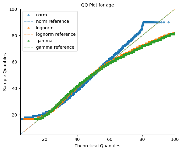
Theoretical QQ Plot Example
In the example below, the distribution_gof_plots function is used to generate
theoretical quantile–quantile (QQ) plots for the variable "age". The goal
is to assess how well several candidate parametric distributions fit the empirical
data.
Three commonly used continuous distributions are evaluated:
Normal distribution (
"norm")Log-normal distribution (
"lognorm")Gamma distribution (
"gamma")
Each distribution is fit to the data using the default maximum likelihood
estimation (MLE) procedure. The plot_types="qq" argument instructs the
function to generate only QQ plots, while qq_type="theoretical" specifies that
sample quantiles should be compared against quantiles derived from the fitted
theoretical distributions.
A reference identity line is included via show_reference=True, allowing for
direct visual assessment of deviations from the ideal 1:1 relationship. If the
empirical data follow a given distribution closely, the corresponding points will
align tightly along this reference line.
Distinct colors are assigned to each fitted distribution using the palette
parameter, making it easy to visually compare goodness-of-fit across models. Axis
limits are constrained using xlim and ylim to focus the comparison on a
relevant range of values and ensure consistent scaling.
The resulting figure is saved in both PNG and SVG formats using the provided output paths and filename.
from eda_toolkit import distribution_gof_plots

distribution_gof_plots(
    df,
    var="age",
    dist=["norm", "lognorm", "gamma"],
    plot_types="qq",
    qq_type="theoretical",
    show_reference=True,
    image_path_png=image_path_png,
    image_path_svg=image_path_svg,
    palette={
        "norm": "tab:blue",
        "lognorm": "tab:orange",
        "gamma": "tab:green",
    },
    image_filename="gof_qq_age_adult_income",
    xlim=(5, 100),
    ylim=(5, 100),
)
Interpretation
Points closely following the diagonal reference line indicate a strong agreement between the empirical distribution and the theoretical model.
Systematic curvature suggests skewness or variance mismatches.
Deviations in the tails highlight poor tail behavior, which is often critical in risk modeling, reliability analysis, and anomaly detection contexts.
This diagnostic provides a fast, visual comparison of multiple candidate distributions and is typically used as a first-pass validation step before making distributional assumptions in downstream modeling.
Empirical QQ Plot Example (Sample vs Reference Data)
In this example, the distribution_gof_plots function is used to generate an
empirical quantile–quantile (QQ) plot, comparing the distribution of a target
sample against a reference empirical distribution, rather than against a
theoretical model.
Unlike theoretical QQ plots, which compare sample quantiles to quantiles derived from a fitted parametric distribution, empirical QQ plots compare quantiles between two observed samples directly. This makes them particularly useful for distributional comparisons across subpopulations, cohorts, or time periods.
Here, the variable "age" is analyzed for the full dataset and compared against
a reference sample consisting only of observations where sex == "Male". The
reference data are extracted explicitly and passed via the reference_data
parameter.
Although a distribution name ("norm") is still required for labeling purposes,
no theoretical distribution is involved in the QQ geometry when
qq_type="empirical". Instead, matched empirical quantiles from the sample and
reference data are plotted against one another.
reference_data = df.loc[df["sex"] == "Male", "age"].dropna().values

from eda_toolkit import distribution_gof_plots

distribution_gof_plots(
    df,
    var="age",
    dist="norm",
    plot_types="qq",
    qq_type="empirical",
    reference_data=reference_data,
)
Interpretation
Points lying close to the diagonal indicate that the sample and reference distributions are similar across quantiles.
Systematic deviations from the diagonal reveal distributional shifts, such as differences in central tendency, spread, or tail behavior.
Curvature in the upper or lower quantiles highlights differences in tail behavior between the two samples.
Empirical QQ plots are especially valuable for fairness analysis, cohort comparison, and data drift detection, where direct comparison between groups is preferred over assumptions of parametric form.

CDF Plot Example (Lower and Upper Tails)
In this example, the distribution_gof_plots function is used to generate
cumulative distribution function (CDF) plots for the variable "age",
including both the lower tail (CDF) and upper tail (exceedance probability).
Two candidate parametric distributions are evaluated:
Normal distribution (
"norm")Log-normal distribution (
"lognorm")
The plot_types="cdf" argument instructs the function to produce CDF-based
diagnostics, while the default tail="both" setting ensures that both the
CDF and exceedance curves are plotted simultaneously. This dual representation
provides a complete view of the distribution’s behavior across the full range of
values.
The CDF curves illustrate the probability that the random variable takes on a
value less than or equal to a given threshold, while the exceedance curves
(1 − CDF) highlight the probability of observing values greater than that
threshold. This is especially useful for understanding upper-tail risk and
extreme-value behavior.
All plots are rendered on a linear scale, making it easier to compare overall distributional shape and mid-range behavior between candidate models.
from eda_toolkit import distribution_gof_plots

distribution_gof_plots(
    df,
    var="age",
    dist=["norm", "lognorm"],
    plot_types="cdf",
)
Interpretation
CDF curves that rise more quickly indicate distributions with greater mass at lower values.
Exceedance curves that decay more slowly suggest heavier upper tails and higher probability of extreme observations.
Differences between the normal and log-normal fits are most pronounced in the tails, where modeling assumptions often matter most.
CDF and exceedance plots are particularly valuable in risk analysis, threshold-based decision-making, and model selection, where understanding tail behavior is as important as central tendency.

Feature Scaling and Outliers
- data_doctor(df, feature_name, data_fraction=1, scale_conversion=None, scale_conversion_kws=None, apply_cutoff=False, lower_cutoff=None, upper_cutoff=None, show_plot=True, plot_type='all', figsize=(18, 6), xlim=None, kde_ylim=None, hist_ylim=None, box_violin_ylim=None, save_plot=False, image_path_png=None, image_path_svg=None, apply_as_new_col_to_df=False, kde_kws=None, hist_kws=None, box_violin_kws=None, box_violin='boxplot', label_fontsize=12, tick_fontsize=10, random_state=None)
Analyze and transform a specific feature in a DataFrame, with options for scaling, applying cutoffs, and visualizing the results. This function also allows for the creation of a new column with the transformed data if specified. Plots can be saved in PNG or SVG format with filenames that incorporate the
plot_type,feature_name,scale_conversion, andcutoffif cutoffs are applied.- Parameters:
df (pandas.DataFrame) – The DataFrame containing the feature to analyze.
feature_name (str) – The name of the feature (column) to analyze.
data_fraction (float, optional) – Fraction of the data to analyze. Default is
1(full dataset). Useful for large datasets where a sample can represent the population. Ifapply_as_new_col_to_df=True, the full dataset is used (data_fraction=1).scale_conversion (str, optional) –
Type of conversion to apply to the feature. Options include:
'abs': Absolute values'log': Natural logarithm'sqrt': Square root'cbrt': Cube root'reciprocal': Reciprocal transformation'stdrz': Standardized (z-score)'minmax': Min-Max scaling'boxcox': Box-Cox transformation (positive values only; supportslmbdafor specific lambda oralphafor confidence interval)'robust': Robust scaling (median and IQR)'maxabs': Max-abs scaling'exp': Exponential transformation'logit': Logit transformation (values between 0 and 1)'arcsinh': Inverse hyperbolic sine'square': Squaring the values'power': Power transformation (Yeo-Johnson).
scale_conversion_kws (dict, optional) –
Additional keyword arguments to pass to the scaling functions, such as:
'alpha'for Box-Cox transformation (returns a confidence interval for lambda)'lmbda'for a specific Box-Cox transformation value'quantile_range'for robust scaling.
apply_cutoff (bool, optional (default=False)) – Whether to apply upper and/or lower cutoffs to the feature.
lower_cutoff (float, optional) – Lower bound to apply if
apply_cutoff=True.upper_cutoff (float, optional) – Upper bound to apply if
apply_cutoff=True.show_plot (bool, optional (default=True)) – Whether to display plots of the transformed feature: KDE, histogram, and boxplot/violinplot.
plot_type (str, list, or tuple, optional (default="all")) –
Specifies the type of plot(s) to produce. Options are:
'all': Generates KDE, histogram, and boxplot/violinplot.'kde': KDE plot only.'hist': Histogram plot only.'box_violin': Boxplot or violin plot only (specified bybox_violin).
If a list or tuple is provided (e.g.,
plot_type=["kde", "hist"]), the specified plots are displayed in a single row with sufficient spacing. AValueErroris raised if an invalid plot type is included.figsize (tuple or list, optional (default=(18, 6))) – Specifies the figure size for the plots. This applies to all plot types, including single plots (when
plot_typeis set to “kde”, “hist”, or “box_violin”) and multi-plot layout whenplot_typeis “all”.xlim (tuple or list, optional) – Limits for the x-axis in all plots, specified as
(xmin, xmax).kde_ylim (tuple or list, optional) – Limits for the y-axis in the KDE plot, specified as
(ymin, ymax).hist_ylim (tuple or list, optional) – Limits for the y-axis in the histogram plot, specified as
(ymin, ymax).box_violin_ylim (tuple or list, optional) – Limits for the y-axis in the boxplot or violin plot, specified as
(ymin, ymax).save_plot (bool, optional (default=False)) – Whether to save the plots as PNG and/or SVG images. If
True, the user must specify at least one ofimage_path_pngorimage_path_svg, otherwise aValueErroris raised.image_path_png (str, optional) – Directory path to save the plot as a PNG file. Only used if
save_plot=True.image_path_svg (str, optional) – Directory path to save the plot as an SVG file. Only used if
save_plot=True.apply_as_new_col_to_df (bool, optional (default=False)) –
Whether to create a new column in the DataFrame with the transformed values. If
True, the new column name is generated based on the feature name and the transformation applied:<feature_name>_<scale_conversion>: If a transformation is applied.<feature_name>_w_cutoff: If only cutoffs are applied.
For Box-Cox transformation, if
alphais specified, the confidence interval for lambda is displayed. Iflmbdais specified, the lambda value is displayed.kde_kws (dict, optional) – Additional keyword arguments to pass to the KDE plot (
seaborn.kdeplot).hist_kws (dict, optional) – Additional keyword arguments to pass to the histogram plot (
seaborn.histplot).box_violin_kws (dict, optional) – Additional keyword arguments to pass to either boxplot or violinplot.
box_violin (str, optional (default="boxplot")) – Specifies whether to plot a
boxplotorviolinplotifplot_typeis set tobox_violin.label_fontsize (int, optional (default=12)) – Font size for the axis labels and plot titles.
tick_fontsize (int, optional (default=10)) – Font size for the tick labels on both axes.
random_state (int, optional) – Seed for reproducibility when sampling the data.
- Returns:
NoneDisplays the feature’s descriptive statistics, quartile information, and outlier details. If a new column is created, confirms the addition to the DataFrame. For Box-Cox, either the lambda or its confidence interval is displayed.- Raises:
If an invalid
scale_conversionis provided.If Box-Cox transformation is applied to non-positive values.
If
save_plot=Truebut neitherimage_path_pngnorimage_path_svgis provided.If an invalid option is provided for
box_violin.If an invalid option is provided for
plot_type.If the length of transformed data does not match the original feature length.
Note
When saving plots, the filename will include the
feature_name,scale_conversion, each selectedplot_type, and, if cutoffs are applied,"_cutoff". For example, iffeature_nameis"age",scale_conversionis"boxcox", andplot_typeis"kde", with cutoffs applied, the filename will be:age_boxcox_kde_cutoff.pngorage_boxcox_kde_cutoff.svg.
Available Scale Conversions
The scale_conversion parameter accepts several options for data scaling, providing flexibility in how you preprocess your data. Each option addresses specific transformation needs, such as normalizing data, stabilizing variance, or adjusting data ranges. Below is the exhaustive list of available scale conversions:
'abs': Takes the absolute values of the data, removing any negative signs.'log': Applies the natural logarithm to the data, useful for compressing large ranges and reducing skewness.'sqrt': Applies the square root transformation, often used to stabilize variance.'cbrt': Takes the cube root of the data, which can be useful for transforming both positive and negative values symmetrically.'stdrz': Standardizes the data to have a mean of 0 and a standard deviation of 1, also known as z-score normalization.'minmax': Rescales the data to a specified range, defaulting to [0, 1], ensuring that all values fall within this range.'boxcox': Applies the Box-Cox transformation to stabilize variance and make the data more normally distributed. Only works with positive values and supports passinglmbdaoralphafor flexibility.'robust': Scales the data based on percentiles (such as the interquartile range), which reduces the influence of outliers.'maxabs': Scales the data by dividing it by its maximum absolute value, preserving the sign of the data while constraining it to the range [-1, 1].'reciprocal': Transforms the data by taking the reciprocal (1/x), which is useful when handling values that are far from zero.'exp': Applies the exponential function to the data, which is useful for modeling exponential growth or increasing the impact of large values.'logit': Applies the logit transformation to data, which is only valid for values between 0 and 1. This is typically used in logistic regression models.'arcsinh': Applies the inverse hyperbolic sine transformation, which is similar to the logarithm but can handle both positive and negative values.'square': Squares the values of the data, effectively emphasizing larger values while downplaying smaller ones.'power': Applies the power transformation (Yeo-Johnson), which is similar to Box-Cox but works for both positive and negative values.
boxcox is just one of the many options available for transforming data in the data_doctor function, providing versatility to handle different scaling needs.
Box-Cox Transformation Example 1
In this example from the US Census dataset [1], we demonstrate the usage of the data_doctor
function to apply a Box-Cox transformation to the age column in a DataFrame.
The data_doctor function provides a flexible way to preprocess data by applying
various scaling techniques. In this case, we apply the Box-Cox transformation without any tuning
of the alpha or lambda parameters, allowing the function to handle the transformation in a
barebones approach. You can also choose other scaling conversions from the list of available
options (such as 'minmax', 'standard', 'robust', etc.), depending on your needs.
from eda_toolkit import data_doctor

data_doctor(
    df=df,
    feature_name="age",
    data_fraction=0.6,
    scale_conversion="boxcox",
    apply_cutoff=False,
    lower_cutoff=None,
    upper_cutoff=None,
    show_plot=True,
    apply_as_new_col_to_df=True,
    random_state=111,
)
            DATA DOCTOR SUMMARY REPORT
+------------------------------+--------------------+
| Feature                      | age                |
+------------------------------+--------------------+
| Statistic                    | Value              |
+------------------------------+--------------------+
| Min                          |             3.6664 |
| Max                          |             6.8409 |
| Mean                         |             5.0163 |
| Median                       |             5.0333 |
| Std Dev                      |             0.6761 |
+------------------------------+--------------------+
| Quartile                     | Value              |
+------------------------------+--------------------+
| Q1 (25%)                     |             4.5219 |
| Q2 (50% = Median)            |             5.0333 |
| Q3 (75%)                     |             5.5338 |
| IQR                          |             1.0119 |
+------------------------------+--------------------+
| Outlier Bound                | Value              |
+------------------------------+--------------------+
| Lower Bound                  |             3.0040 |
| Upper Bound                  |             7.0517 |
+------------------------------+--------------------+

New Column Name: age_boxcox
Box-Cox Lambda: 0.1748

df.head()
| age | workclass | education | education-num | marital-status | occupation | relationship | age_boxcox | |
|---|---|---|---|---|---|---|---|---|
| census_id | ||||||||
| 582248222 | 39 | State-gov | Bachelors | 13 | Never-married | Adm-clerical | Not-in-family | 5.180807 |
| 561810758 | 50 | Self-emp-not-inc | Bachelors | 13 | Married-civ-spouse | Exec-managerial | Husband | 5.912323 |
| 598098459 | 38 | Private | HS-grad | 9 | Divorced | Handlers-cleaners | Not-in-family | 5.227960 |
| 776705221 | 53 | Private | 11th | 7 | Married-civ-spouse | Handlers-cleaners | Husband | 6.389562 |
| 479262902 | 28 | Private | Bachelors | 13 | Married-civ-spouse | Prof-specialty | Wife | 3.850675 |
Note
Notice that the unique identifiers function was also applied on the dataframe to generate randomized census IDs for the rows of the data.
Explanation
df=df: We are passingdfas the input DataFrame.feature_name="age": The feature we are transforming isage.data_fraction=1: We are using 100% of the data in theagecolumn. You can adjust this if you want to perform the operation on a subset of the data.scale_conversion="boxcox": This parameter defines the type of scaling we want to apply. In this case, we are using the Box-Cox transformation. You can changeboxcoxto any supported scale conversion method.apply_cutoff=False: We are not applying any outlier cutoff in this example.lower_cutoff=Noneandupper_cutoff=None: These are left asNonesince we are not applying outlier cutoffs in this case.show_plot=True: This option will generate a plot to visualize the distribution of theagecolumn before and after the transformation.apply_as_new_col_to_df=True: This tells the function to apply the transformation and create a new column in the DataFrame. The new column will be namedage_boxcox, where"boxcox"indicates the type of transformation applied.
Box-Cox Transformation: This transformation normalizes the data by making the distribution more Gaussian-like, which can be beneficial for certain statistical models.
No Outlier Handling: In this example, we are not applying any cutoffs to remove or modify outliers. This means the function will process the entire range of values in the
agecolumn without making adjustments for extreme values.New Column Creation: By setting
apply_as_new_col_to_df=True, a new column namedage_boxcoxwill be created in thedfDataFrame, where the transformed values will be stored. This allows us to keep the originalagecolumn intact while adding the transformed data as a new feature.The
show_plot=Trueparameter will generate a plot that visualizes the distribution of the originalagedata alongside the transformedage_boxcoxdata. This can help you assess how the Box-Cox transformation has affected the data distribution.
Box-Cox Transformation Example 2
In this second example from the US Census dataset [1], we apply the Box-Cox
transformation to the age column in a DataFrame, but this time with custom
keyword arguments passed through the scale_conversion_kws. Specifically, we
provide an alpha value of 0.8, influencing the confidence interval for the
transformation. Additionally, we customize the
visual appearance of the plots by specifying keyword arguments for the violinplot,
KDE, and histogram plots. These customizations allow for greater control over the
visual output.
from eda_toolkit import data_doctor

data_doctor(
    df=df,
    feature_name="age",
    data_fraction=1,
    scale_conversion="boxcox",
    apply_cutoff=False,
    lower_cutoff=None,
    upper_cutoff=None,
    show_plot=True,
    apply_as_new_col_to_df=True,
    scale_conversion_kws={"alpha": 0.8},
    box_violin="violinplot",
    box_violin_kws={"color": "lightblue"},
    kde_kws={"fill": True, "color": "blue"},
    hist_kws={"color": "green"},
    random_state=111,
)
            DATA DOCTOR SUMMARY REPORT
+------------------------------+--------------------+
| Feature                      | age                |
+------------------------------+--------------------+
| Statistic                    | Value              |
+------------------------------+--------------------+
| Min                          |             3.6664 |
| Max                          |             6.8409 |
| Mean                         |             5.0163 |
| Median                       |             5.0333 |
| Std Dev                      |             0.6761 |
+------------------------------+--------------------+
| Quartile                     | Value              |
+------------------------------+--------------------+
| Q1 (25%)                     |             4.5219 |
| Q2 (50% = Median)            |             5.0333 |
| Q3 (75%)                     |             5.5338 |
| IQR                          |             1.0119 |
+------------------------------+--------------------+
| Outlier Bound                | Value              |
+------------------------------+--------------------+
| Lower Bound                  |             3.0040 |
| Upper Bound                  |             7.0517 |
+------------------------------+--------------------+

New Column Name: age_boxcox
Box-Cox C.I. for Lambda: (0.1717, 0.1779)

Note
Note that this example specifies The theoretical overview section provides a detailed framework for a Box-Cox transformation.
df.head()
| age | workclass | education | education-num | marital-status | occupation | relationship | age_boxcox | |
|---|---|---|---|---|---|---|---|---|
| census_id | ||||||||
| 582248222 | 39 | State-gov | Bachelors | 13 | Never-married | Adm-clerical | Not-in-family | 3.936876 |
| 561810758 | 50 | Self-emp-not-inc | Bachelors | 13 | Married-civ-spouse | Exec-managerial | Husband | 4.019590 |
| 598098459 | 38 | Private | HS-grad | 9 | Divorced | Handlers-cleaners | Not-in-family | 4.521908 |
| 776705221 | 53 | Private | 11th | 7 | Married-civ-spouse | Handlers-cleaners | Husband | 5.033257 |
| 479262902 | 28 | Private | Bachelors | 13 | Married-civ-spouse | Prof-specialty | Wife | 5.614411 |
In this example, you can see how the data_doctor function supports further
flexibility with customizable plot aesthetics and scaling techniques. The
Box-Cox transformation is still applied without any tuning of the lambda parameter,
while the alpha value provides a confidence interval for the resulting transformation:
Box-Cox C.I. for Lambda: (0.1717, 0.1779)
This allows for tailored visualizations with consistent styling across multiple plot types.
Some of the keyword arguments, such as those passed in box_violin_kws, are
specific to Python version 3.7. For example, in this version, we remove the fill
color from the boxplot using boxprops.
box_violin_kws={
    "boxprops": dict(facecolor="none", edgecolor="blue")
},
In later Python versions (e.g., 3.11),
this can be done more easily with fill=True. Therefore, it is important to pass
any desired keyword arguments based on the correct version of Python you’re using.
Explanation
df=df: We are passingdfas the input DataFrame.feature_name="age": The feature we are transforming isage.data_fraction=1: We are using 100% of the data in theagecolumn. You can adjust this if you want to perform the operation on a subset of the data.scale_conversion="boxcox": This parameter defines the type of scaling we want to apply. In this case, we are using the Box-Cox transformation.apply_cutoff=False: We are not applying any outlier cutoff in this example.lower_cutoff=Noneandupper_cutoff=None: These are left asNonesince we are not applying outlier cutoffs in this case.show_plot=True: This option will generate a plot to visualize the distribution of theagecolumn before and after the transformation.apply_as_new_col_to_df=True: This tells the function to apply the transformation and create a new column in the DataFrame. The new column will be namedage_boxcox_alphato indicate that an alpha parameter was used in the transformation.scale_conversion_kws={"alpha":0.8}: Thealphakeyword argument specifies the confidence interval for the Box-Cox transformation’s lambda value, ensuring a confidence interval is returned instead of a single lambda value.box_violin_kws={"boxprops": dict(facecolor='none', edgecolor="blue")}: This keyword argument customizes the appearance of the boxplot by removing the fill color and setting the edge color to blue. This syntax is specific to Python 3.7. In later versions (i.e., 3.11+), thefill=Trueargument can be used to control this behavior.kde_kws={"fill":True, "color":"blue"}: This fills the area under the KDE plot with a blue color, enhancing the plot’s visual presentation.hist_kws={"color":"blue"}: This colors the histogram bars in blue for visual consistency across plots.image_path_svg=image_path_svg: This parameter specifies the path where the resulting plot will be saved as an SVG file.save_plot=True: This tells the function to save the plot, and since an image path is provided, the plot will be saved as an SVG file.
Box-Cox Transformation with Confidence Interval: In this example, we use the Box-Cox transformation with the
alphaparameter set to 0.8, which returns a confidence interval for the lambda value rather than a single value.No Outlier Handling: Similar to Example 1, no outliers are handled in this transformation.
New Column Creation: The transformed data is added to the DataFrame in a new column named
age_boxcox_alpha, where “alpha” indicates the confidence interval applied in the Box-Cox transformation.Custom Plot Visuals: The KDE, histogram, and boxplot are customized with blue colors, and specific keyword arguments are provided for the boxplot appearance based on Python version. These changes allow for finer control over the visual aesthetics of the resulting plots.
Plot Saving: The
save_plotparameter is set toTrue, and the plot will be saved as an SVG file at the specified location.
Data Fraction Usage
In the Box-Cox transformation examples, you may notice a difference in the values for data_fraction:
In Box-Cox Example 1, we set
data_fraction=0.6.In Box-Cox Example 2, we used the full data with
data_fraction=1.
Despite using a data_fraction of 0.6 in Example 1, the function still processed
the entire dataset. The purpose of the data_fraction parameter is to allow
users to select a smaller subset of the data for sampling and transformation while
ensuring the final operation is applied to the full scope of data.
This behavior is intentional, as it serves to:
1. Ensure Reproducibility: By using a consistent random_state, the sampled
subset can reliably represent the dataset, regardless of data_fraction.
2. Preserve Sampling Assumptions: Applying the desired operation (e.g., transformations) on the full data aligns the sample with the larger population and allows a seamless projection of the sample properties to the entire dataset.
Thus, while data_fraction provides a way to adjust the percentage of data
used for sampling, the function will always apply the transformation across the
full dataset, balancing performance efficiency with statistical integrity.
Retaining a Sample for Analysis
To sample the exact subset used in the data_fraction=0.6 calculation, you
can directly sample from the DataFrame with a consistent random state for
reproducibility. This method allows you to work with a representative subset of
the data while preserving the original distribution characteristics.
To sample 60% of the data using the exact logic of the data_doctor function,
use the following code:
sampled_df = df.sample(frac=0.6, random_state=111)
The random_state parameter ensures that the sampled data remains consistent
across runs. After creating this subset, you can apply the data_doctor
function to sampled_df as shown below to perform the Box-Cox transformation
on the age column:
from eda_toolkit import data_doctor

data_doctor(
    df=sampled_df,
    feature_name="age",
    data_fraction=1,
    scale_conversion="boxcox",
    apply_cutoff=False,
    lower_cutoff=None,
    upper_cutoff=None,
    show_plot=True,
    apply_as_new_col_to_df=True,
    random_state=111,
)
By setting data_fraction=1 within the data_doctor function, you ensure
that it operates on the entire sampled_df, which now consists of the selected
60% subset. To confirm that the sampled data is indeed 60% of the original
DataFrame, you can print the shape of sampled_df as follows:
print(
    f"The sampled dataframe has {sampled_df.shape[0]} rows and {sampled_df.shape[1]} columns."
)
The sampled dataframe has 29305 rows and 16 columns.
We can also inspect the first five rows of the sampled_df dataframe below:
| age | workclass | education | education-num | marital-status | occupation | relationship | age_boxcox | |
|---|---|---|---|---|---|---|---|---|
| census_id | ||||||||
| 408117383 | 40 | Private | Some-college | 10 | Married-civ-spouse | Machine-op-inspct | Husband | 4.355015 |
| 669717925 | 58 | Private | HS-grad | 9 | Married-civ-spouse | Exec-managerial | Husband | 5.086108 |
| 399428377 | 41 | Private | HS-grad | 9 | Separated | Machine-op-inspct | Not-in-family | 5.037743 |
| 961427355 | 73 | NaN | Some-college | 10 | Married-civ-spouse | NaN | Husband | 4.216561 |
| 458295720 | 19 | Private | HS-grad | 9 | Never-married | Farming-fishing | Not-in-family | 5.520438 |
Logit Transformation Example
In this example, we demonstrate the usage of the data_doctor function to
apply a logit transformation to a feature in a DataFrame. The logit transformation
is used when dealing with data bounded between 0 and 1, as it maps values within
this range to an unbounded scale in log-odds terms, making it particularly useful
in fields such as logistic regression.
Note
The data_doctor function provides a range of scaling options, and in this case,
we use the logit transformation to illustrate how the transformation is applied.
However, it’s important to note that if the feature contains values outside the (0, 1)
range, the function will raise a ValueError. This is because the logit function
is undefined for values less than or equal to 0 and greater than or equal to 1.
from eda_toolkit import data_doctor

data_doctor(
    df=df,
    feature_name="age",
    data_fraction=1,
    scale_conversion="logit",
    apply_cutoff=False,
    lower_cutoff=None,
    upper_cutoff=None,
    show_plot=True,
    apply_as_new_col_to_df=True,
    random_state=111,
)
Error
ValueError: Logit transformation requires values to be between 0 and 1. Consider using a scaling method such as min-max scaling first.
If you attempt to apply this transformation to data outside the (0, 1) range, such as an unscaled numerical feature, the function will halt and display an error message advising you to use an appropriate scaling method first.
If you encounter this error, it is recommended to first scale your data using a method like min-max scaling to bring it within the (0, 1) range before applying the logit transformation.
In this example:
df=df: Specifies the DataFrame containing the feature.feature_name="feature_proportion": The feature we are transforming should be bounded between 0 and 1.scale_conversion="logit": Sets the transformation to logit. Ensure thatfeature_proportionvalues are within (0, 1) before applying.show_plot=True: Generates a plot of the transformed feature.
Plain Outliers Example
Observed Outliers Sans Cutoffs
In this example, we examine the final weight (fnlwgt) feature from the US Census
dataset [1], focusing on detecting outliers without applying any scaling
transformations. The data_doctor function is used with minimal configuration
to visualize where outliers are present in the raw data.
By enabling apply_cutoff=True and selecting plot_type=["box_violin", "hist"],
we can clearly identify outliers both visually and numerically. This basic setup
highlights the outliers without altering the data distribution, making it easy
to see extreme values that could affect further analysis.
The following code demonstrates this:
from eda_toolkit import data_doctor

data_doctor(
    df=df,
    feature_name="fnlwgt",
    data_fraction=0.6,
    plot_type=["box_violin", "hist"],
    hist_kws={"color": "gray"},
    figsize=(8, 4),
    image_path_svg=image_path_svg,
    save_plot=True,
    random_state=111,
)
            DATA DOCTOR SUMMARY REPORT
+------------------------------+--------------------+
| Feature                      | fnlwgt             |
+------------------------------+--------------------+
| Statistic                    | Value              |
+------------------------------+--------------------+
| Min                          |        12,285.0000 |
| Max                          |     1,484,705.0000 |
| Mean                         |       189,181.3719 |
| Median                       |       177,955.0000 |
| Std Dev                      |       105,417.5713 |
+------------------------------+--------------------+
| Quartile                     | Value              |
+------------------------------+--------------------+
| Q1 (25%)                     |       117,292.0000 |
| Q2 (50% = Median)            |       177,955.0000 |
| Q3 (75%)                     |       236,769.0000 |
| IQR                          |       119,477.0000 |
+------------------------------+--------------------+
| Outlier Bound                | Value              |
+------------------------------+--------------------+
| Lower Bound                  |       -61,923.5000 |
| Upper Bound                  |       415,984.5000 |
+------------------------------+--------------------+

In this visualization, the boxplot and histogram display outliers prominently, showing you exactly where the extreme values lie. This setup serves as a baseline view of the raw data, making it useful for assessing the initial distribution before any scaling or transformation is applied.
Treated Outliers With Cutoffs
In this scenario, we address the extreme values observed in the fnlwgt feature
by applying a visual cutoff based on the distribution seen in the previous example.
Here, we set an approximate upper cutoff of 400,000 to limit the impact of outliers
without any additional scaling or transformation. By using apply_cutoff=True along
with upper_cutoff=400000, we effectively cap the extreme values.
This example also demonstrates how you can further customize the visualization by
specifying additional histogram keyword arguments with hist_kws. Here, we use
bins=20 to adjust the bin size, creating a smoother view of the feature’s
distribution within the cutoff limits.
In the resulting visualization, you will see that the boxplot and histogram have a controlled range due to the applied upper cutoff, limiting the influence of extreme outliers on the visual representation. This treatment provides a clearer view of the primary distribution, allowing for a more focused analysis on the bulk of the data without outliers distorting the scale.
The following code demonstrates this configuration:
from eda_toolkit import data_doctor

data_doctor(
    df=df,
    feature_name="fnlwgt",
    data_fraction=0.6,
    apply_as_new_col_to_df=True,
    apply_cutoff=True,
    upper_cutoff=400000,
    plot_type=["box_violin", "hist"],
    hist_kws={"color": "gray", "bins": 20},
    figsize=(8, 4),
    image_path_svg=image_path_svg,
    save_plot=True,
    random_state=111,
)

| age | workclass | fnlwgt | education | marital-status | occupation | relationship | fnlwgt_w_cutoff | |
|---|---|---|---|---|---|---|---|---|
| census_id | ||||||||
| 582248222 | 39 | State-gov | 77516 | Bachelors | Never-married | Adm-clerical | Not-in-family | 132222 |
| 561810758 | 50 | Self-emp-not-inc | 83311 | Bachelors | Married-civ-spouse | Exec-managerial | Husband | 68624 |
| 598098459 | 38 | Private | 215646 | HS-grad | Divorced | Handlers-cleaners | Not-in-family | 161880 |
| 776705221 | 53 | Private | 234721 | 11th | Married-civ-spouse | Handlers-cleaners | Husband | 73402 |
| 479262902 | 28 | Private | 338409 | Bachelors | Married-civ-spouse | Prof-specialty | Wife | 97261 |
RobustScaler Outliers Example
In this example from the US Census dataset [1], we apply the RobustScaler
transformation to the age column in a DataFrame to address potential outliers.
The data_doctor function enables users to apply transformations with specific
configurations via the scale_conversion_kws parameter, making it ideal for
refining how outliers affect scaling.
For this example, we set the following custom keyword arguments:
Disable centering: By setting
with_centering=False, the transformation scales based only on the range, without shifting the median to zero.Adjust quantile range: We specify a narrower
quantile_rangeof (10.0, 90.0) to reduce the influence of extreme values on scaling.
The following code demonstrates this transformation:
from eda_toolkit import data_doctor

data_doctor(
    df=df,
    feature_name='age',
    data_fraction=0.6,
    scale_conversion="robust",
    apply_as_new_col_to_df=True,
    scale_conversion_kws={
        "with_centering": False,  # Disable centering
        "quantile_range": (10.0, 90.0)  # Use a custom quantile range
    },
    random_state=111,
)
             DATA DOCTOR SUMMARY REPORT
+------------------------------+--------------------+
| Feature                      | age                |
+------------------------------+--------------------+
| Statistic                    | Value              |
+------------------------------+--------------------+
| Min                          | 0.4722             |
| Max                          | 2.5000             |
| Mean                         | 1.0724             |
| Median                       | 1.0278             |
| Std Dev                      | 0.3809             |
+------------------------------+--------------------+
| Quartile                     | Value              |
+------------------------------+--------------------+
| Q1 (25%)                     | 0.7778             |
| Q2 (Median)                  | 1.0278             |
| IQR                          | 0.5556             |
| Q3 (75%)                     | 1.3333             |
| Q4 (Max)                     | 2.5000             |
+------------------------------+--------------------+
| Outlier Bound                | Value              |
+------------------------------+--------------------+
| Lower Bound                  | -0.0556            |
| Upper Bound                  | 2.1667             |
+------------------------------+--------------------+

New Column Name: age_robust

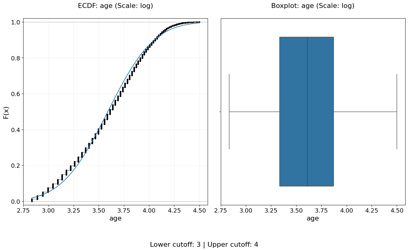
ECDF Distribution Example
In this example, we demonstrate the use of the Empirical Cumulative Distribution
Function (ECDF) to visualize the distribution of the "age" variable from the
US Census Adult Income dataset [1].
ECDF plots provide a robust, non-parametric view of a variable’s distribution by showing the cumulative proportion of observations less than or equal to a given value. Unlike histograms or kernel density estimates, ECDFs do not rely on binning or smoothing parameters, making them especially useful for diagnostic analysis.
For a formal mathematical definition and theoretical background of the ECDF, see the Empirical Cumulative Distribution Function (ECDF) section in the theoretical overview.
This example uses the data_doctor function to generate multiple complementary
distribution views for the same feature:
Kernel Density Estimate (
"kde")Empirical Cumulative Distribution Function (
"ecdf")Box and violin plots (
"box_violin")
In addition, a logarithmic scaling transformation is applied to the "age"
feature via scale_conversion="log", allowing the cumulative behavior of the
distribution to be examined after compressing the right tail.
The following code demonstrates this workflow:
from eda_toolkit import data_doctor

print("\nRunning data_doctor with plot_type=['kde', 'ecdf', 'box_violin'] ...\n")

data_doctor(
    df=df,
    feature_name="age",
    plot_type=["kde", "ecdf", "box_violin"],
    scale_conversion="log",
)
Running data_doctor with plot_type=['kde', 'ecdf', 'box_violin'] ...

            DATA DOCTOR SUMMARY REPORT
+------------------------------+--------------------+
| Feature                      | age                |
+------------------------------+--------------------+
| Statistic                    | Value              |
+------------------------------+--------------------+
| Min                          |             2.8332 |
| Max                          |             4.4998 |
| Mean                         |             3.5905 |
| Median                       |             3.6109 |
| Std Dev                      |             0.3617 |
+------------------------------+--------------------+
| Quartile                     | Value              |
+------------------------------+--------------------+
| Q1 (25%)                     |             3.3322 |
| Q2 (50% = Median)            |             3.6109 |
| Q3 (75%)                     |             3.8712 |
| IQR                          |             0.5390 |
+------------------------------+--------------------+
| Outlier Bound                | Value              |
+------------------------------+--------------------+
| Lower Bound                  |             2.5237 |
| Upper Bound                  |             4.6797 |
+------------------------------+--------------------+
Stacked Crosstab Plots
Generate stacked or regular bar plots and crosstabs for specified columns in a DataFrame.
The stacked_crosstab_plot function is a powerful tool for visualizing categorical data relationships through stacked bar plots and contingency tables (crosstabs). It supports extensive customization options, including plot appearance, color schemes, and saving output in multiple formats. Users can choose between regular or normalized plots and control whether the function returns the generated crosstabs as a dictionary.
- stacked_crosstab_plot(df, col, func_col, legend_labels_list, title, kind='bar', width=0.9, rot=0, custom_order=None, image_path_png=None, image_path_svg=None, save_formats=None, color=None, output='both', return_dict=False, x=None, y=None, p=None, file_prefix=None, logscale=False, plot_type='both', show_legend=True, legend_loc='best', label_fontsize=12, tick_fontsize=10, text_wrap=50, remove_stacks=False, xlim=None, ylim=None)
- Parameters:
df (pandas.DataFrame) – The DataFrame containing the data to plot.
col (str) – The name of the column in the DataFrame to be analyzed.
func_col (list of str) – List of columns in the DataFrame to generate the crosstabs and stack the bars in the plot.
legend_labels_list (list of list of str) – List of legend labels corresponding to each column in
func_col.title (list of str) – List of titles for each plot generated.
kind (str, optional) – Type of plot to generate (
"bar"or"barh"for horizontal bars). Default is"bar".width (float, optional) – Width of the bars in the bar plot. Default is
0.9.rot (int, optional) – Rotation angle of the x-axis labels. Default is
0.custom_order (list, optional) – Custom order for the categories in
col.image_path_png (str, optional) – Directory path to save PNG plot images.
image_path_svg (str, optional) – Directory path to save SVG plot images.
save_formats (list, str, or tuple, optional) – List, string, or tuple of file formats to save the plots (e.g.,
["png", "svg"]). Default isNone. Raises an error if an invalid format is provided without the corresponding path.color (list of str, optional) – List of colors to use for the plots. Default is the seaborn color palette.
output (str, optional) – Specify the output type:
"plots_only","crosstabs_only", or"both". Default is"both".return_dict (bool, optional) – Return the crosstabs as a dictionary. Default is
False.x (int, optional) – Width of the figure in inches.
y (int, optional) – Height of the figure in inches.
p (int, optional) – Padding between subplots.
file_prefix (str, optional) – Prefix for filenames when saving plots.
logscale (bool, optional) – Apply a logarithmic scale to the y-axis. Default is
False.plot_type (str, optional) – Type of plot to generate:
"both","regular", or"normalized". Default is"both".show_legend (bool, optional) – Show the legend on the plot. Default is
True.legend_loc (str, optional) – Location of the legend on the plot. Passed directly to
matplotlib.axes.Axes.legend. Common options include"best","upper right","upper left","lower left","lower right", and"center".label_fontsize (int, optional) – Font size for axis labels. Default is
12.tick_fontsize (int, optional) – Font size for tick labels. Default is
10.text_wrap (int, optional) – Maximum width of the title text before wrapping. Default is
50.remove_stacks (bool, optional) – Remove stacks and create a regular bar plot. Only works when
plot_typeis"regular". Default isFalse.xlim (tuple or list, optional) – Tuple or list specifying limits of the x-axis (e.g.,
(min, max)).ylim (tuple or list, optional) – Tuple or list specifying limits of the y-axis (e.g.,
(min, max)).
- Raises:
If
remove_stacksisTrueandplot_typeis not"regular".If an invalid save format is specified without providing the corresponding path.
If
outputis not one of"both","plots_only", or"crosstabs_only".If
plot_typeis not one of"both","regular", or"normalized".If
remove_stacksis used withplot_typenot set to"regular".If lengths of
title,func_col, andlegend_labels_listare unequal.
KeyError – If any column in
colorfunc_colis missing from the DataFrame.
- Returns:
Dictionary of crosstabs DataFrames if
return_dictisTrue. Otherwise, returnsNone.- Return type:
dict or
None
Notes
Ensure
save_formatsaligns with provided paths for saving images. For instance, specifyimage_path_pngorimage_path_svgif saving as"png"or"svg"respectively.The returned crosstabs dictionary includes both absolute and normalized values when
return_dict=True.
Stacked Bar Plots With Crosstabs Example
The provided code snippet demonstrates how to use the stacked_crosstab_plot
function to generate stacked bar plots and corresponding crosstabs for different
columns in a DataFrame. Here’s a detailed breakdown of the code using the census
dataset as an example [1].
First, the func_col list is defined, specifying the columns ["sex", "income"]
to be analyzed. These columns will be used in the loop to generate separate plots.
The legend_labels_list is then defined, with each entry corresponding to a
column in func_col. In this case, the labels for the sex column are
["Male", "Female"], and for the income column, they are ["<=50K", ">50K"].
These labels will be used to annotate the legends of the plots.
Next, the title list is defined, providing titles for each plot corresponding
to the columns in func_col. The titles are set to ["Sex", "Income"],
which will be displayed on top of each respective plot.
Note
The legend_labels_list parameter should be a list of lists, where each
inner list corresponds to the ground truth labels for the respective item in
the func_col list. Each element in the func_col list represents a
column in your DataFrame that you wish to analyze, and the corresponding
inner list in legend_labels_list should contain the labels that will be
used in the legend of your plots.
For example:
# Define the func_col to use in the loop in order of usage
func_col = ["sex", "income"]

# Define the legend_labels to use in the loop
legend_labels_list = [
    ["Male", "Female"],  # Corresponds to "sex"
    ["<=50K", ">50K"],   # Corresponds to "income"
]

# Define titles for the plots
title = [
    "Sex",
    "Income",
]
Important
Ensure that func_col, legend_labels_list, and title have the
same number of elements. Each item in func_col must correspond to a list
of labels in legend_labels_list and a title in title to ensure the
function generates plots with the correct labels and titles.
Additionally, in this example, remove trailing periods from the income
column to correctly split its contents into two categories.
In this example:
func_colcontains two elements:"sex"and"income". Each corresponds to a specific column in your DataFrame.legend_labels_listis a nested list containing two inner lists:The first inner list,
["Male", "Female"], corresponds to the"sex"column infunc_col.The second inner list,
["<=50K", ">50K"], corresponds to the"income"column infunc_col.
titlecontains two elements:"Sex"and"Income", which will be used as the titles for the respective plots.
Note
Before proceeding with any further examples in this documentation, ensure that the age variable is binned into a new variable, age_group.
Detailed instructions for this process can be found under Binning Numerical Columns.
from eda_toolkit import stacked_crosstab_plot

stacked_crosstabs = stacked_crosstab_plot(
    df=df,
    col="age_group",
    func_col=func_col,
    legend_labels_list=legend_labels_list,
    title=title,
    kind="bar",
    width=0.8,
    rot=0,
    custom_order=None,
    color=["#00BFC4", "#F8766D"],
    output="both",
    return_dict=True,
    x=14,
    y=8,
    p=10,
    logscale=False,
    plot_type="both",
    show_legend=True,
    label_fontsize=14,
    tick_fontsize=12,
)
The above example generates stacked bar plots for "sex" and "income"
grouped by "education". The plots are executed with legends, labels, and
tick sizes customized for clarity. The function returns a dictionary of
crosstabs for further analysis or export.
Important
Importance of Correctly Aligning Labels
It is crucial to properly align the elements in the legend_labels_list,
title, and func_col parameters when using the stacked_crosstab_plot
function. Each of these lists must be ordered consistently because the function
relies on their alignment to correctly assign labels and titles to the
corresponding plots and legends.
For instance, in the example above:
The first element in
func_colis"sex", and it is aligned with the first set of labels["Male", "Female"]inlegend_labels_listand the first title"Sex"in thetitlelist.Similarly, the second element in
func_col,"income", aligns with the labels["<=50K", ">50K"]and the title"Income".
Misalignment between these lists would result in incorrect labels or titles being applied to the plots, potentially leading to confusion or misinterpretation of the data. Therefore, it’s important to ensure that each list is ordered appropriately and consistently to accurately reflect the data being visualized.
Proper Setup of Lists
When setting up the legend_labels_list, title, and func_col, ensure
that each element in the lists corresponds to the correct variable in the DataFrame.
This involves:
Ordering: Maintaining the same order across all three lists to ensure that labels and titles correspond correctly to the data being plotted.
Consistency: Double-checking that each label in
legend_labels_listmatches the categories present in the correspondingfunc_col, and that thetitleaccurately describes the plot.
By adhering to these guidelines, you can ensure that the stacked_crosstab_plot
function produces accurate and meaningful visualizations that are easy to interpret and analyze.


Note
When you set return_dict=True, you are able to see the crosstabs printed out
as shown below.
| Crosstab for sex | |||||
|---|---|---|---|---|---|
| sex | Female | Male | Total | Female_% | Male_% |
| age_group | |||||
| < 18 | 295 | 300 | 595 | 49.58 | 50.42 |
| 18-29 | 5707 | 8213 | 13920 | 41 | 59 |
| 30-39 | 3853 | 9076 | 12929 | 29.8 | 70.2 |
| 40-49 | 3188 | 7536 | 10724 | 29.73 | 70.27 |
| 50-59 | 1873 | 4746 | 6619 | 28.3 | 71.7 |
| 60-69 | 939 | 2115 | 3054 | 30.75 | 69.25 |
| 70-79 | 280 | 535 | 815 | 34.36 | 65.64 |
| 80-89 | 40 | 91 | 131 | 30.53 | 69.47 |
| 90-99 | 17 | 38 | 55 | 30.91 | 69.09 |
| Total | 16192 | 32650 | 48842 | 33.15 | 66.85 |
| Crosstab for income | |||||
| income | <=50K | >50K | Total | <=50K_% | >50K_% |
| age_group | |||||
| < 18 | 595 | 0 | 595 | 100 | 0 |
| 18-29 | 13174 | 746 | 13920 | 94.64 | 5.36 |
| 30-39 | 9468 | 3461 | 12929 | 73.23 | 26.77 |
| 40-49 | 6738 | 3986 | 10724 | 62.83 | 37.17 |
| 50-59 | 4110 | 2509 | 6619 | 62.09 | 37.91 |
| 60-69 | 2245 | 809 | 3054 | 73.51 | 26.49 |
| 70-79 | 668 | 147 | 815 | 81.96 | 18.04 |
| 80-89 | 115 | 16 | 131 | 87.79 | 12.21 |
| 90-99 | 42 | 13 | 55 | 76.36 | 23.64 |
| Total | 37155 | 11687 | 48842 | 76.07 | 23.93 |
When you set return_dict=True, you can access these crosstabs as
DataFrames by assigning them to their own vriables. For example:
crosstab_age_sex = stacked_crosstabs["sex"]
crosstab_age_income = stacked_crosstabs["income"]
Pivoted Stacked Bar Plots Example
Using the census dataset [1], to create horizontal stacked bar plots, set the kind parameter to
"barh" in the stacked_crosstab_plot function. This option pivots the
standard vertical stacked bar plot into a horizontal orientation, making it easier
to compare categories when there are many labels on the y-axis.

Non-Normalized Stacked Bar Plots Example
In the census data [1], to create stacked bar plots without the normalized versions,
set the plot_type parameter to "regular" in the stacked_crosstab_plot
function. This option removes the display of normalized plots beneath the regular
versions. Alternatively, setting the plot_type to "normalized" will display
only the normalized plots. The example below demonstrates regular stacked bar plots
for income by age.

Regular Non-Stacked Bar Plots Example
In the census data [1], to generate regular (non-stacked) bar plots without
displaying their normalized versions, set the plot_type parameter to "regular"
in the stacked_crosstab_plot function and enable remove_stacks by setting
it to True. This configuration removes any stacked elements and prevents the
display of normalized plots beneath the regular versions. Alternatively, setting
plot_type to "normalized" will display only the normalized plots.
When unstacking bar plots in this fashion, the distribution is aligned in descending order, making it easier to visualize the most prevalent categories.
In the example below, the color of the bars has been set to a dark grey (#333333),
and the legend has been removed by setting show_legend=False. This illustrates
regular bar plots for income by age, without stacking.

Outcome Crosstab Plots
Visualize the distribution of multiple categorical predictors with respect to a binary outcome.
The outcome_crosstab_plot function produces stacked bar plots for each categorical variable provided, segmented by a binary outcome. It supports both count-based and normalized percentage views, optional value annotations, flexible color configurations, and output saving. Each subplot compares a predictor variable against the outcome.
- outcome_crosstab_plot(df, list_name, outcome, bbox_to_anchor=(0.5, -0.25), w_pad=4, h_pad=4, figsize=(12, 8), label_fontsize=12, tick_fontsize=10, n_rows=None, n_cols=None, label_0=None, label_1=None, normalize=False, show_value_counts=False, color_schema=None, save_plots=False, image_path_png=None, image_path_svg=None, string=None)
- Parameters:
df (pandas.DataFrame) – The DataFrame containing your data.
list_name (list of str) – List of column names (categorical variables) to plot.
outcome (str) – Name of the binary outcome variable.
bbox_to_anchor (tuple) – Location for legend anchoring. Default is
(0.5, -0.25).w_pad (float) – Padding between columns in the subplot grid.
h_pad (float) – Padding between rows in the subplot grid.
figsize (tuple of int) – Tuple specifying the overall figure size.
label_fontsize (int) – Font size for axis labels, titles, and legend text.
tick_fontsize (int) – Font size for tick labels.
n_rows (int, optional) – Optional number of subplot rows. If not provided, it’s auto-calculated.
n_cols (int, optional) – Optional number of subplot columns. If not provided, it’s auto-calculated.
label_0 (str, optional) – Optional custom label for outcome value
0.label_1 (str, optional) – Optional custom label for outcome value
1.normalize (bool) – If True, show proportions instead of raw counts.
show_value_counts (bool) – If True, append counts or percentages to the legend.
color_schema (
None, list, tuple, or dict) – Color mapping options. Can be: -None(use default colors) - list/tuple (applies across all subplots) - dict mapping variable name to color listsave_plots (bool) – Whether to save the plots.
image_path_png (str, optional) – Directory path to save PNG files.
image_path_svg (str, optional) – Directory path to save SVG files.
string (str, optional) – Base name for output files.
- Returns:
None. Displays plots and optionally saves them.- Return type:
None
Notes
The function assumes a binary outcome. For multiclass, use alternative plotting strategies.
You can format outcome axis labels using
label_0andlabel_1for better readability.Normalization (
normalize=True) adjusts bar heights to percentages rather than counts.When
show_value_counts=True, each legend entry includes eithern=counts or percentage values.
Outcome Crosstab Example
This example demonstrates how to generate outcome-wise crosstab plots for multiple categorical variables (race and sex) against a binary outcome variable (income).
from eda_toolkit import outcome_crosstab_plot

bar_list = ["race", "sex"]

outcome_crosstab_plot(
    df=df,
    list_name=bar_list,
    label_0="<=50K",
    label_1=">50K",
    figsize=(10, 6),
    normalize=False,
    string="outcome_by_feature",
    outcome="income",
    show_value_counts=True,
)
Note
Ensure that the DataFrame df contains the specified categorical variables in bar_list and the binary outcome variable income. The function will generate stacked bar plots for each categorical variable, comparing their distributions against the binary outcome.
In this example:
dfis the DataFrame containing your dataset.bar_listdefines the list of categorical variables to compare againstincome.The labels
<=50Kand>50Kare shown on the x-axis instead of default numeric values.Setting
normalize=Falseplots raw counts instead of percentages.show_value_counts=Trueincludes value counts in the legend.Output plots are saved as PNG and SVG files to the provided paths with the prefix
outcome_by_feature.

Box and Violin Plots
Create and save individual boxplots or violin plots, an entire grid of subplots, or both for specified metrics and comparisons.
The box_violin_plot function generates individual and/or subplot-based plots of boxplots or violin plots for specified metrics against comparison categories in a DataFrame. It offers extensive customization options, including control over plot type, display mode, axis label rotation, figure size, and saving preferences, making it suitable for a wide range of data visualization needs.
This function supports:
Rotating plots (swapping x and y axes).
Adjusting font sizes for axis labels and tick labels.
Wrapping plot titles for better readability.
Saving plots in PNG and/or SVG format with customizable file paths.
Visualizing the distribution of metrics across categories, either individually, as subplots, or both.
- box_violin_plot(df, metrics_list, metrics_comp, n_rows=None, n_cols=None, image_path_png=None, image_path_svg=None, save_plots=False, show_legend=True, legend_loc='best', plot_type='boxplot', xlabel_rot=0, show_plot='both', rotate_plot=False, individual_figsize=(6, 4), subplot_figsize=None, label_fontsize=12, tick_fontsize=10, text_wrap=50, xlim=None, ylim=None, **kwargs)
- Parameters:
df (pandas.DataFrame) – The DataFrame containing the data to plot.
metrics_list (list of str) – List of column names representing the metrics to plot.
metrics_comp (list of str) – List of column names representing the comparison categories.
n_rows (int, optional) – Number of rows in the subplot grid. Automatically calculated if not provided.
n_cols (int, optional) – Number of columns in the subplot grid. Automatically calculated if not provided.
image_path_png (str, optional) – Directory path to save plots in PNG format.
image_path_svg (str, optional) – Directory path to save plots in SVG format.
save_plots (bool, optional) – Boolean indicating whether to save plots. Defaults to
False.show_legend (bool, optional) – Whether to display the legend in the plots. Defaults to
True.legend_loc (str, optional) – Location of the legend on the plot. Passed directly to
matplotlib.axes.Axes.legend. Common options include"best","upper right","upper left","lower left","lower right", and"center".plot_type (str, optional) – Type of plot to generate, either
"boxplot"or"violinplot". Defaults to"boxplot".xlabel_rot (int, optional) – Rotation angle for x-axis labels. Defaults to
0.show_plot (str, optional) – Specify the plot display mode:
"individual","subplots", or"both". Defaults to"both".rotate_plot (bool, optional) – Whether to rotate the plots by swapping the x and y axes. Defaults to
False.individual_figsize (tuple, optional) – Dimensions (width, height) for individual plots. Defaults to
(6, 4).subplot_figsize (tuple, optional) – Dimensions (width, height) of the subplots.
label_fontsize (int, optional) – Font size for axis labels. Defaults to
12.tick_fontsize (int, optional) – Font size for tick labels. Defaults to
10.text_wrap (int, optional) – Maximum width of plot titles before wrapping. Defaults to
50.xlim (tuple or list, optional) – Limits for the x-axis as a tuple or list (
min,max).ylim (tuple or list, optional) – Limits for the y-axis as a tuple or list (
min,max).kwargs (additional keyword arguments) – Additional keyword arguments passed to the Seaborn plotting function.
- Raises:
If
show_plotis not one of"individual","subplots", or"both".If
save_plotsisTruebut neitherimage_path_pngnorimage_path_svgis specified.If
rotate_plotis not a boolean value.If
individual_figsizeis not a tuple or list of two numbers.If
subplot_figsizeis provided and is not a tuple or list of two numbers.
- Returns:
None
Notes
Automatically calculates subplot dimensions if
n_rowsandn_colsare not specified.Rotating plots swaps the roles of the x and y axes.
Saving plots requires specifying valid file paths for PNG and/or SVG formats.
Supports customization of plot labels, title wrapping, and font sizes for publication-quality visuals.
This function provides the ability to create and save boxplots or violin plots for specified metrics and comparison categories. It supports the generation of individual plots, subplots, or both. Users can customize the appearance, save the plots to specified directories, and control the display of legends and labels.
Box Plots: Subplots Example
In this example with the US census data [1], the box_violin_plot function is employed to create subplots of
boxplots, comparing different metrics against the "age_group" column in the
DataFrame. The metrics_comp parameter is set to ["age_group"], meaning
that the comparison will be based on different age groups. The metrics_list is
provided as age_boxplot_list, which contains the specific metrics to be visualized.
The function is configured to arrange the plots in a subplots format. The image_path_png and
image_path_svg parameters are specified to save the plots in both PNG and
SVG formats, and the save_plots option is set to "all", ensuring that both
individual and subplots are saved.
The plots are displayed in a subplots format, as indicated by the show_plot="subplots"
parameter. The plot_type is set to "boxplot", so the function will generate
boxplots for each metric in the list. Additionally, the `x-axis` labels are rotated
by 90 degrees (xlabel_rot=90) to ensure that the labels are legible. The legend is
hidden by setting show_legend=False, keeping the plots clean and focused on the data.
This configuration provides a comprehensive visual comparison of the specified
metrics across different age groups, with all plots saved for future reference or publication.
age_boxplot_list = df[
    [
        "education-num",
        "hours-per-week",
    ]
].columns.to_list()
from eda_toolkit import box_violin_plot

metrics_comp = ["age_group"]

box_violin_plot(
    df=df,
    metrics_list=age_boxplot_list,
    metrics_comp=metrics_comp,
    image_path_png=image_path_png,
    image_path_svg=image_path_svg,
    save_plots="all",
    show_plot="both",
    show_legend=False,
    plot_type="boxplot",
    xlabel_rot=90,
)
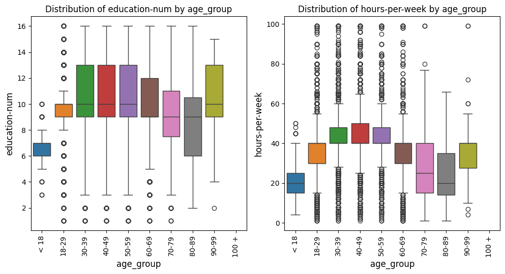
Violin Plots: Subplots Example
In this example with the US census data [1], we keep everything the same as the prior example, but change the
plot_type to violinplot. This adjustment will generate violin plots instead
of boxplots while maintaining all other settings.
from eda_toolkit import box_violin_plot

metrics_comp = ["age_group"]

box_violin_plot(
    df=df,
    metrics_list=age_boxplot_list,
    metrics_comp=metrics_comp,
    image_path_png=image_path_png,
    image_path_svg=image_path_svg,
    save_plots="all",
    show_plot="both",
    show_legend=False,
    plot_type="violinplot",
    xlabel_rot=90,
)
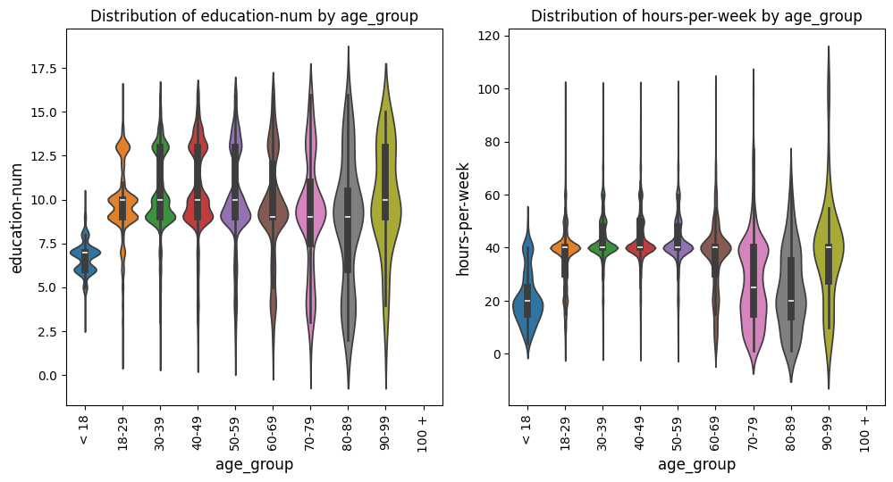
Pivoted Violin Plots: Subplots Example
In this example with the US census data [1], we set xlabel_rot=0 and rotate_plot=True
to pivot the plot, changing the orientation of the axes while keeping the x-axis labels upright.
This adjustment flips the axes, providing a different perspective on the data distribution.
from eda_toolkit import box_violin_plot

metrics_comp = ["age_group"]

box_violin_plot(
    df=df,
    metrics_list=age_boxplot_list,
    metrics_comp=metrics_comp,
    show_plot="both",
    rotate_plot=True,
    show_legend=False,
    plot_type="violinplot",
    xlabel_rot=0,
)
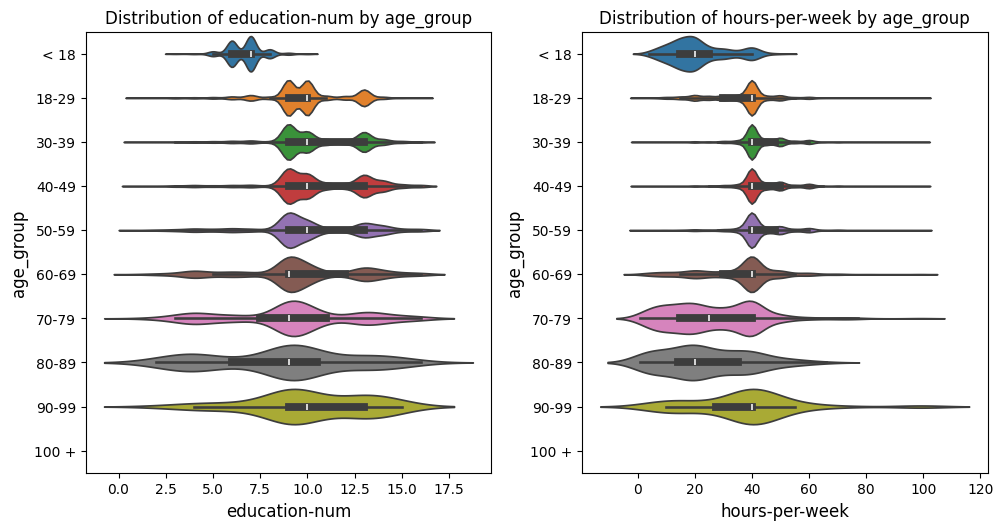
Scatter Plots and Best Fit Lines
Scatter Fit Plot
Create and Save Scatter Plots or Subplots of Scatter Plots
This function, scatter_fit_plot, generates scatter plots for one or more pairs of variables (x_vars and y_vars) from a given DataFrame. The function can produce individual scatter plots or organize multiple scatter plots into a subplots layout, enabling easy visualization of relationships between different pairs of variables in a unified view.
Optional Features
Best Fit Line: Adds an optional best fit line to the scatter plots, calculated using linear regression. This provides visual insights into the linear relationship between variables. The equation of the line can also be displayed in the plot’s legend.
Correlation Coefficient Display: Displays the Pearson correlation coefficient directly in the plot title, offering a numeric indicator of the linear relationship between variables.
Customization Options
The function provides a variety of parameters to customize the appearance and behavior of scatter plots:
Color: Customize point colors with a fixed color or a
hueparameter to group points by a categorical variable.Size and Marker: Adjust the size of points dynamically based on a variable, and specify custom markers to represent data effectively.
Labels and Axis Configuration: Set axis labels, font sizes, label rotation, and axis limits to ensure readability and focus on relevant data.
Plot Management
Display Options: Control how plots are displayed: as individual plots, subplots, or both.
Saving Options: Save the generated plots in PNG or SVG formats. Specify which plots to save (e.g.,
"all","individual", or"subplots") and their respective file paths.
Advanced Features
Combination Plotting: Automatically generate scatter plots for all combinations of variables when using the
all_varsparameter.Exclusion Rules: Exclude specific (
x_var,y_var) combinations from being plotted using theexclude_combinationsparameter.Legend and Aesthetic Adjustments: Toggle legends, adjust plot size for individual or subplots, and wrap long titles for clarity.
Error Handling
The function performs comprehensive input validation to prevent common errors, such as:
Conflicting inputs for
all_vars,x_vars, andy_vars.Invalid or missing column names in the DataFrame.
Incorrectly specified parameters like axis limits or figure sizes.
- scatter_fit_plot(df, x_vars=None, y_vars=None, all_vars=None, exclude_combinations=None, n_rows=None, n_cols=None, max_cols=4, image_path_png=None, image_path_svg=None, save_plots=None, show_legend=True, legend_loc='best', xlabel_rot=0, show_plot='subplots', rotate_plot=False, individual_figsize=(6, 4), subplot_figsize=None, label_fontsize=12, tick_fontsize=10, text_wrap=50, add_best_fit_line=False, scatter_color='C0', best_fit_linecolor='red', best_fit_linestyle='-', hue=None, hue_palette=None, size=None, sizes=None, marker='o', show_correlation=True, xlim=None, ylim=None, label_names=None, **kwargs)
Generate scatter plots or subplots of scatter plots for the given
x_varsandy_vars, with optional best fit lines, correlation coefficients, and customizable aesthetics.- Parameters:
df (pandas.DataFrame) – The DataFrame containing the data for the plots.
x_vars (list of str or str, optional) – List of variable names to plot on the
x-axis. If a single string is provided, it will be converted into a list with one element.y_vars (list of str or str, optional) – List of variable names to plot on the
y-axis. If a single string is provided, it will be converted into a list with one element.all_vars (list of str, optional) – Generates scatter plots for all combinations of variables in this list, overriding
x_varsandy_vars.exclude_combinations (list of tuples, optional) – List of (
x_var,y_var) combinations to exclude from plotting.n_rows (int, optional) – Number of rows in the subplot grid. Calculated automatically if not specified.
n_cols (int, optional) – Number of columns in the subplot grid. Calculated automatically if not specified.
max_cols (int, optional) – Maximum number of columns in the subplot grid. Default is
4.image_path_png (str, optional) – Directory path to save PNG images of scatter plots.
image_path_svg (str, optional) – Directory path to save SVG images of scatter plots.
save_plots (str, optional) – Specify which plots to save (
"all","individual", or"subplots"); uses a progress bar (tqdm) for saving.show_legend (bool, optional) – Toggle display of the plot legend. Default is
True.legend_loc (str, optional) – Location of the legend on the plot. Passed directly to
matplotlib.axes.Axes.legend. Common options include"best","upper right","upper left","lower left","lower right", and"center".xlabel_rot (int, optional) – Angle to rotate
x-axislabels. Default is0.show_plot (str, optional) – Controls plot display:
"individual","subplots","both", or"combinations". Default is"subplots". Use"combinations"to return all valid (x, y) variable pairs without generating plots.rotate_plot (bool, optional) – Rotate plots (swap
xandyaxes). Default isFalse.individual_figsize (tuple or list, optional) – Dimensions for individual plot figures (width, height). Default is
(6, 4).subplot_figsize (tuple or list, optional) – Dimensions for subplots (width, height). Calculated automatically if not specified.
label_fontsize (int, optional) – Font size for axis labels. Default is
12.tick_fontsize (int, optional) – Font size for axis ticks. Default is
10.text_wrap (int, optional) – Maximum title width before wrapping. Default is
50.add_best_fit_line (bool, optional) – Add a best fit line to scatter plots. Default is
False.scatter_color (str, optional) – Default color for scatter points. Default is
"C0".best_fit_linecolor (str, optional) – Color for the best fit line. Default is
"red".best_fit_linestyle (str, optional) – Linestyle for the best fit line. Default is
"-".hue (str, optional) – Column name for grouping variable to color points differently.
hue_palette (dict, list, or str, optional) – Colors for each
huelevel (requireshue).size (str, optional) – Variable to scale scatter point sizes.
sizes (dict, optional) – Mapping of minimum and maximum point sizes.
marker (str, optional) – Style of scatter points. Default is
"o".show_correlation (bool, optional) – Display correlation coefficient in titles. Default is
True.xlim (tuple or list, optional) – Limits for the
x-axis(min,max).ylim (tuple or list, optional) – Limits for the
y-axis(min,max).label_names (dict, optional) – Rename columns for display in titles and labels.
kwargs (dict, optional) – Additional options for
sns.scatterplot.
- Raises:
ValueError – See function docstring for detailed error conditions.
- Returns:
None. Generates and optionally saves scatter plots.
Regression-Centric Scatter Plots Example
In this US census data [1] example, the scatter_fit_plot function is
configured to display the Pearson correlation coefficient and a best fit line
on each scatter plot. The correlation coefficient is shown in the plot title,
controlled by the show_correlation=True parameter, which provides a measure
of the strength and direction of the linear relationship between the variables.
Additionally, the add_best_fit_line=True parameter adds a best fit line to
each plot, with the equation for the line displayed in the legend. This equation,
along with the best fit line, helps to visually assess the relationship between
the variables, making it easier to identify trends and patterns in the data. The
combination of the correlation coefficient and the best fit line offers both
a quantitative and visual representation of the relationships, enhancing the
interpretability of the scatter plots.
from eda_toolkit import scatter_fit_plot

scatter_fit_plot(
    df=df,
    x_vars=["age", "education-num"],
    y_vars=["hours-per-week"],
    show_legend=True,
    show_plot="subplots",
    subplot_figsize=None,
    label_fontsize=14,
    tick_fontsize=12,
    add_best_fit_line=True,
    scatter_color="#808080",
    show_correlation=True,
)
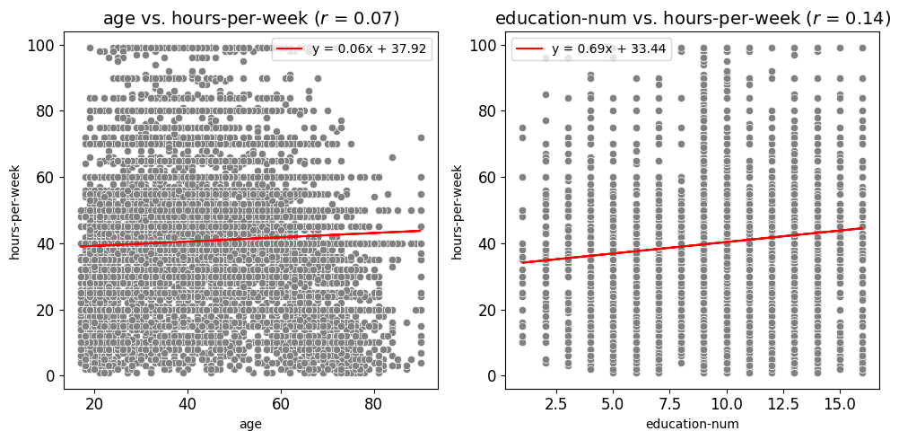
Scatter Plots Grouped by Category Example
In this example, the scatter_fit_plot function is used to generate subplots of
scatter plots that examine the relationships between age and hours-per-week
as well as education-num and hours-per-week. Compared to the previous
example, a few key inputs have been changed to adjust the appearance and functionality
of the plots:
Hue and Hue Palette: The
hueparameter is set to"income", meaning that the data points in the scatter plots are colored according to the values in theincomecolumn. A custom color mapping is provided via thehue_paletteparameter, where the income categories"<=50K"and">50K"are assigned the colors"brown"and"green", respectively. This change visually distinguishes the data points based on income levels.Scatter Color: The
scatter_colorparameter is set to"#808080", which applies a grey color to the scatter points when nohueis provided. However, since ahueis specified in this example, thehue_palettetakes precedence and overrides this color setting.Best Fit Line: The
add_best_fit_lineparameter is set toFalse, meaning that no best fit line is added to the scatter plots. This differs from the previous example where a best fit line was included.Correlation Coefficient: The
show_correlationparameter is set toFalse, so the Pearson correlation coefficient will not be displayed in the plot titles. This is another change from the previous example where the correlation coefficient was included.Hue Legend: The
show_legendparameter remains set toTrue, ensuring that the legend displaying the hue categories ("<=50K"and">50K") appears on the plots, helping to interpret the color coding of the data points.
These changes allow for the creation of scatter plots that highlight the income levels of individuals, with custom color coding and without additional elements like a best fit line or correlation coefficient. The resulting subplots are then saved as images in the specified paths.
from eda_toolkit import scatter_fit_plot

hue_dict = {"<=50K": "brown", ">50K": "green"}

scatter_fit_plot(
    df=df,
    x_vars=["age", "education-num"],
    y_vars=["hours-per-week"],
    show_legend=True,
    show_plot="subplots",
    label_fontsize=14,
    tick_fontsize=12,
    add_best_fit_line=False,
    scatter_color="#808080",
    hue="income",
    hue_palette=hue_dict,
    show_correlation=False,
)
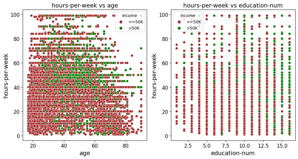
Scatter Plots (All Combinations Example)
In this example, the scatter_fit_plot function is used to generate subplots of scatter plots that explore the relationships between all numeric variables in the df DataFrame. The function automatically identifies and plots all possible combinations of these variables. Below are key aspects of this example:
All Variables Combination: The
all_varsparameter is used to automatically generate scatter plots for all possible combinations of numerical variables in the DataFrame. This means you don’t need to manually specifyx_varsandy_vars, as the function will iterate through each possible pair.Subplot Display: The
show_plotparameter is set to"subplots", so the scatter plots are displayed in subplots format. This is useful for comparing multiple relationships simultaneously.Font Sizes: The
label_fontsizeandtick_fontsizeparameters are set to14and12, respectively. This increases the readability of axis labels and tick marks, making the plots more visually accessible.Best Fit Line: The
add_best_fit_lineparameter is set toTrue, meaning that a best fit line is added to each scatter plot. This helps in visualizing the linear relationship between variables.Scatter Color: The
scatter_colorparameter is set to"#808080", applying a grey color to the scatter points. This provides a neutral color that does not distract from the data itself.Correlation Coefficient: The
show_correlationparameter is set toTrue, so the Pearson correlation coefficient will be displayed in the plot titles. This helps to quantify the strength of the relationship between the variables.
These settings allow for the creation of scatter plots that comprehensively explore the relationships between all numeric variables in the DataFrame. The plots are saved in subplots format, with added best fit lines and correlation coefficients for deeper analysis. The resulting images can be stored in the specified directory for future reference.
from eda_toolkit import scatter_fit_plot

scatter_fit_plot(
    df=df,
    all_vars=df.select_dtypes(np.number).columns.to_list(),
    show_legend=True,
    show_plot="subplots",
    label_fontsize=14,
    tick_fontsize=12,
    add_best_fit_line=True,
    scatter_color="#808080",
    show_correlation=True,
)
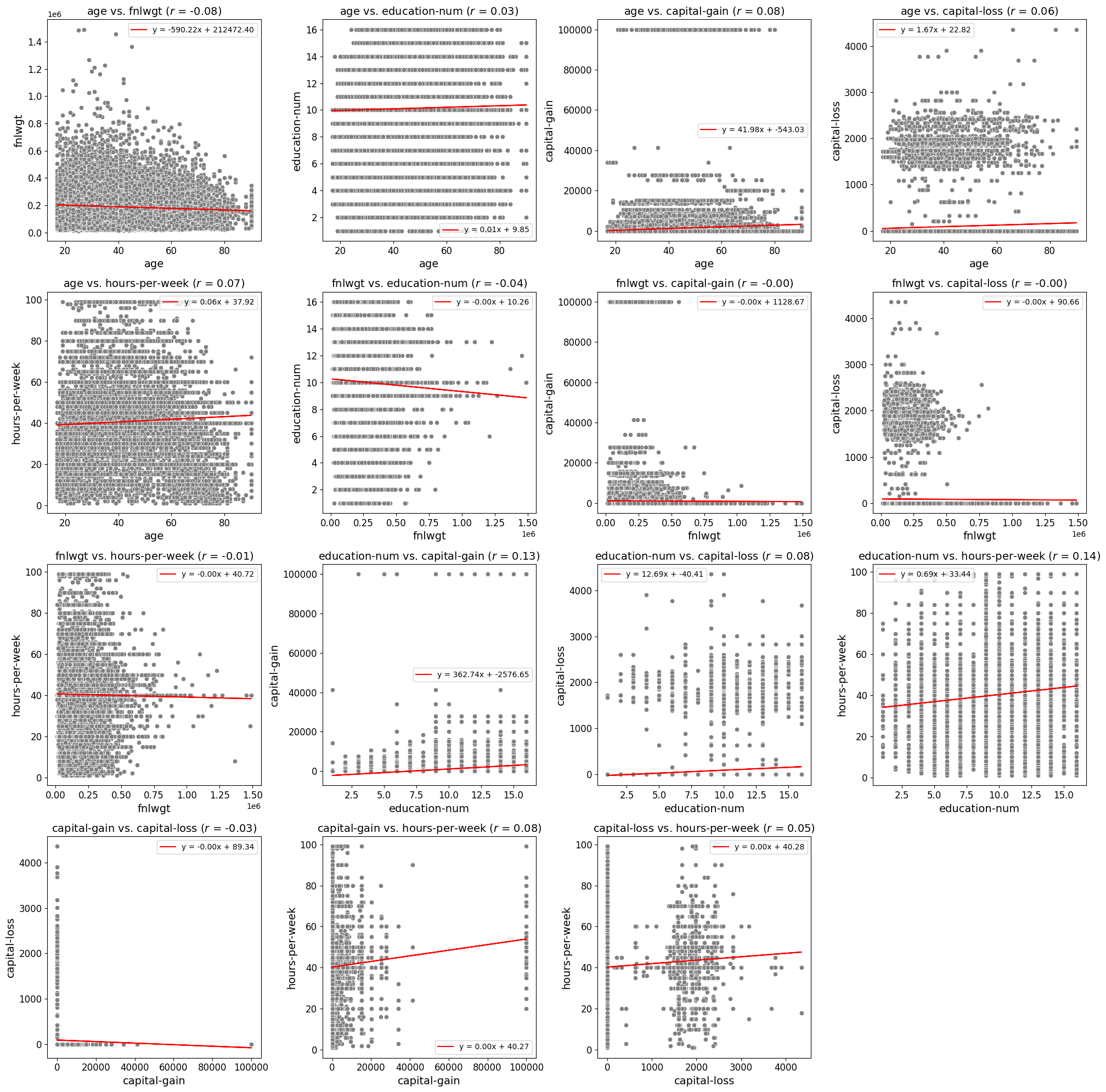
Scatter Plots: Excluding Specific Combinations
Example 1
In this example, the scatter_fit_plot function is used to generate subplots of
scatter plots while excluding specific combinations of variables. This allows for
a more targeted exploration of relationships, omitting plots that may be redundant
or irrelevant. Below are key aspects of this example:
1. Exclude Combinations: The exclude_combinations parameter is used to
specify pairs of variables that should be excluded from the scatter plot subplot grid.
For example:
("capital-gain", "hours-per-week")
("capital-loss", "capital-gain")
("education-num", "hours-per-week")
This ensures that the generated plots are more relevant to the analysis.
2. All Variables Combination: Like the previous example, the all_vars parameter
is used to automatically generate scatter plots for all combinations of numerical
variables in the DataFrame, minus the excluded pairs.
3. Subplot Display: The show_plot parameter is set to "subplots", allowing for
simultaneous visualization of multiple relationships in a cohesive layout.
By excluding specific variable combinations, this example demonstrates how to fine-tune the generated scatter plots to focus only on the most meaningful comparisons.
from eda_toolkit import scatter_fit_plot

exclude_combinations = [
    ("capital-gain", "hours-per-week"),
    ("capital-loss", "capital-gain"),
    ("capital-loss", "hours-per-week"),
    ("capital-loss", "education-num"),
    ("capital-loss", "fnlwgt"),
    ("education-num", "hours-per-week"),
    ("hours-per-week", "age"),
]

scatter_fit_plot(
    df=df,
    all_vars=df.select_dtypes(np.number).columns.to_list(),
    show_legend=True,
    exclude_combinations=exclude_combinations,
    show_plot="subplots",
    label_fontsize=14,
    tick_fontsize=12,
    add_best_fit_line=True,
    scatter_color="#808080",
    show_correlation=True,
)
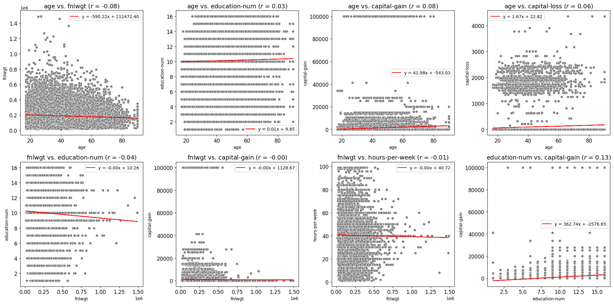
Example 2
In this example, the scatter_fit_plot function is used to generate a list of
valid (x, y) combinations without creating any plots. This feature is particularly
useful when identifying potential variable pairs for further analysis or programmatically
excluding irrelevant combinations. Below are key aspects of this example:
1. List of Combinations: Setting the show_plot parameter to "combinations"
returns a list of all valid combinations of numerical variables. The exclude_combinations
parameter is used to omit specific pairs from this list.
Excluded Combinations: Certain variable pairs are excluded using the
exclude_combinationsparameter. For instance:("capital-gain", "hours-per-week")("capital-loss", "education-num")("hours-per-week", "age")
This ensures the returned list only includes meaningful and relevant combinations.
3. Order Irrelevance: The order of variables in each tuple is irrelevant. For example,
("capital-gain", "hours-per-week") and ("hours-per-week", "capital-gain") are
considered the same pair, and only one is included in the output.
4. Efficient Output: No scatter plots are generated or displayed, making this approach efficient for exploratory analysis or preprocessing.
Below is an example illustrating how to retrieve a list of combinations:
from eda_toolkit import scatter_fit_plot

exclude_combinations = [
    ("capital-gain", "hours-per-week"),
    ("capital-loss", "capital-gain"),
    ("capital-loss", "hours-per-week"),
    ("capital-loss", "education-num"),
    ("capital-loss", "fnlwgt"),
    ("education-num", "hours-per-week"),
    ("hours-per-week", "age"),
]

combinations = scatter_fit_plot(
    df=df,
    all_vars=df.select_dtypes(np.number).columns.to_list(),
    show_legend=True,
    exclude_combinations=exclude_combinations,
    show_plot="combinations",
    label_fontsize=14,
    tick_fontsize=12,
    add_best_fit_line=True,
    scatter_color="#808080",
    show_correlation=True,
    image_path_png=image_path_png,
    image_path_svg=image_path_svg,
    save_plots="subplots",
)

print(combinations)
The returned list of combinations will look like this:
[
    ('age', 'fnlwgt'),
    ('age', 'education-num'),
    ('age', 'capital-gain'),
    ('age', 'capital-loss'),
    ('fnlwgt', 'education-num'),
    ('fnlwgt', 'capital-gain'),
    ('fnlwgt', 'hours-per-week'),
    ('education-num', 'capital-gain'),
]
This feature allows users to explore potential variable relationships before deciding on visualization or further analysis.
Correlation Matrices
Generate and Save Customizable Correlation Heatmaps
The flex_corr_matrix function is designed to create highly customizable correlation heatmaps for visualizing the relationships between variables in a DataFrame. This function allows users to generate either a full or triangular correlation matrix, with options for annotation, color mapping, and saving the plot in multiple formats.
Customizable Plot Appearance
The function provides extensive customization options for the heatmap’s appearance:
Colormap Selection: Choose from a variety of colormaps to represent the strength of correlations. The default is
"coolwarm", but this can be adjusted to fit the needs of the analysis.Annotation: Optionally annotate the heatmap with correlation coefficients, making it easier to interpret the strength of relationships at a glance.
Figure Size and Layout: Customize the dimensions of the heatmap to ensure it fits well within reports, presentations, or dashboards.
Triangular vs. Full Correlation Matrix
A key feature of the flex_corr_matrix function is the ability to generate either a full correlation matrix or only the upper triangle. This option is particularly useful when the matrix is large, as it reduces visual clutter and focuses attention on the unique correlations.
Label and Axis Configuration
The function offers flexibility in configuring axis labels and titles:
Label Rotation: Rotate x-axis and y-axis labels for better readability, especially when working with long variable names.
Font Sizes: Adjust the font sizes of labels and tick marks to ensure the plot is clear and readable.
Title Wrapping: Control the wrapping of long titles to fit within the plot without overlapping other elements.
Plot Display and Saving Options
The flex_corr_matrix function allows you to display the heatmap directly or save it as PNG or SVG files for use in reports or presentations. If saving is enabled, you can specify file paths and names for the images.
- flex_corr_matrix(df, cols=None, annot=True, cmap='coolwarm', save_plots=False, image_path_png=None, image_path_svg=None, figsize=(10, 10), title=None, label_fontsize=12, tick_fontsize=10, xlabel_rot=45, ylabel_rot=0, xlabel_alignment='right', ylabel_alignment='center_baseline', text_wrap=50, vmin=-1, vmax=1, cbar_label='Correlation Index', triangular=True, **kwargs)
Create a customizable correlation heatmap with options for annotation, color mapping, figure size, and saving the plot.
- Parameters:
df (pandas.DataFrame) – The DataFrame containing the data.
cols (list of str, optional) – List of column names to include in the correlation matrix. If
None, all columns are included.annot (bool, optional) – Whether to annotate the heatmap with correlation coefficients. Default is
True.cmap (str, optional) – The colormap to use for the heatmap. Default is
"coolwarm".save_plots (bool, optional) – Controls whether to save the plots. Default is
False.image_path_png (str, optional) – Directory path to save PNG images of the heatmap.
image_path_svg (str, optional) – Directory path to save SVG images of the heatmap.
figsize (tuple, optional) – Width and height of the figure for the heatmap. Default is
(10, 10).title (str, optional) – Title of the heatmap. Default is
None.label_fontsize (int, optional) – Font size for tick labels and colorbar label. Default is
12.tick_fontsize (int, optional) – Font size for axis tick labels. Default is
10.xlabel_rot (int, optional) – Rotation angle for x-axis labels. Default is
45.ylabel_rot (int, optional) – Rotation angle for y-axis labels. Default is
0.xlabel_alignment (str, optional) – Horizontal alignment for x-axis labels. Default is
"right".ylabel_alignment (str, optional) – Vertical alignment for y-axis labels. Default is
"center_baseline".text_wrap (int, optional) – The maximum width of the title text before wrapping. Default is
50.vmin (float, optional) – Minimum value for the heatmap color scale. Default is
-1.vmax (float, optional) – Maximum value for the heatmap color scale. Default is
1.cbar_label (str, optional) – Label for the colorbar. Default is
"Correlation Index".triangular (bool, optional) – Whether to show only the upper triangle of the correlation matrix. Default is
True. Excludes the diagonal and lower triangle if enabled.kwargs (dict, optional) – Additional keyword arguments for
seaborn.heatmap()to customize the plot further.
- Raises:
If
annotis not a boolean.If
colsis not a list of column names.If
save_plotsis not a boolean.If
triangularis not a boolean.If
save_plotsis True but neitherimage_path_pngnorimage_path_svgis specified.
- Returns:
NoneThis function does not return any value but generates and optionally saves a correlation heatmap.
Note
To save images, you must specify the paths for image_path_png or image_path_svg.
Saving plots is triggered by providing a valid save_formats string.
Triangular Correlation Matrix Example
The provided code filters the census [1] DataFrame df to include only numeric columns using
select_dtypes(np.number). It then utilizes the flex_corr_matrix() function
to generate a right triangular correlation matrix, which only displays the
upper half of the correlation matrix. The heatmap is customized with specific
colormap settings, title, label sizes, axis label rotations, and other formatting
options.
Note
This triangular matrix format is particularly useful for avoiding redundancy in correlation matrices, as it excludes the lower half, making it easier to focus on unique pairwise correlations.
The function also includes a labeled color bar, helping users quickly interpret the strength and direction of the correlations.
# Select only numeric data to pass into the function
df_num = df.select_dtypes(np.number)
from eda_toolkit import flex_corr_matrix

flex_corr_matrix(
    df=df,
    cols=df_num.columns.to_list(),
    annot=True,
    cmap="coolwarm",
    figsize=(10, 8),
    title="US Census Correlation Matrix",
    xlabel_alignment="right",
    label_fontsize=14,
    tick_fontsize=12,
    xlabel_rot=45,
    ylabel_rot=0,
    text_wrap=50,
    vmin=-1,
    vmax=1,
    cbar_label="Correlation Index",
    triangular=True,
)

Full Correlation Matrix Example
In this modified census [1] example, the key changes are the use of the viridis
colormap and the decision to plot the full correlation matrix instead of just the
upper triangle. By setting cmap="viridis", the heatmap will use a different
color scheme, which can provide better visual contrast or align with specific
aesthetic preferences. Additionally, by setting triangular=False, the full
correlation matrix is displayed, allowing users to view all pairwise correlations,
including both upper and lower halves of the matrix. This approach is beneficial
when you want a comprehensive view of all correlations in the dataset.
from eda_toolkit import flex_corr_matrix

flex_corr_matrix(
    df=df,
    cols=df_num.columns.to_list(),
    annot=True,
    cmap="viridis",
    figsize=(10, 8),
    title="US Census Correlation Matrix",
    xlabel_alignment="right",
    label_fontsize=14,
    tick_fontsize=12,
    xlabel_rot=45,
    ylabel_rot=0,
    text_wrap=50,
    vmin=-1,
    vmax=1,
    cbar_label="Correlation Index",
    triangular=False,
)
